15 Vintage Gallery Wall Ideas for a Collected-Over-Time Look
There is a specific kind of wall that looks like it was never decorated at all, just gathered. A face from a portrait you can’t place, a fern print with foxed edges, a small oval frame holding someone’s grandmother. Nothing on it was bought as a set. That is the feeling most people want when they say they want a vintage gallery wall, and it is also the thing a matching three-pack of frames from a big box store can never give you.
The trick is not finding one perfect old piece. It is mixing enough different eras, frame finishes, and art styles that the wall reads as collected rather than curated, then anchoring all of it with one consistent color story so the mix does not turn into clutter.
These fifteen vintage gallery wall ideas each lean on a different kind of piece, from botanical prints to miniature portraits to celestial charts, so you can pull two or three that match what you already own or can actually find secondhand.
1. Start With a Dense Salon-Style Hang of Mixed Frames
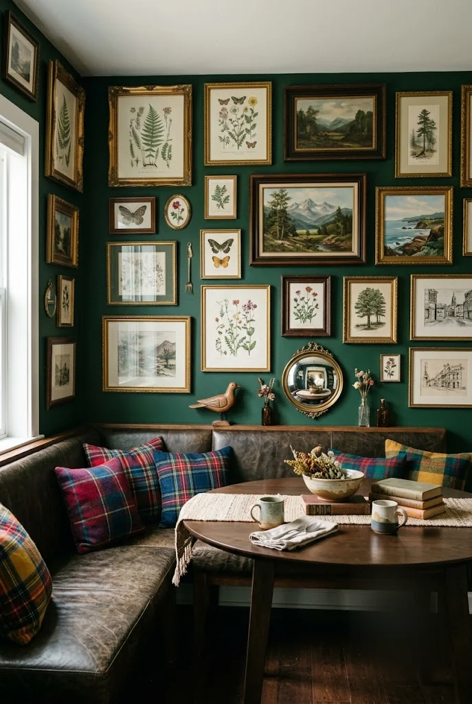
Most gallery walls fail because they leave too much breathing room between pieces, which reads as sparse instead of collected. Go dense instead. Group ten or more frames close together, gold beside dark wood beside a plain black frame, sizes ranging from small to oversized, with only an inch or two of wall showing between them. Mismatched frame finishes are the whole point here, not a mistake to fix. Start with your largest piece slightly off center, then build outward with smaller frames filling the gaps. A single warm accent color repeated across a few of the pieces keeps the wall from feeling chaotic even when nothing else matches.
A single framed print centered alone on a large blank wall, with acres of empty space around it.
The same wall dense with ten mismatched frames grouped close together, gold and dark wood side by side.
2. Choose Botanical Prints With Delicate, Not Bulky, Frames
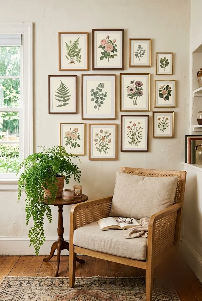
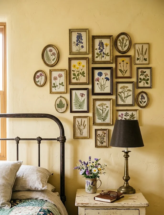
A thick, heavy frame fights a delicate botanical illustration instead of supporting it. Keep botanical prints in slim wood or thin brass frames, the kind that almost disappear against the wall, so the linework and color of the plant itself stays the focus. Mix a few different plant subjects, ferns, florals, single stems, rather than repeating the same flower in every frame. A real plant nearby, something with the same loose, trailing shape as the prints, ties the illustrated greenery back to something actually alive in the room.
💡 Quick Tip
Skip anything with a frame wider than half an inch. A slim profile is what makes a botanical print look like it was found, not bought to match the room.
3. Warm Sepia Tones Read as Collected, Not Matched
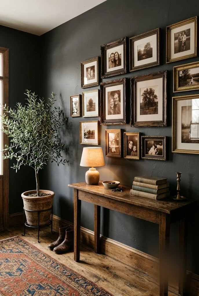
Black-and-white photography feels like the safe choice for a vintage wall, but true sepia tones do more work. The warm brown cast reads as aged and photographed decades ago, even when the print is new, and it pulls together with wood tones and brass hardware in a way that stark black and white does not. Keep the frames in dark wood or aged brass so nothing in the arrangement reads as a modern print in an old frame. A console table underneath, with a single lamp instead of an overhead fixture, keeps the warm cast consistent all the way down the wall.
Warm sepia-toned prints in dark wood or aged brass frames.
A single lamp underneath instead of overhead light.
Stark black-and-white prints in bright modern frames.
Cool overhead lighting that flattens the warm tone.
4. Source Old-Style Portraits From Estate Sales and Thrift Shops
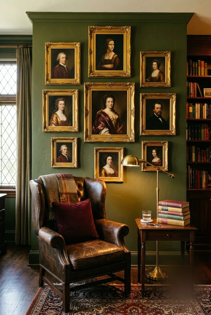
Old-style portrait paintings show up at estate sales and thrift shops far more often than people expect, usually priced as if nobody wants a stranger’s face on their wall. That is exactly the opportunity. A gilded frame in rough shape can be cleaned up with a little gold wax, and the portrait inside gains character precisely because nobody in the room knows who it is. Look for warm, muted color palettes, burgundy, gold, deep green, so the pieces sit together even if you find them years apart. It is one of the cheapest vintage gallery wall ideas here, since most sellers just want the frame gone.
Check estate sales and thrift shops for gilded frames priced low, portrait included.
Clean tarnished gold frames with a small amount of gold wax or metallic polish.
Group portraits by color palette, not by subject, so they read as one collection.
5. Hunt for Technical Line Drawings in Unexpected Places
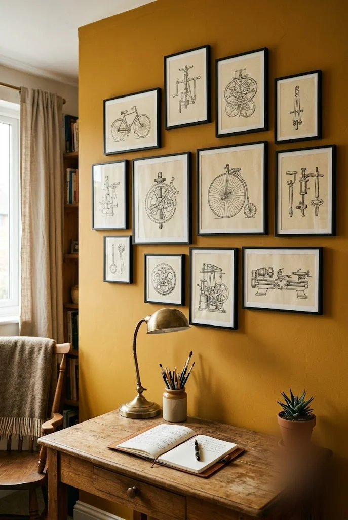
A stack of old textbooks at a used bookstore is an underrated source for this look. Technical line drawings, the kind that once illustrated how a bicycle or an engine actually worked, have a precision that regular decorative prints do not. Pull a few pages, have them matted and framed in simple black, and hang them somewhere with focus, a desk or office rather than a busy living space, so the fine linework does not get lost.
- ▸Used bookstores and library sales for old technical manuals.
- ▸Antique shops with a paper ephemera bin.
- ▸Estate sales that include a garage or workshop.
6. Cluster Tiny Oval Frames for an Intimate Focal Point
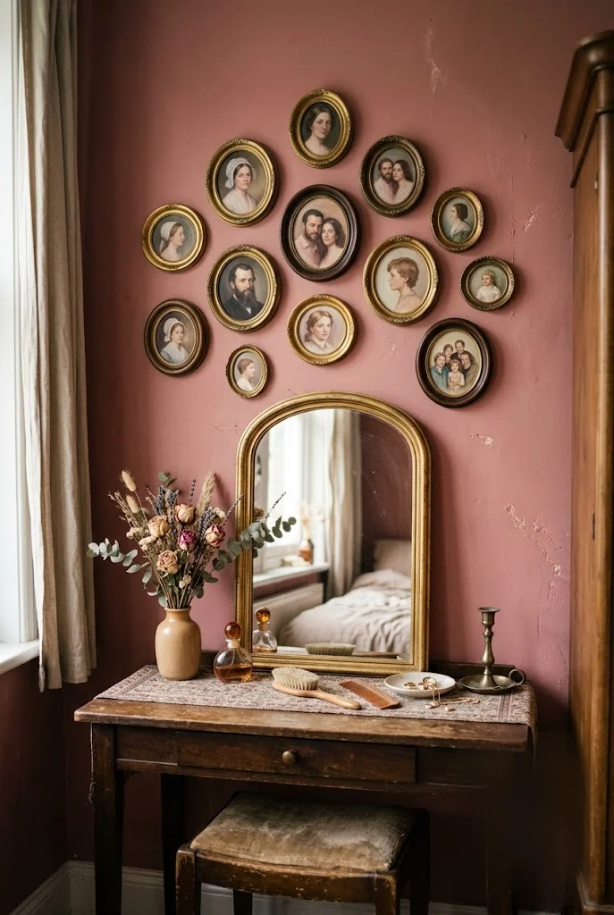
Small frames get overlooked because they seem too minor to build a whole wall around, but clustered tightly together, a group of oval and round miniature frames becomes a genuine focal point instead of an afterthought. Hang them low enough to actually see the detail up close, above a vanity or a small console rather than high on a stairwell. The intimacy is the whole appeal here. A miniature portrait rewards someone who steps close to look, which a giant statement piece across the room never asks anyone to do.
Small, clustered frames reward a close look in a way one large piece never will, so hang them somewhere people actually stand near.
7. Let Flowing Art Nouveau Lines Balance Out a Geometric Room
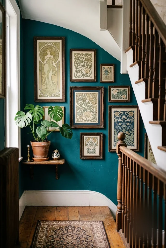
A room full of straight lines, square furniture, boxy shelving, benefits from at least one wall that curves instead. Art nouveau prints, with their flowing plant stems and organic border work, do exactly that. They soften a hallway or stairwell without adding any actual clutter, since the visual movement comes from the linework itself rather than the number of objects on the wall. Pair the flowing frames with straight-edged furniture nearby rather than more curved pieces, so the contrast stays visible instead of blending into a single soft look.
| Straight Lines Only | Straight Furniture + Flowing Wall Art |
|---|---|
| Reads as flat and rigid, nothing for the eye to follow. | The curved linework gives the eye somewhere to rest. |
| Boxy shelving and square furniture with no contrast. | Organic wall art keeps the contrast visible, not blended. |
8. Ground the Grouping With a Hand-Tinted Vintage Map
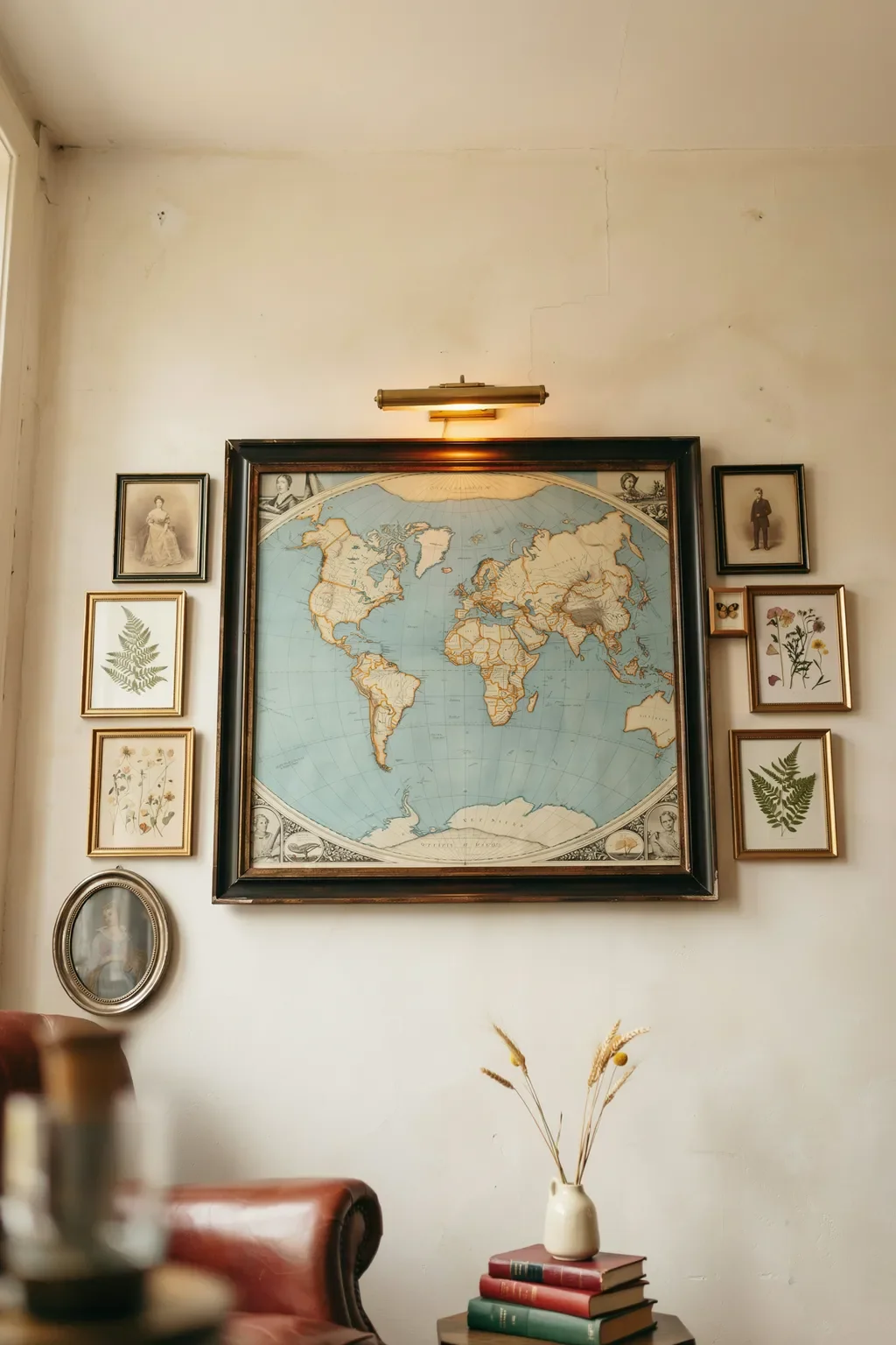
An old world map does something a smaller print cannot, it gives the eye one clear place to land in an otherwise busy wall. Look for hand-tinted or lithographed maps from the late 1800s through the 1930s, framed in dark wood with visible wear at the corners, and hang it slightly larger than everything else around it. The blue oceans and warm land tones give a gallery wall a color story you can build the rest of the pieces around, since almost any warm sepia photograph or botanical print will already sit inside that palette. A small brass picture light angled across the frame from above is what pushes the whole arrangement from wall decor to library corner.
💡 Quick Tip
Aim for a map at least 24 inches on its longest side. Anything smaller reads as decoration next to the surrounding frames instead of the anchor of the whole wall.
9. Weave in Small Mercury-Glass Mirrors Between the Frames
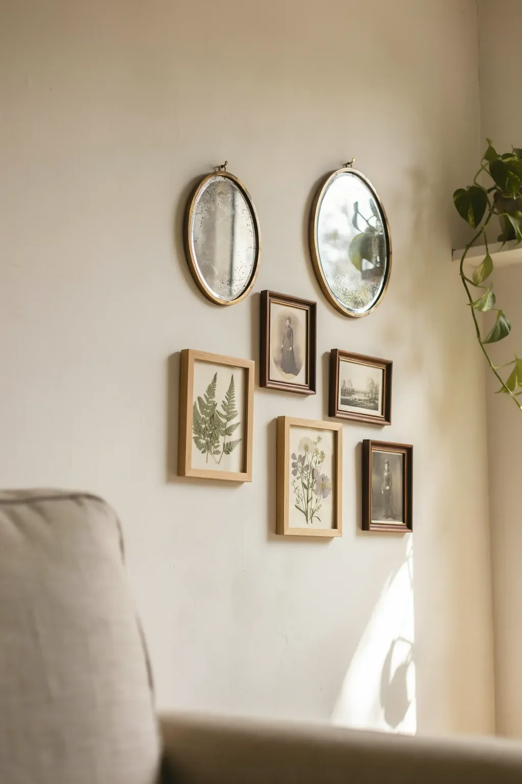
Antique mercury-glass mirrors are the shortcut for a gallery wall that stays too flat. The speckled silvering catches whatever light is in the room and throws it back at a broken angle, which adds a shimmer that no amount of print or photograph will give you. Tuck two or three oval mirrors between framed pieces rather than making them the focal point, and let the specks in the glass do the visual work. The whole point is the age. Look for pieces where the silvering has flaked or clouded, that is how you can tell it is actually old versus made yesterday to look old.
Oval or round mirrors with visibly clouded, flaked silvering.
Two or three tucked between frames, never centered as the focal point.
A perfectly clean, factory-new mirror sold as “antique style.”
One large mirror that pulls the whole wall to itself.
10. Frame Handwritten Letters and Postmarked Postcards
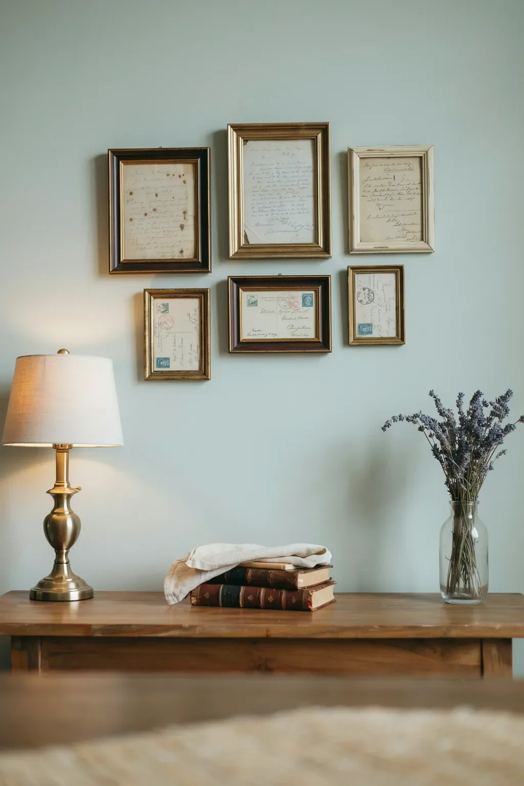
Old handwritten letters and postcards read as personal before someone even reads a word of them. The cursive handwriting itself is now unusual enough that a framed letter behaves like abstract art, and postmarked stamps add specks of color and a small piece of geographic history. Cluster four or five together on one part of the wall, tightly, so the eye reads them as one collection rather than random papers. Simple black or slim wood frames keep the paper as the focus. Estate sale bins, antique-mall paper booths, and old family shoeboxes are the three places these actually turn up.
- ▸Estate-sale paper bins, usually priced by the inch or under a dollar.
- ▸Antique-mall booths that specifically stock paper ephemera.
- ▸Family shoeboxes and grandparent attics before they get thrown out.
11. Add a Row of Pressed-Flower Herbarium Specimens
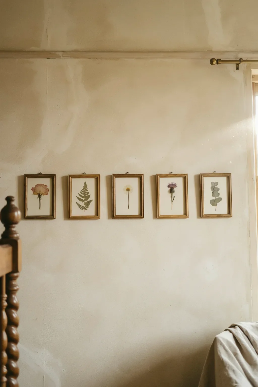
Not every vintage gallery wall has to cluster in tight groups. A horizontal row of matching slim frames, each holding a single pressed flower or fern specimen on cream backing paper, is exactly the arrangement that works above a bed or below a low ceiling where a dense hang would feel heavy. Stick to five or seven frames in the row, spaced evenly, all the same size, all the same finish. The pressed pieces inside should each be different, a rose, a fern, a daisy, a thistle, eucalyptus, so the eye has something to move between. It is the most orderly of these ideas here, and the calm is exactly why it works in a room meant for sleep.
| Tight Cluster Hang | Even Horizontal Row |
|---|---|
| Best for a living room, above a sofa, or a busy stairwell. | Best above a bed, over a console, or under a low ceiling. |
| Mismatched frame sizes and finishes, gathered look. | Matching slim frames, quiet and repeating. |
12. Anchor One Corner With a Small Oil Still-Life in a Gilded Frame
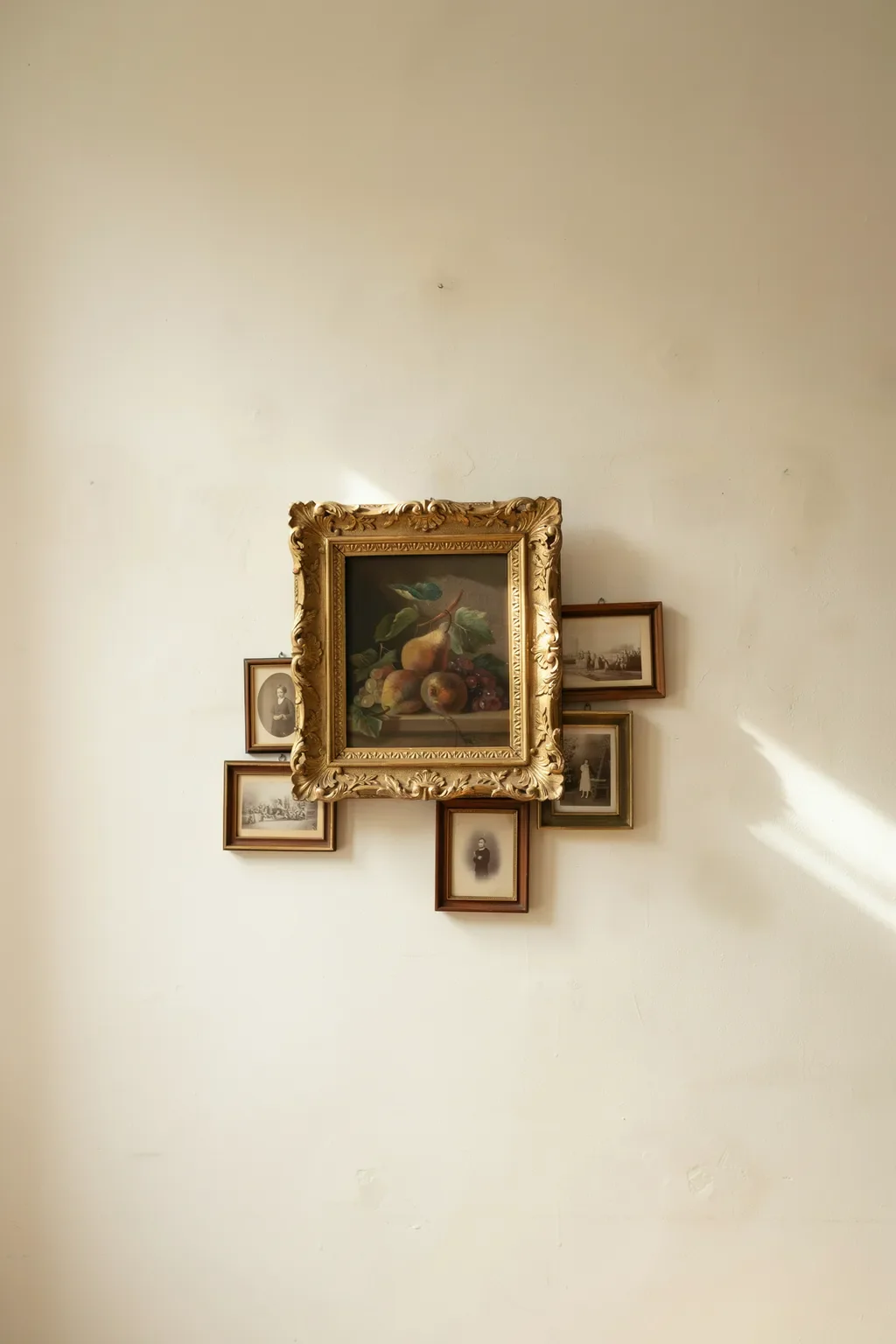
A single ornate gilded frame with a real oil painting inside is worth building an entire corner of the wall around. The heavy carved frame does the visual work of five smaller frames combined, and the painted brushwork inside gives the arrangement a texture a printed piece cannot. Look for still-life paintings of fruit or flowers, since those show up at estate sales more often than portraits and cost less. Cluster three or four small sepia photographs around the base of the gilded frame rather than trying to match its size, and let the ornate piece dominate. The mismatch in scale is what makes it read as a collector’s corner instead of a gallery hang.
A single heavy gilded frame does the visual work of five smaller ones, so let it dominate a corner instead of matching everything else in size.
13. Cut-Paper Silhouette Portraits on Cream Mats for Quiet Contrast
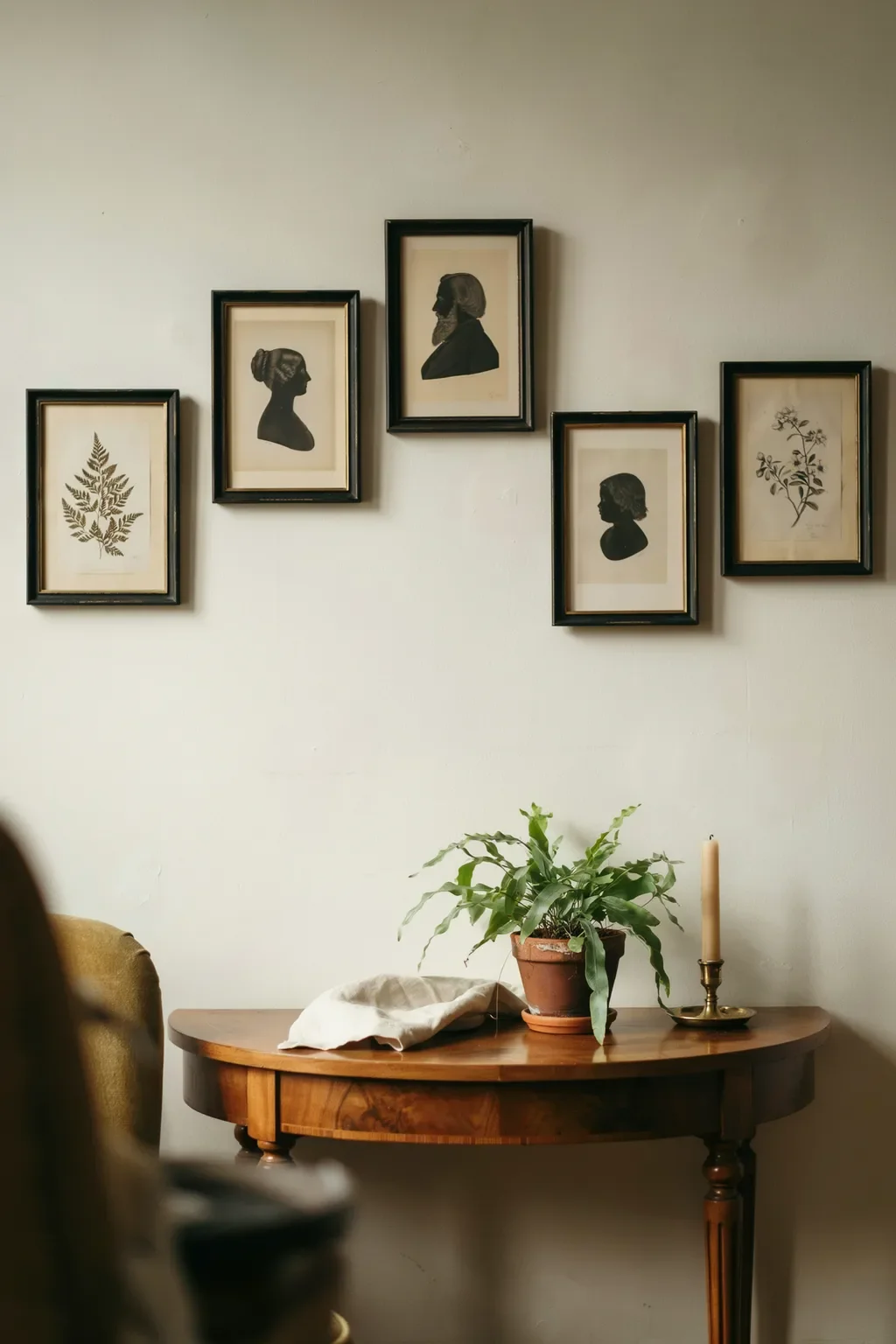
Cut-paper silhouettes are the piece most people forget exists, and they solve a specific problem, how to add strong black shapes to a wall that has drifted too warm and beige. A Victorian silhouette in a slim black frame reads instantly older than any print, since the technique itself dates to the 1700s, and the black profile against a cream mat gives the whole wall a visual anchor without competing for attention. Group two or three together at the same height, all in matching thin black frames, and let the sepia photographs and botanical prints around them look softer by comparison. It works especially well above a dark walnut console where the black frames pick up the wood tone.
An all-beige wall of sepia photos and botanical prints, no visual anchor for the eye to hold on to.
The same wall with three matching black silhouettes at eye level, giving the arrangement a quiet spine.
14. Slip in Vintage Sheet Music or an Opera Playbill
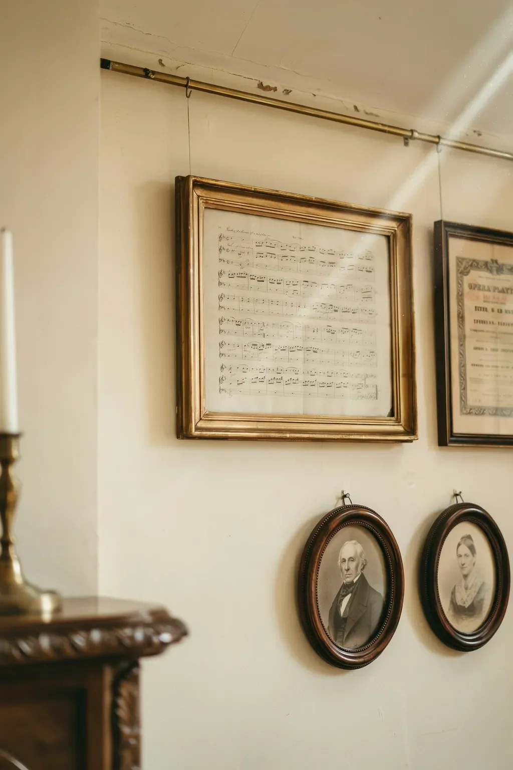
Framed sheet music and old opera playbills add a specific kind of visual texture photographs and prints cannot, the printed letters and staff lines read as pattern from a distance and as content up close. Look for sheets from the 1920s or 1930s that have yellowed naturally, since the aged paper color already coordinates with sepia photographs. Keep the framing simple, slim black or thin brass, so the printed text stays legible. One or two of these mixed into a wall of portraits and botanicals breaks up the rhythm without dominating. Sourcing is the easiest part of the whole list.
Check used-piano stores and estate sales for boxes of old sheet music, often free with a purchase.
Search opera-house archives and Etsy shops for original playbills from the 1920s through the 1950s.
Frame with a cream mat and slim black or thin brass edge so the aged paper reads as the piece.
15. Finish With a Celestial Chart or Moon-Phase Engraving
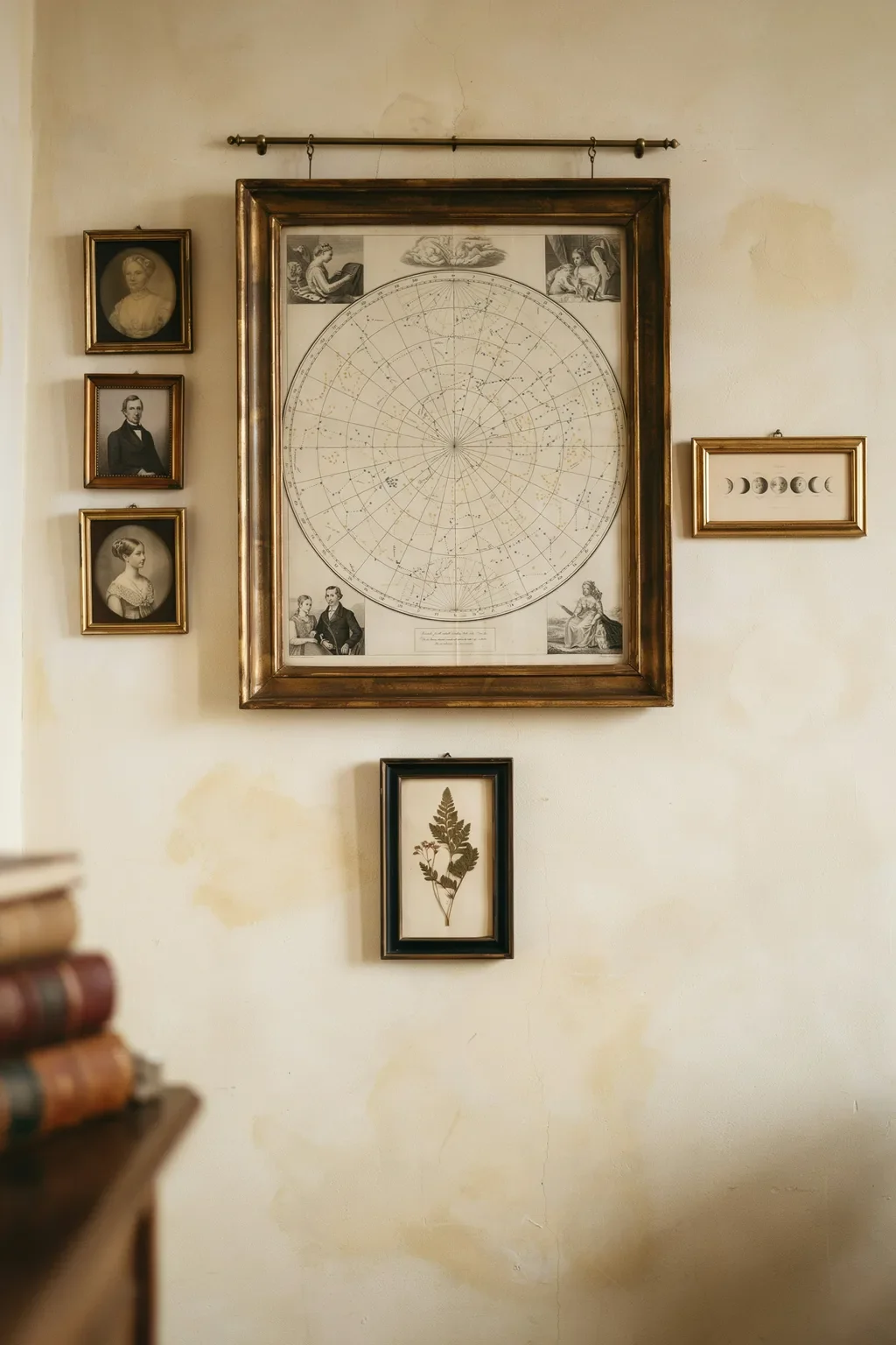
An antique celestial star-chart or moon-phase engraving is what pulls a warm sepia and gold wall into the evening, since the midnight indigo background of a good celestial chart adds a cool tone the rest of the wall does not have. Hang the largest one at eye level as the closing piece of the arrangement, with the smaller moon-phase panel beside it.
The faded gold constellation lines on aged parchment pick up the brass frames and sepia photographs already on the wall, so nothing feels bolted on. It is a good final piece to add once the rest of the wall is settled, since a celestial print is specific enough that you want to know what else is up there before committing to it.
💡 Quick Tip
Reprints of Andreas Cellarius’s 1660 Harmonia Macrocosmica plates are in the public domain and print beautifully at poster size, if a true antique is out of budget.
Conclusion
None of these fifteen ideas ask you to find one perfect antique. They ask you to gather pieces slowly, from a thrift shop here, an estate sale there, a print pulled from an old book, and give yourself permission to mix eras instead of matching them. That mix is what actually makes a wall look collected over time instead of purchased in an afternoon.
Pick the one or two vintage gallery wall ideas that match what you already have in a closet or a flea market bag, start there, and let the rest fill in slowly. Save this list for the next thrift trip, since half of building a wall like this is just knowing what to look for.