19 Gallery Wall Ideas for Every Kind of Wall You Have
A blank wall is intimidating in a way that’s hard to explain. You know you want something there, but a single print looks lonely, and buying a big piece of art feels like a decision you’re not ready to make. So the wall just stays empty for another year.
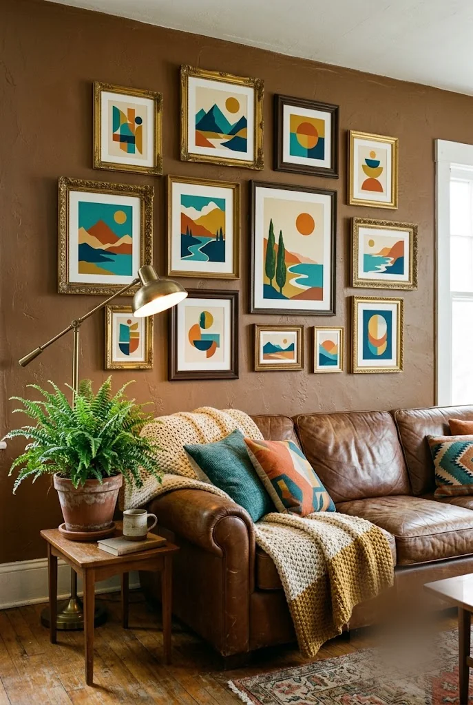
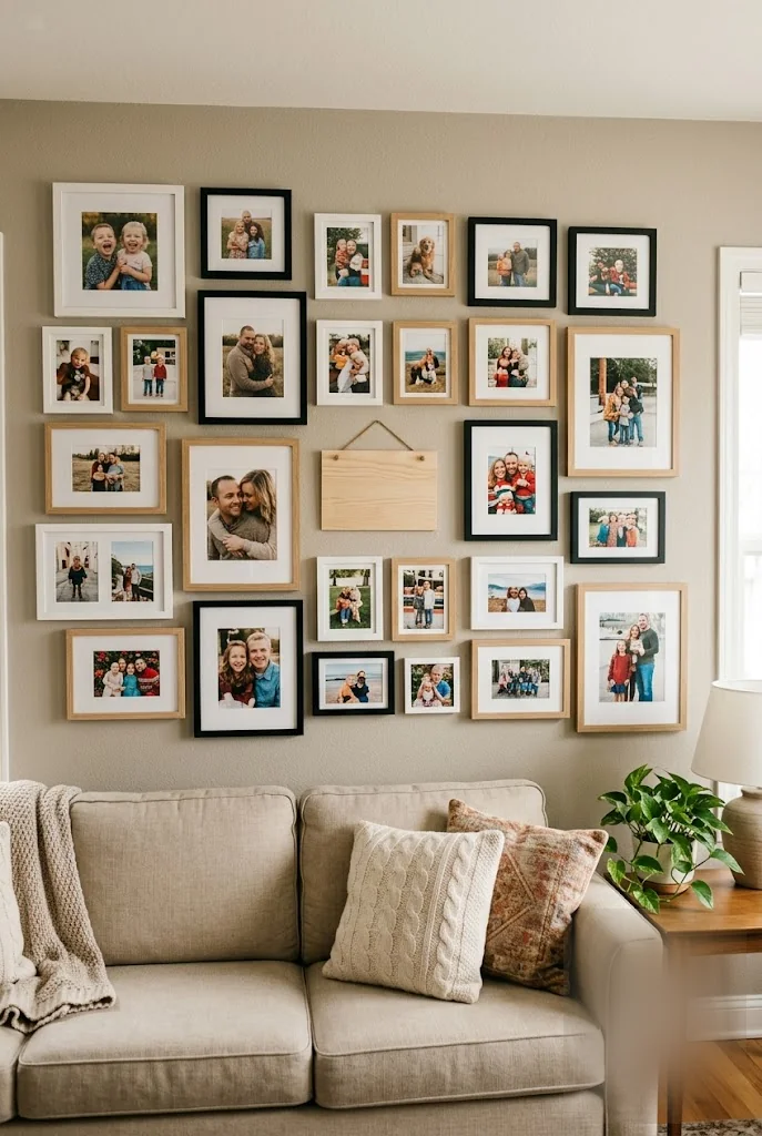
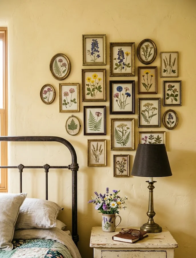
The fix isn’t one perfect piece. It’s a collection: frames in different finishes, art in different styles, maybe a few objects that aren’t art at all, all working together because they share a color story or a wall color that ties them down. Once you see it that way, a gallery wall stops being one big decision and turns into a bunch of small ones you can make over time.
These nineteen gallery wall ideas cover almost every kind of wall you might be staring at right now: a stairwell, a hallway, a corner, a wall behind the sofa. Pick the one that matches your actual space and start there.
1. Go Dense: Group Ten-Plus Frames With Almost No Wall Showing
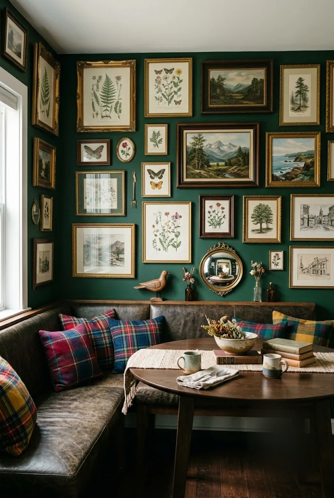
Most gallery walls fail from being too cautious, leaving inches of breathing room between each frame the way a museum would. Skip that instinct. Group ten, fifteen, even twenty frames close together, an inch or two of wall between them at most, mixing gold with dark wood with plain black. Start with your largest piece placed slightly off center, then work outward, tucking smaller frames into the gaps as you go. The mismatched finishes are the point, not a mistake to fix later. A single warm color repeated across three or four of the pieces is what keeps the whole cluster from reading as random.
A single small print centered alone on a large green wall, surrounded by empty space.
The same wall dense with fifteen mismatched frames grouped an inch apart, gold and dark wood mixed together.
2. Match Frame Style, Not Frame Size, for an Instant Sense of Order
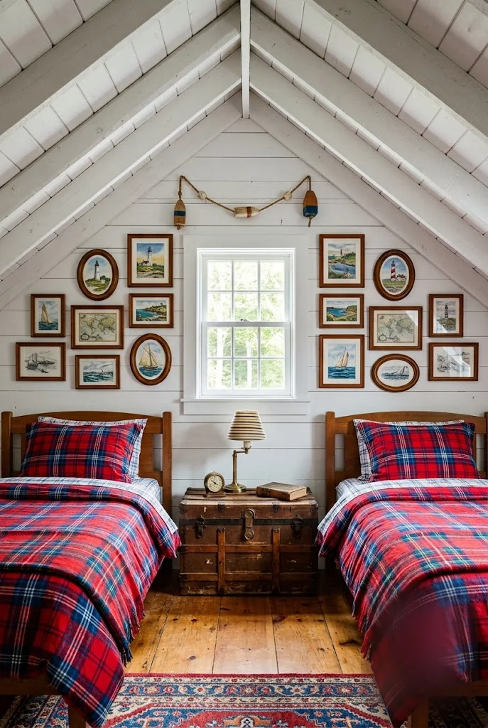
Symmetry does more heavy lifting than people expect when frame sizes and subjects vary widely. Keep the frame finish consistent, the same wood tone or the same gold, even if the art inside ranges from a small oval print to a large landscape. That one repeated detail is what reads as intentional from across the room, while the actual sizes and shapes stay completely free to vary. Anchor the whole arrangement around a fixed point, a window, a headboard, a mirror, and let the frames radiate out symmetrically from there.
💡 Quick Tip
If the art inside your frames doesn’t match, let the frames themselves match instead. Same wood tone, same gold finish. Consistency in one place buys you freedom everywhere else.
3. Let Wallpaper and Framed Art Share the Same Wall on Purpose
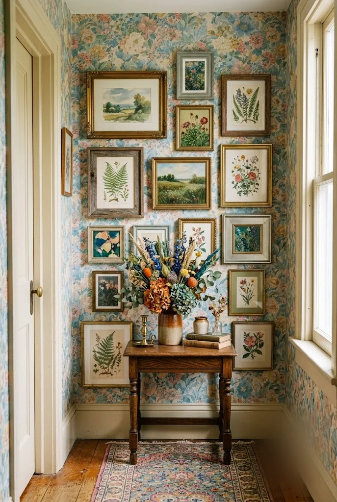
A dried flower arrangement sitting on a side table below a wall of framed landscapes, all set against a busy floral wallpaper, shouldn’t work on paper. It works in person because nothing here is fighting for the same kind of attention. The wallpaper handles pattern. The frames handle color and subject. The dried flowers add one more layer of texture without adding another pattern to compete. Once you stop trying to keep a patterned wall “clean” behind your art, a whole category of gallery wall ideas that most people skip opens back up.
- ▸Let the wallpaper carry the pattern, and keep frame contents simpler.
- ▸Match frame tones to a color already in the wallpaper.
- ▸Add one textural object, like dried flowers, instead of more frames.
4. Cover a Stairwell in Nothing But Silhouettes
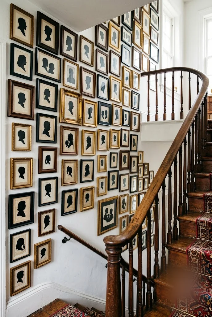
A stairwell wall covered in nothing but small black silhouette portraits does something a mixed gallery wall can’t: it reads as one cohesive piece from the bottom of the stairs, even though it’s really dozens of individual frames. The trick is repetition without exact duplication. Keep every silhouette roughly the same size and style, black profile on cream, but vary the frame finish between black and gold so the wall doesn’t feel stamped from a kit. Climbing the stairs becomes a small reveal instead of a hallway you walk past.
One repeated art style, styled dozens of times over, reads as more intentional than any single statement piece ever could.
5. Turn a Cork Board Into the Centerpiece of a Working Wall
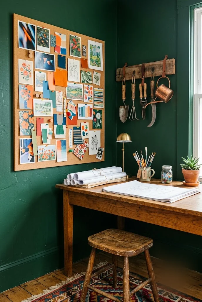
A home office wall doesn’t need to choose between decoration and function, and a cork inspiration board proves it. Cover a large board in photos, fabric swatches, and color clippings pinned in loose clusters rather than a tidy grid. Hang a small collection of related objects, vintage tools, old hardware, whatever fits your work, on the wall beside it. Keep the board close enough to the desk that you actually update it, since an inspiration board that never changes is just another framed piece.
Choose a large cork board sized to fill real wall space, not a small corner.
Pin photos, swatches, and clippings in loose clusters, not a strict grid.
Hang a related object collection beside it for texture and contrast.
6. Anchor a Reading Wall With One Round Mirror
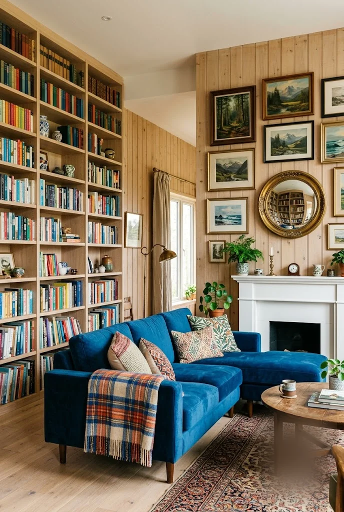
A gallery wall built entirely of flat, framed pieces misses an easy trick: adding one reflective object changes how the whole wall reads. Work a round mirror into the mix alongside your landscape prints, ideally somewhere it can bounce back a window or a light source across the room. Skip hanging the mirror directly above a busy shelf or another cluttered surface, since it just doubles the mess instead of adding depth. A floor-to-ceiling bookshelf on the opposite wall gives the room enough visual weight that this kind of gallery wall idea doesn’t have to do all the work alone.
Work one round mirror into the mix alongside your landscape prints.
Position it to reflect a window or light source.
Hanging the mirror directly above a busy, cluttered shelf.
Letting it just double the mess instead of adding depth.
7. Let a Few Animal Paintings Replace a Whole Theme
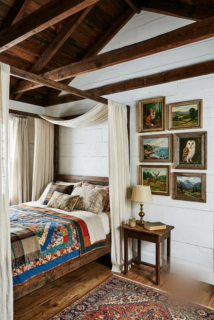
A themed gallery wall, all botanical or all maps or all one artist, looks polished but can feel a little stiff after a while. A handful of animal paintings does something looser: a fox here, an owl there, a deer print beside a small landscape, none of them matching exactly but all of them warm and small in scale. The effect reads as collected rather than curated, which is the whole difference between a wall that feels decorated and one that feels lived in.
| A Fully Themed Wall | A Loose Animal Painting Cluster |
|---|---|
| Feels polished but can read as staged. | Feels collected, like it happened over time. |
| Every piece matches the same subject. | Fox, owl, deer, and landscape mixed freely. |
8. Cluster Floral Still Lifes the Way a Salon Would
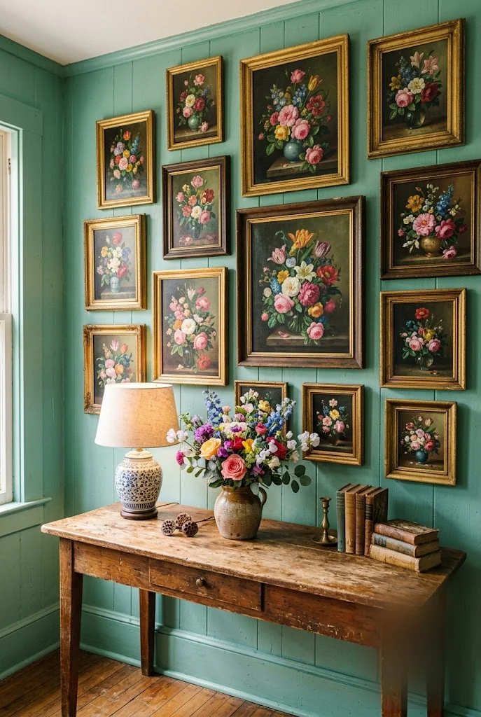
Gold frame beside dark wood beside a plain black frame, each one holding a different arrangement of the same handful of flowers: that repetition with variation is what makes a cluster of floral still lifes feel like a real collection instead of a matching set. Hang them close together in a loose grid, largest piece near the center, and let a vase of fresh flowers on the surface below echo the colors in the paintings above it. The still lifes do the color work. Everything else in the room can stay simple.
9. Layer Landscapes Above a Mantel Instead of Centering One
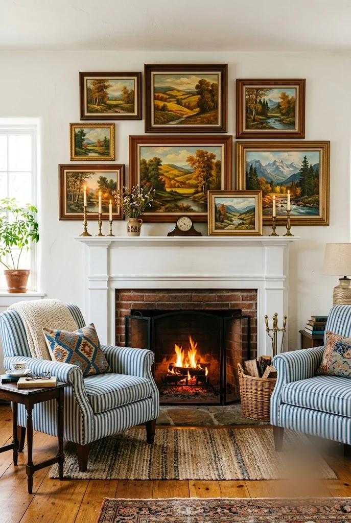
A single landscape centered above the mantel is the default, but it’s rarely the most interesting choice. Layer three or four landscape paintings of different sizes instead, some hung, some simply leaned against the wall behind candlesticks or a small vase. The stone or brick of the fireplace itself already provides a strong visual anchor, so the art above it doesn’t need to be one large, safe choice. Varying the heights and letting a few pieces lean rather than hang gives the mantel a sense of being styled over time, not installed in an afternoon, which is true of most of the best gallery wall ideas.
Building a layered mantel wall
10. Fill a Wall With Portraits Until It Reads as One Piece
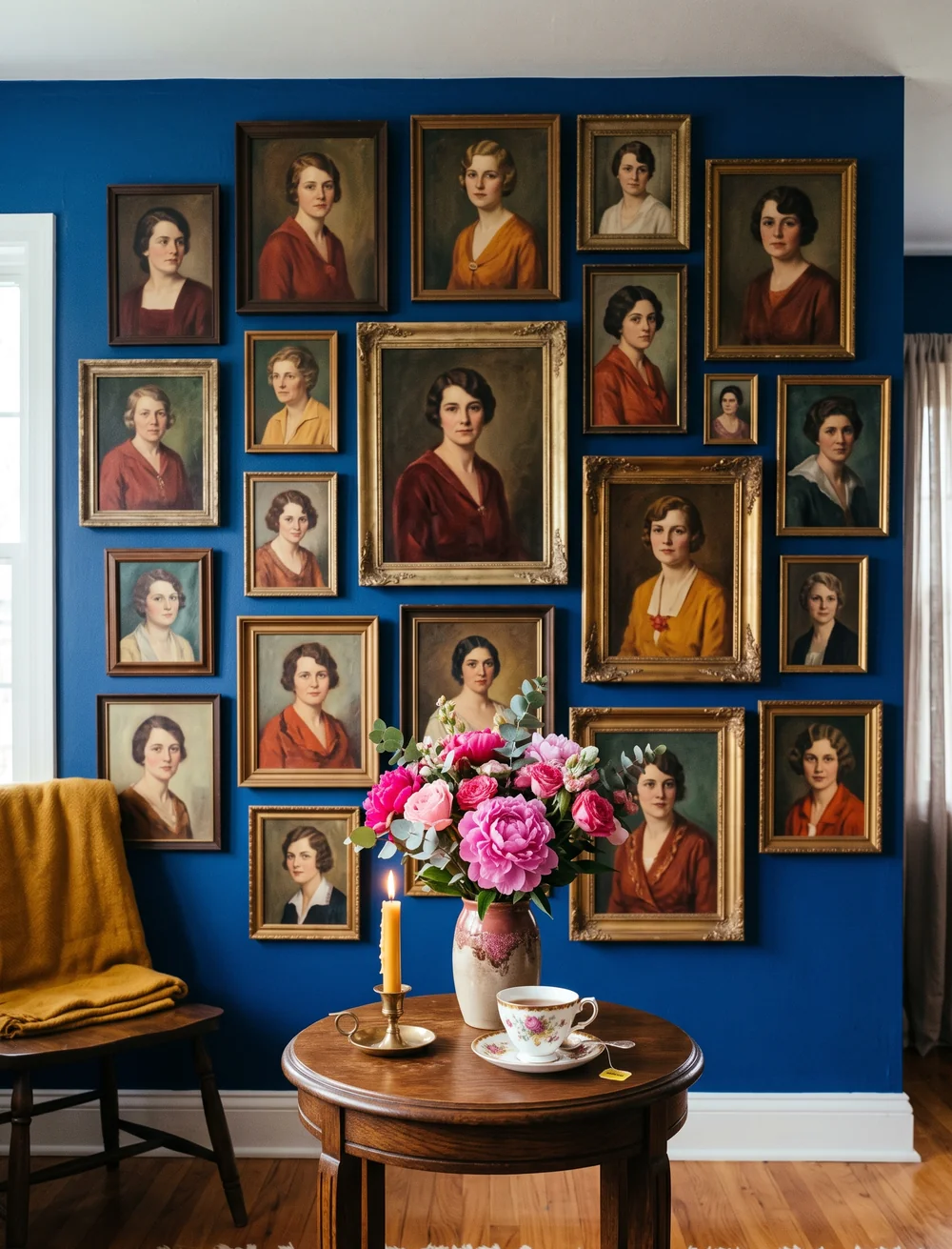
A blank blue wall and a wall dense with dozens of small portrait paintings are the same square footage, but they don’t feel like the same room. Hang enough portraits close together, and individual frames stop mattering. The wall reads as one large, textured piece instead of a collection of separate pictures. Keep the frame finishes in the same warm gold and wood family so the density doesn’t tip into visual noise. A small round table underneath, with fresh flowers and a lit candle, keeps the whole wall from feeling like a museum exhibit.
A plain deep blue wall, wide open and unstyled.
The same wall dense with dozens of small gold-framed portraits, reading as one textured piece.
11. Prove a Wall Can Hold Sketches, Skulls, and Silhouettes at Once
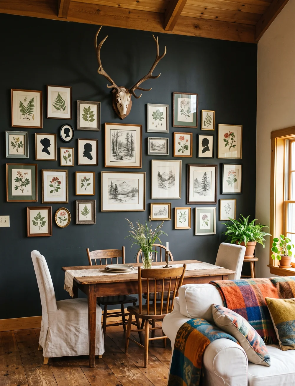
A gallery wall that only holds one kind of art, all paintings or all photos, can start to feel monotonous once you’ve looked at it a hundred times. Mixing in different formats fixes that fast. Pencil sketches next to silhouette portraits next to a mounted antler and skull gives the eye more to track without adding more color or clutter. Botanical illustrations in green-toned mats tie the mix back together, so it reads as curated chaos instead of just chaos. A charcoal wall behind all of it keeps every piece from getting lost against white.
- ▸Mix mediums: sketches, silhouettes, botanical illustrations, mounted objects.
- ▸Use one consistent mat or frame tone to tie the mix together.
- ▸Let a dark wall color make lighter pieces stand out.
12. Wrap a Whole Reading Corner in Frames, Ceiling to Baseboard
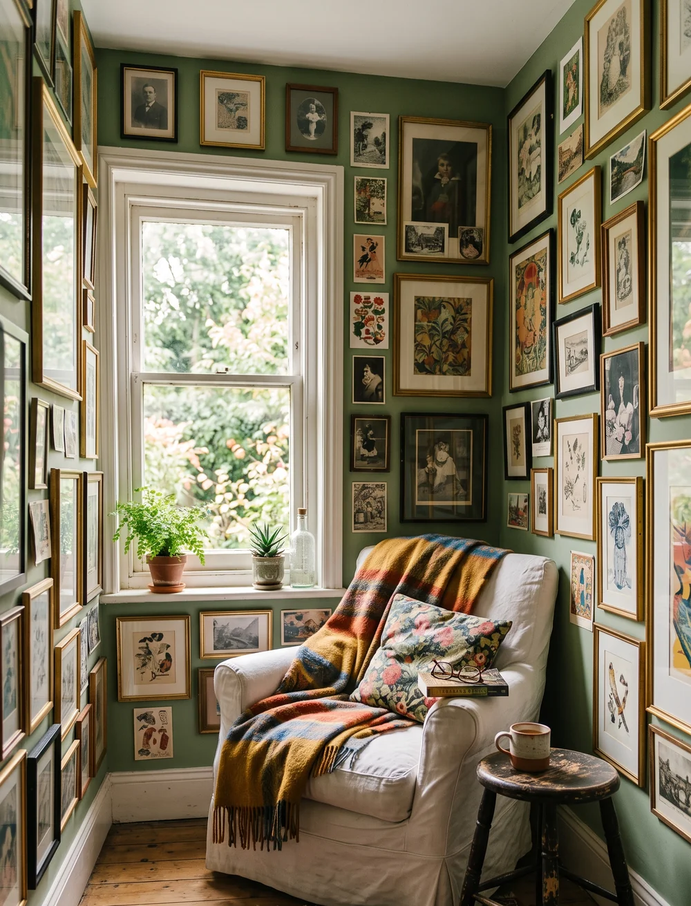
An armchair tucked into a corner with a plaid throw and a window full of real plants only feels like a proper reading nook once the walls around it disappear under frames. Cover every visible inch, floor to baseboard, ceiling to window frame, mixing sizes freely so no single piece has to carry the whole wall. The density is what makes a small corner feel intentional instead of like leftover space nobody decorated yet, and it’s one of the more dramatic gallery wall ideas on this list. Sage green underneath all of it keeps the crowded wall from feeling heavy.
A small corner covered floor to ceiling in frames reads as more finished than a large wall with a few pieces spaced out.
13. Hang the Games You Actually Played, Not Just Photos of People
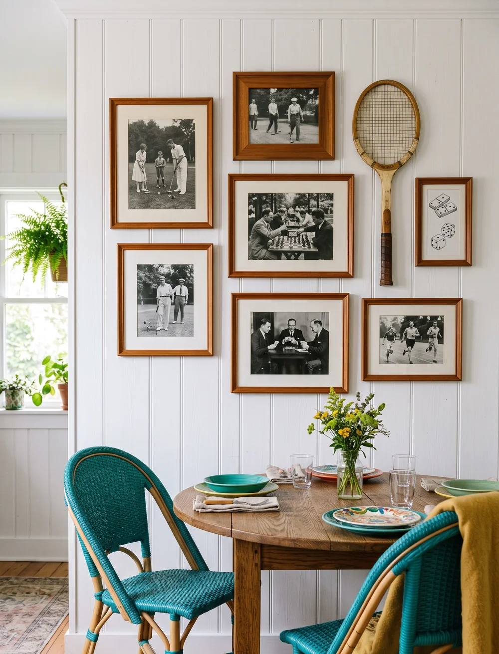
The easy version of a game-themed wall is framing photos of board games or trophies, but the more interesting version is photos of people actually playing. Black-and-white shots of a chess match, a round of golf, or friends dealing cards do more storytelling than a still life of game pieces ever could. Add one real object, a wooden tennis racket or a set of dice, mounted directly on the wall for texture. Keep the frames in a single warm wood tone so a wall built from very different photo subjects still reads as one collection.
Choose photos of people actually playing, not just game equipment.
Mount one real object, like a racket, directly on the wall.
Keep every frame in the same warm wood tone.
14. Let Bold Wallpaper Carry a Deliberately Mismatched Frame Set
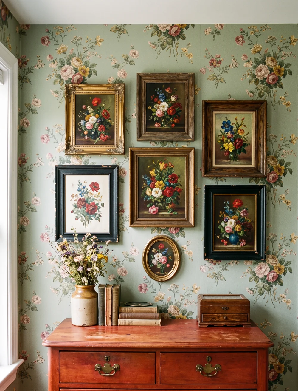
Bold wallpaper can carry more visual weight than people give it credit for, as long as the frames on top of it aren’t fighting for the same kind of attention. Let the floral paintings vary in frame style and size, and hang them slightly off-grid rather than in a strict line, since a too-precise arrangement competes with a busy wallpaper pattern instead of complementing it. A single piece of warm wood furniture underneath, like an antique dresser, grounds the whole wall so the eye has somewhere to land.
Hang frames slightly off-grid, varying style and size freely.
Ground the wall with one piece of warm wood furniture.
A too-precise grid that competes with the wallpaper pattern.
Matching frames that flatten the deliberately mismatched look.
15. Curate a Small Cluster Instead of Filling Every Inch
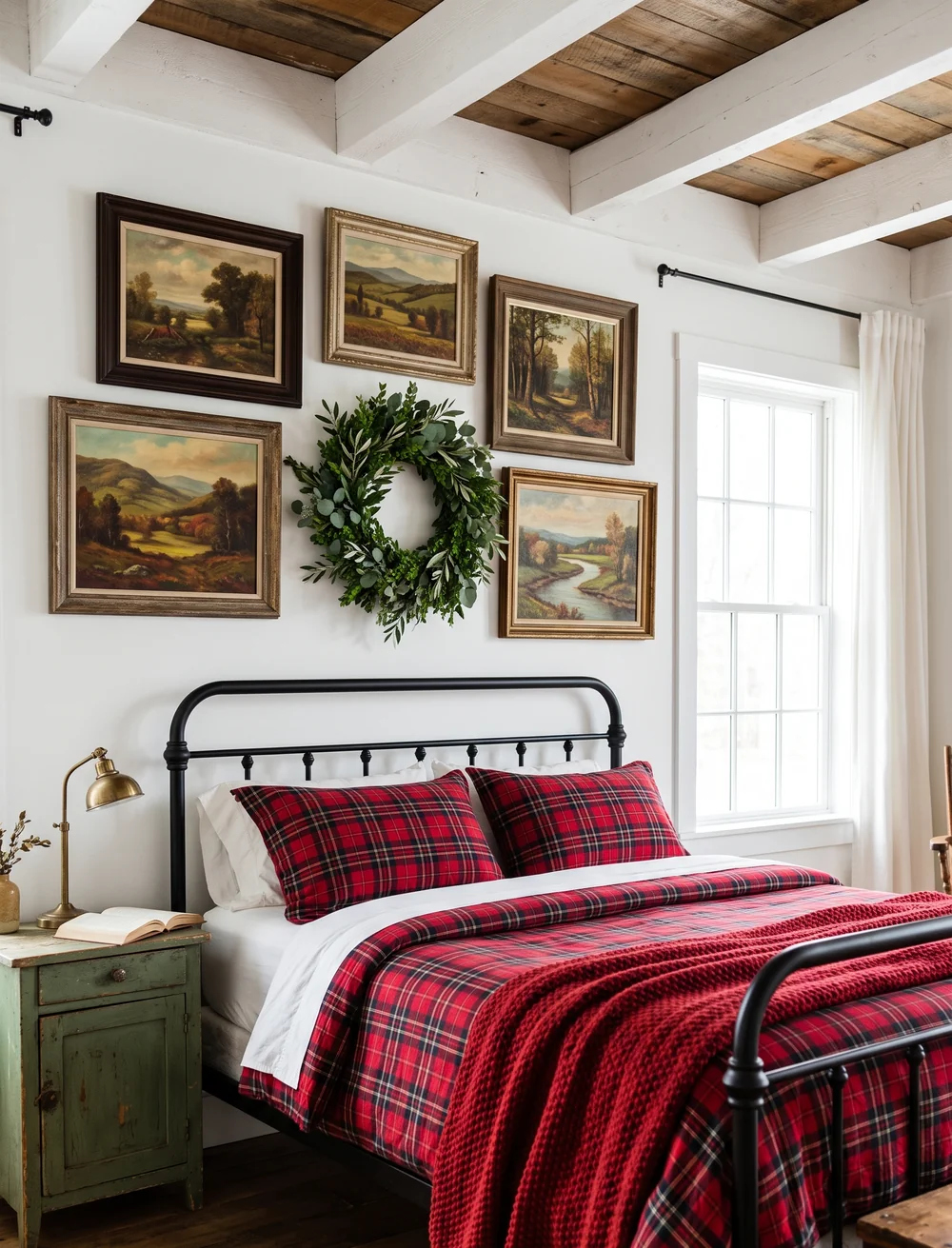
Not every wall needs to be covered edge to edge, and a small, curated cluster of five landscape paintings proves the point. Keep the group tight, roughly centered above the headboard, with one green wreath filling the gap in the middle instead of another frame. The restraint is what makes each individual painting easier to actually see, rather than getting lost in a crowd of dozens of other pieces. A wood-beamed ceiling and simple white walls give the small cluster room to be the obvious focal point, proving restrained gallery wall ideas can hold their own against denser ones.
💡 Quick Tip
Five pieces, tightly grouped, with one non-frame object like a wreath filling the center gap, reads as curated. Add a sixth frame in that same spot and it starts to look crowded instead.
16. Cluster Old Pewter the Way You’d Cluster Frames
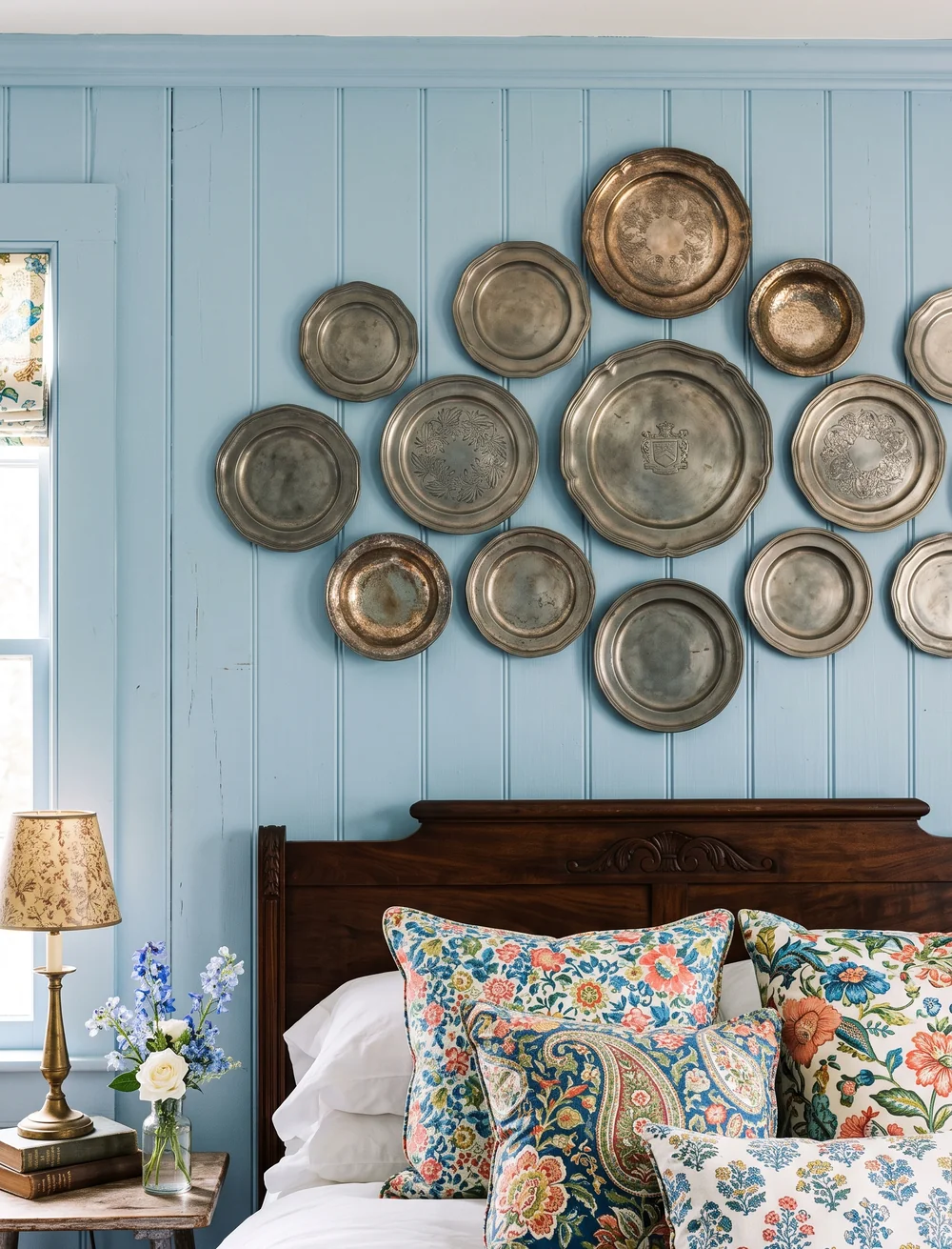
Pewter and silver plates get treated like they only belong on a table, but hung the way you’d hang picture frames, they do the same collected-over-time work as any gallery wall. Cluster them tightly by size rather than spacing them out evenly, mixing tarnished pieces with polished ones so the variation in finish reads as intentional, borrowing the same logic as denser gallery wall ideas. A soft blue wall behind them keeps the metal tones from disappearing into a white background. The plates need almost no extra styling underneath, since the wall itself is the whole statement.
17. Match Bold Wallpaper With an Equally Bold Gallery Wall
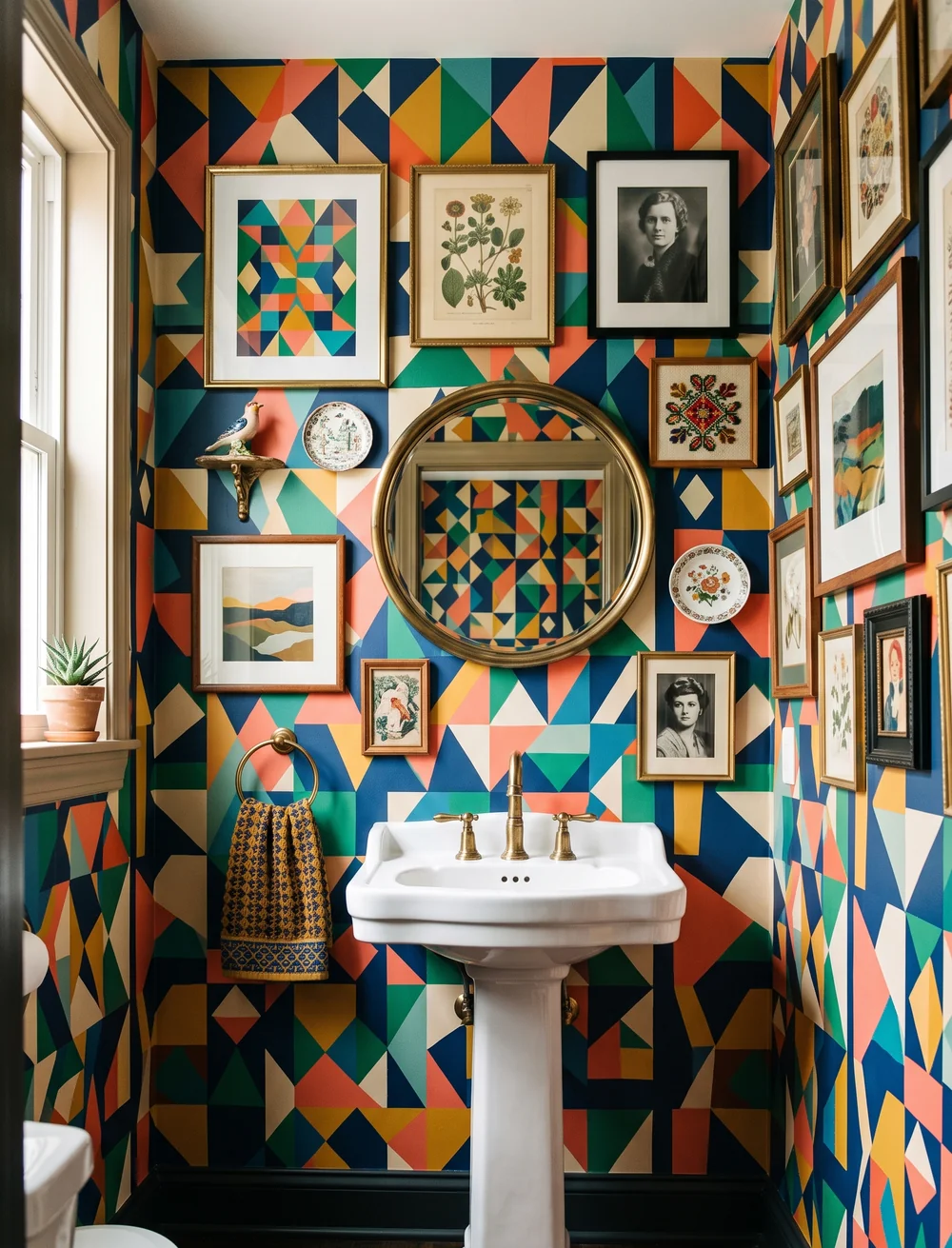
The instinct with loud wallpaper is to keep the wall above it empty, letting the pattern be the whole statement. The better move is the opposite: match it with an equally bold gallery wall instead of backing off. Mixed frame styles, black-and-white photography, and small decorative objects all hold their own against a busy geometric pattern as long as the frames themselves stay simple. A round brass mirror in the center gives the eye one calm spot to rest before it takes in everything else.
| Bold Wallpaper, Bare Wall | Bold Wallpaper, Bold Gallery Wall |
|---|---|
| Feels unfinished, like decorating stopped halfway. | Feels fully committed and intentional. |
| Wastes the pattern’s energy. | Frames and pattern play off each other. |
18. Take a Wall All the Way From Floor to Ceiling With Landscapes
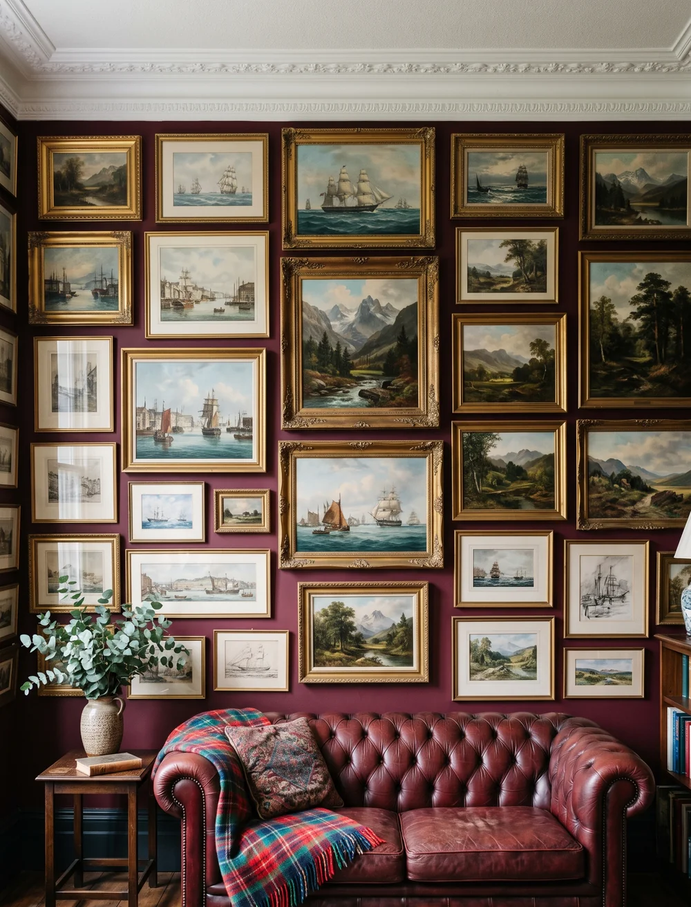
A large wall can swallow a handful of medium frames without ever looking finished, no matter how nice each individual piece is. Landscape and maritime paintings solve that by going all the way from floor to ceiling, filling every available inch rather than clustering in the middle. Gold frames in a range of sizes keep the wall from feeling like a grid, while a deep burgundy paint color underneath makes even a wall this full feel rich instead of overwhelming. A leather sofa and a plaid throw in front ground the whole room so the wall doesn’t have to do it alone.
19. Stack Patterned Plates Down a Narrow Strip of Wall
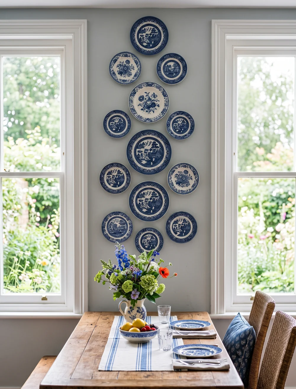
A single tall, narrow strip of wall between two windows is exactly the kind of space that usually gets left blank, since nothing seems to fit it. A vertical column of blue and white patterned plates fits it perfectly. Stack them in a loose zigzag rather than a straight line, largest plate near the center of the column, smaller ones filling the top and bottom. The pale grey wall behind keeps the blue and white pattern as the clear focal point, and the narrow space stops feeling like an afterthought between two windows, which is what the best gallery wall ideas do for any awkward spot in a house.
Filling a narrow wall strip
Conclusion
None of these nineteen ideas require finding one perfect piece of art. They require a wall color you’re willing to commit to, a pile of mismatched frames from thrift stores and closets, and the willingness to hang things close together instead of leaving safe gaps between them. The density is what makes a gallery wall feel collected instead of installed.
Pick whichever one or two gallery wall ideas actually match the wall you’re staring at right now, whether that’s a stairwell, a powder room, or the space behind your bed, and start there. Save this list for the next time you’re standing in front of a blank wall wondering where to begin.