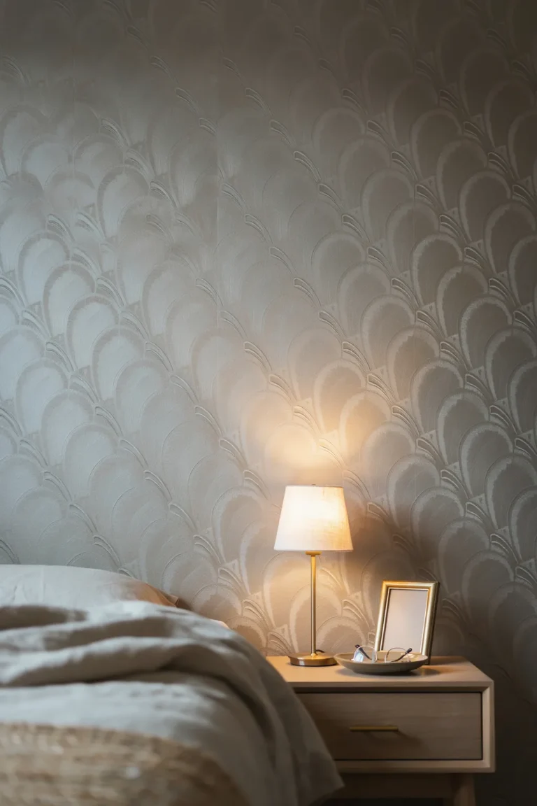
18 Black Wallpaper Ideas for a Bold Statement Wall
Black is the one wall colour that changes a room the second it goes up. Done well, it makes everything in front of it look deliberate: the art sharper, the brass warmer, the furniture more expensive than it was yesterday. Done carelessly, it swallows the room and you spend a year regretting it.
The difference is almost never the shade of black. It comes down to sheen, how much light the room gets, and what you put beside it. A matte black soaks up light and wraps a room in quiet. A lacquered or metallic black throws that light straight back and makes a small space sparkle after dark.
These black wallpaper ideas cover both the look and the decisions behind it. Some are about pattern, some about texture, and a few are about the practical calls nobody mentions: how many lamps you actually need, when to paper all four walls, and what to do if you rent. Every one tells you the room it suits and where it goes wrong.
1. Matte Black Is the Baseline, and It Drinks Light
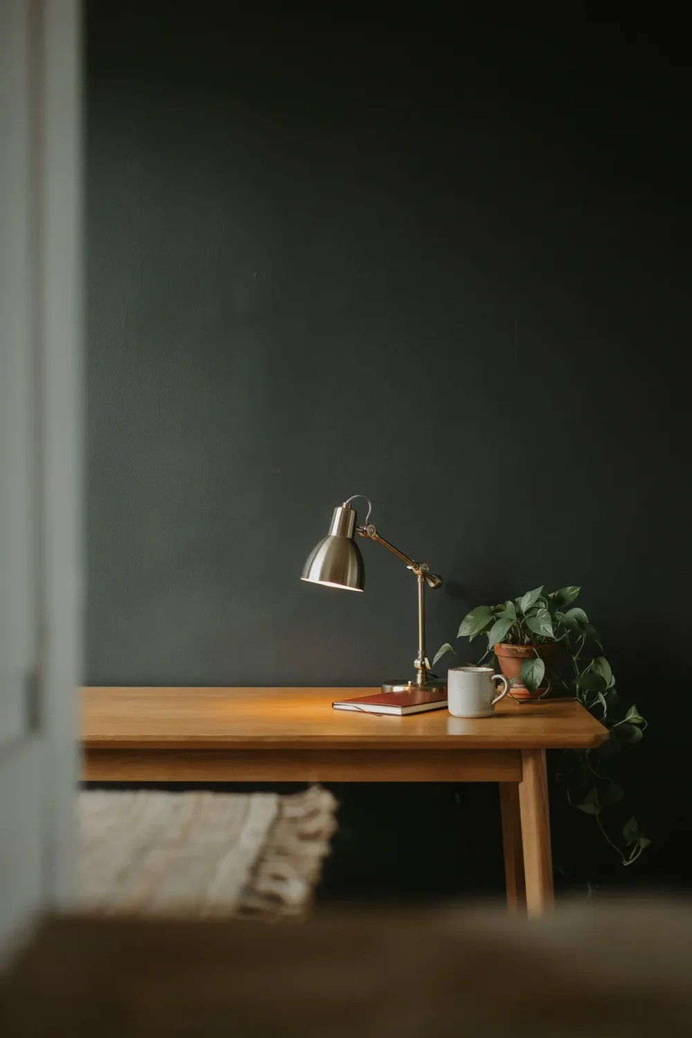
Most black wallpaper ideas start with pattern. Start with finish instead, and treat matte as the default. A flat, chalky black is the most forgiving option, because it hides bumpy plaster and old patch repairs that any sheen would put on display.
The trade-off is light. Matte absorbs it rather than reflecting it, so the room goes quiet and enclosing, which is lovely in a study or a snug and heavy in a room you use every morning.
It suits spaces where you want focus rather than brightness. A home office wall behind the desk, a reading corner, a media room.
Budget for extra light before you buy the paper. A matte black wall will eat whatever one ceiling bulb gives it.
2. Glossy and Lacquered Black Bounce Light Back
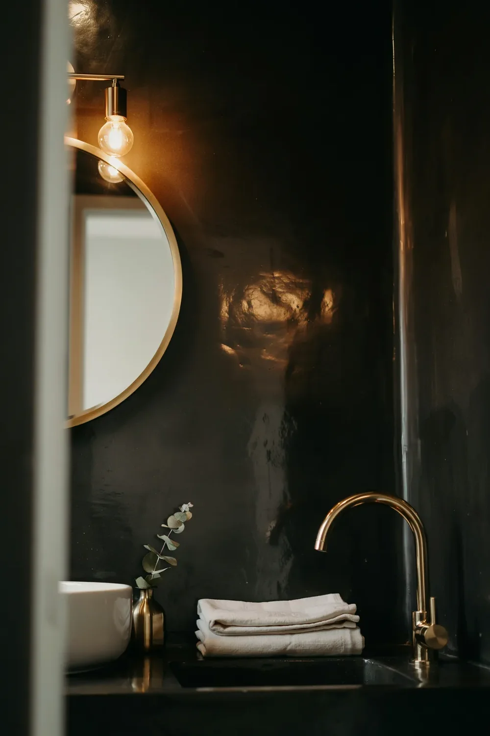
Matte and gloss are two different decisions wearing the same colour. One quiets a room, the other lights it up.
A lacquered or high-sheen black behaves almost like a dark mirror. Lamplight, candles, and window light all skate across it, so a small dining room or a windowless powder room can feel glamorous rather than closed in.
The price is honesty. Gloss shows every lump, seam, and screw hole, so it belongs on walls that are genuinely smooth or on a small surface where flaws are easy to control.
| Matte black | Glossy or lacquered black |
|---|---|
| Absorbs light, room feels enclosing | Reflects light, room feels alive at night |
| Hides uneven plaster and old repairs | Shows every bump, so prep the wall |
| Calm and modern, easy to live with | Glamorous, best in small doses |
| Best in offices, snugs, bedrooms | Best in powder rooms and dining rooms |
3. Woven and Linen-Look Textures Add Depth Without Pattern
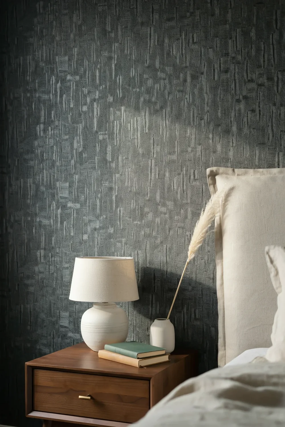
Texture is how you get a black wall that holds interest without a single motif on it. The surface catches light unevenly, so the wall shifts as you move past it instead of reading as a flat void.
Of all the black wallpaper ideas here, this is the safest for anyone who wants drama but not pattern.
Three families worth knowing, and where each one belongs:
4. A Whisper of Gold or Brass for Evening Sparkle
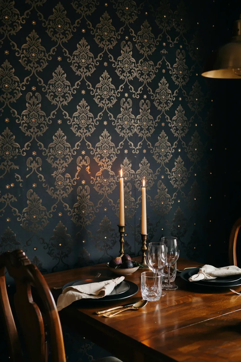
The nicest black wall I have seen looked plain in daylight and then quietly lit up the moment the lamps came on, because a fine gold thread ran through the pattern.
That is the appeal of a metallic on black. In daytime it reads as a rich, near-solid dark wall. After dark it picks up every light source and gives a room the kind of glow that no flat colour manages.
💡 Quick Tip
Judge a metallic sample at night, under your own lamps, never in the shop. The whole point of the finish is what it does after dark, and a shop’s bright ceiling lights flatten the effect completely. Aged brass and antique gold read warmer and more grown-up than bright yellow gold.
5. Black-Ground Florals Turn Pretty Into Gothic
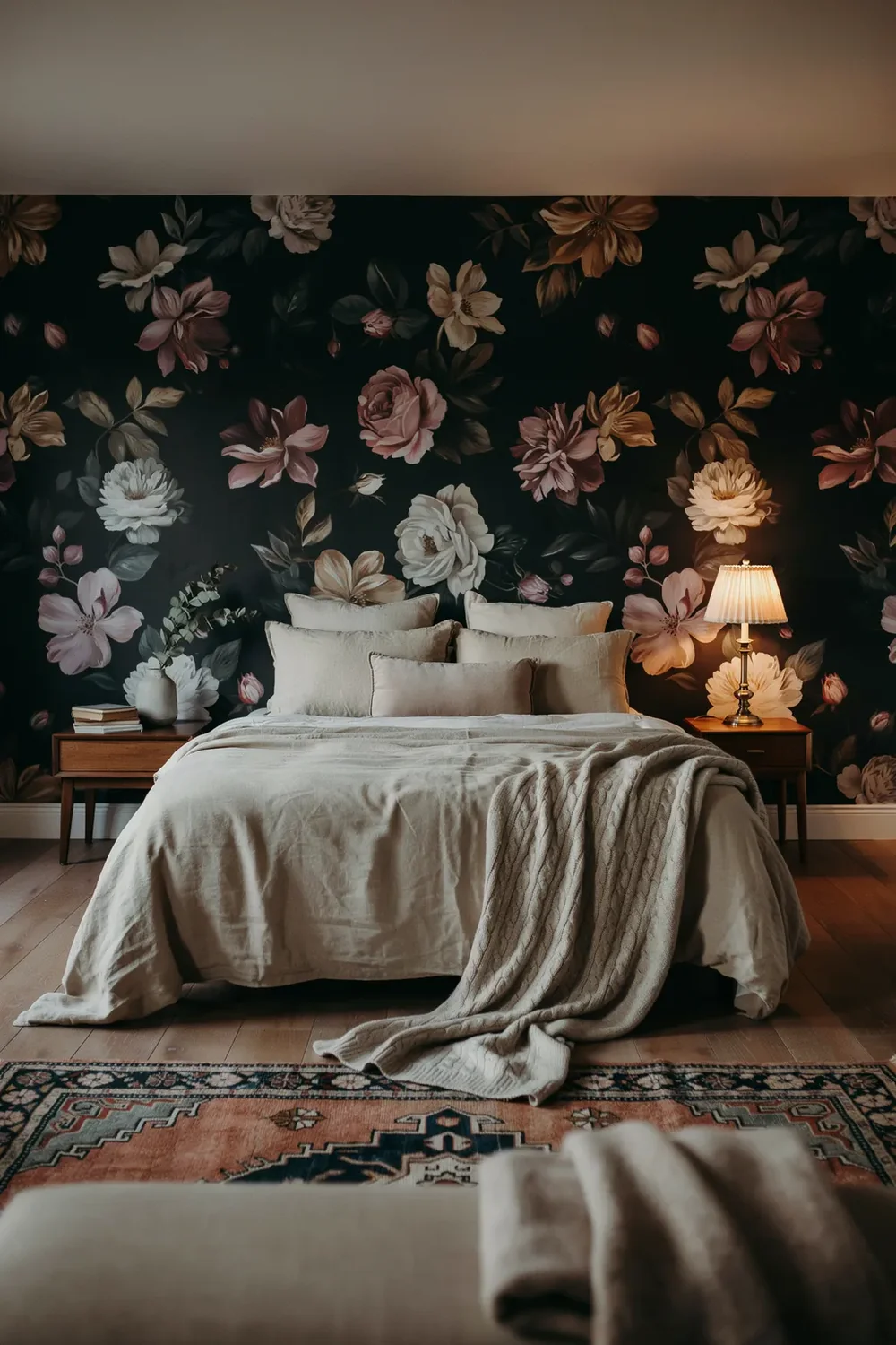
People assume a floral cannot be bold. Put the same flowers on black and the whole thing changes character.
On a pale ground, roses and peonies read sweet and traditional. On black, they lift off the wall, the colours glow, and the pattern reads moody and modern instead of chintzy. It is the fastest way to get a statement wall that still feels romantic.
Save it for a room you use in the evening: a bedroom, a dining room, a snug. In a bright morning kitchen the dark ground can feel heavy against all that daylight.
The same blooms on cream read soft and traditional. Lovely in a cottage bedroom, but it makes no statement and leans old-fashioned.
On black the flowers glow and float forward, the room turns moody and current, and a soft pattern suddenly carries real drama.
6. Tropical Leaves on Black for Jungle Noir

Big palm and monstera leaves against a black ground look nothing like the bright tropical prints you have seen a hundred times. The dark background mutes the green, so the whole thing reads rich and shadowy rather than holiday-bright.
Among black wallpaper ideas this one is unusual: a genuinely bold wall that still feels calm.
Where it works, and where it fights you:
- ▸Best on one wall of a room with a decent ceiling height, so the big leaves have air.
- ▸Excellent in a small windowless cloakroom, where bold in a tiny space is a nice surprise.
- ▸Hard work in a low-ceilinged bedroom you want to relax in.
- ▸Add one real plant nearby and the printed leaves stop looking like a novelty.
7. Black and White Geometrics: Contrast Does the Work
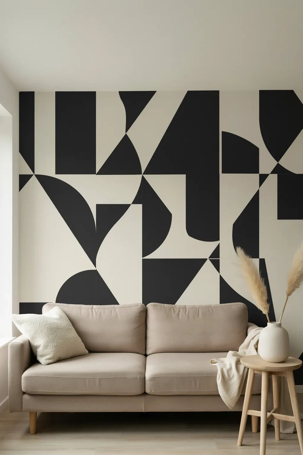
The rule with a geometric on black is that contrast, not pattern, decides whether the wall works. Too little and it disappears; too much and it buzzes.
A crisp white line on black gives you the sharpest, most graphic version. Drop the white to a soft bone or greige and the same shape reads quieter and more expensive, which is usually the better call in a room you sit in every day.
Use a mid-scale repeat, roughly 6 to 12 inches, so it reads from across the room.
Soften the white to bone or cream if the room gets daily use.
Keep it to one or two walls and let the rest stay plain.
Tiny high-contrast repeats across a whole room. They vibrate.
Pure white on black in a bedroom you want restful.
Two competing geometrics in the same sightline.
8. Damask on Black, Modernised So It Isn’t Stuffy
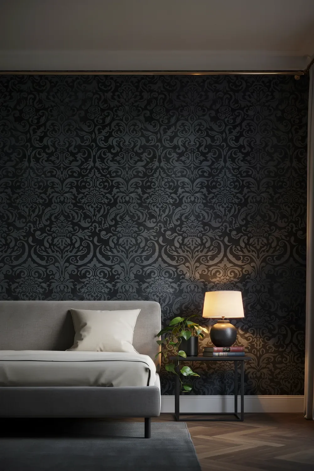
Damask has a reputation problem. Say the word and most people picture a hotel corridor from twenty years ago, which is a shame, because on black it can look genuinely current.
What dates it is the styling, not the pattern. Fix that and the wall reads collected rather than dowdy.
Choose tone-on-tone: black on black, or charcoal on black, rather than gold on black.
Pair it with clean modern furniture, never with matching swags and heavy drapes.
Keep it to one wall, ideally behind a bed or a bar, so it acts as a backdrop.
9. Vertical Black Stripes Stretch a Low Wall
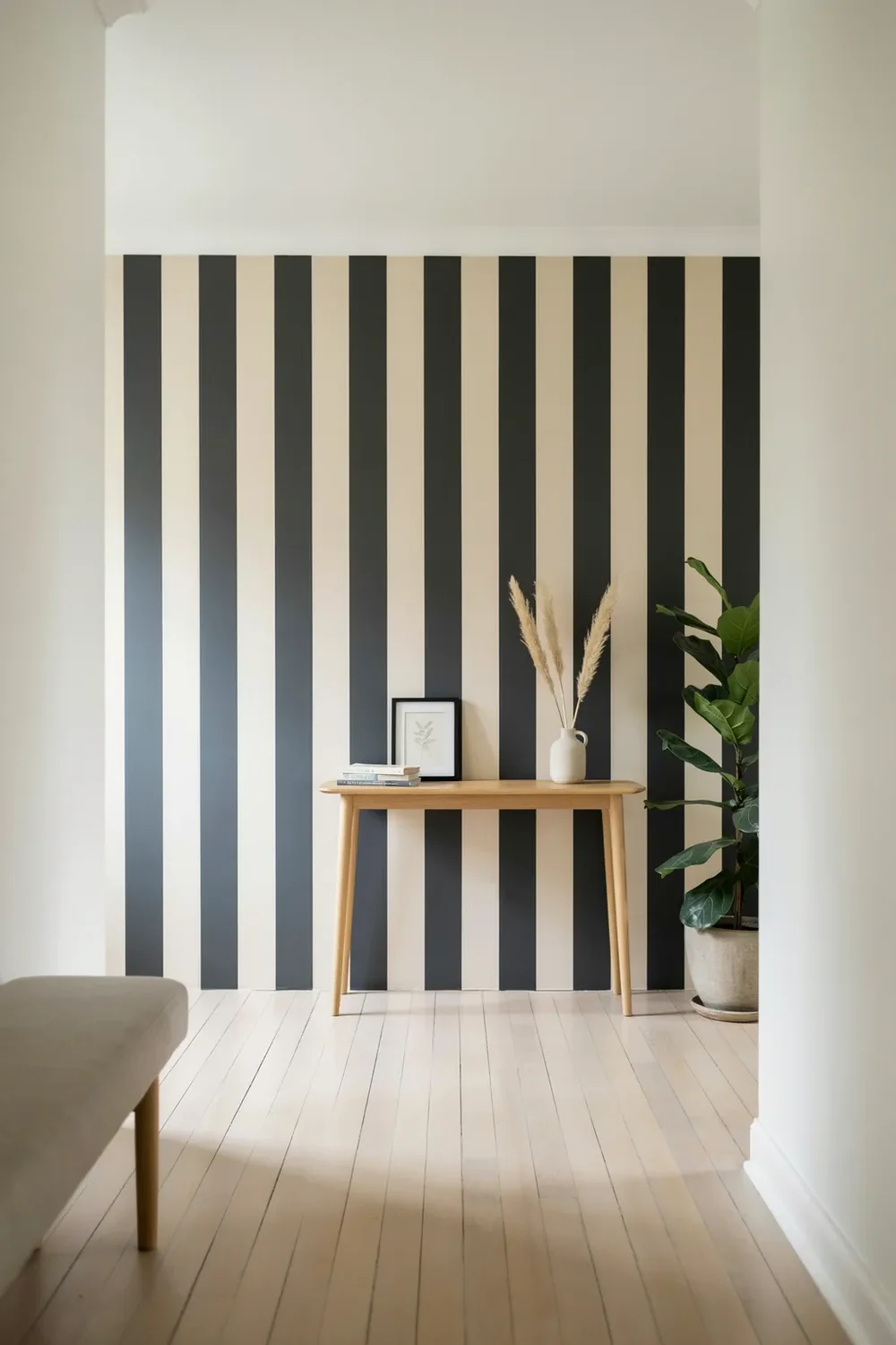
Run the stripe vertically and a low room gains height. It is the cheapest architectural trick in the book, and black makes it graphic rather than nautical.
Keep the two tones close in weight, something like black against a warm bone, and choose a stripe roughly 3 to 6 inches wide. Narrower than that and the wall starts to flicker; much wider and you lose the lift.
One wall is usually enough. Wrapping a whole small room in vertical stripes can feel like standing inside a barcode.
Vertical stripes buy height, horizontal ones buy width. In a low-ceilinged room, always run them up the wall, not across it.
10. A Black Mural or Chinoiserie for One Real Statement
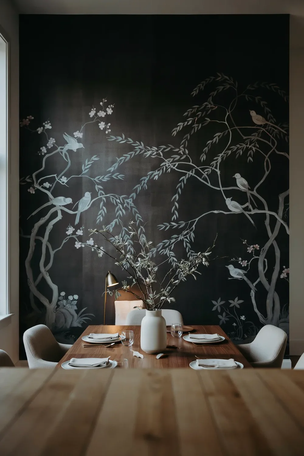
The most common mural mistake is ordering before measuring. Unlike a roll, a mural is printed as a fixed set of panels cut to one wall, and there is no repeat to trim into if you come up short.
Get the measuring right and a black chinoiserie or a moody landscape gives you something a repeating pattern never can: a single, continuous image that behaves like a huge piece of art.
Choose one with light inside the image, a pale sky or silvered branches, so the wall has somewhere for the eye to rest.
Measure before you order a mural
11. Celestial Motifs Belong on a Ceiling or in a Nook
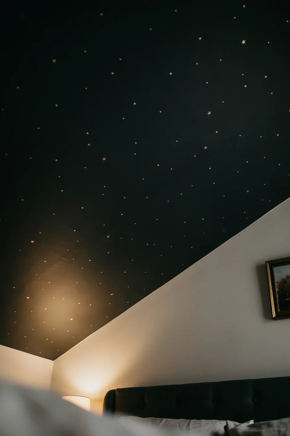
A friend papered the ceiling of her tiny box room in a black paper scattered with fine gold stars, and it is the only ceiling anyone ever comments on.
That is the right dose for a celestial print. Constellations and moons are charming overhead or inside a small enclosed space, and exhausting across four walls of a living room.
Keep the stars fine and sparse rather than dense and cartoonish, and the effect stays grown-up instead of tipping into a children’s bedroom.
12. Faux Brick, Stone and Concrete for Industrial Edge
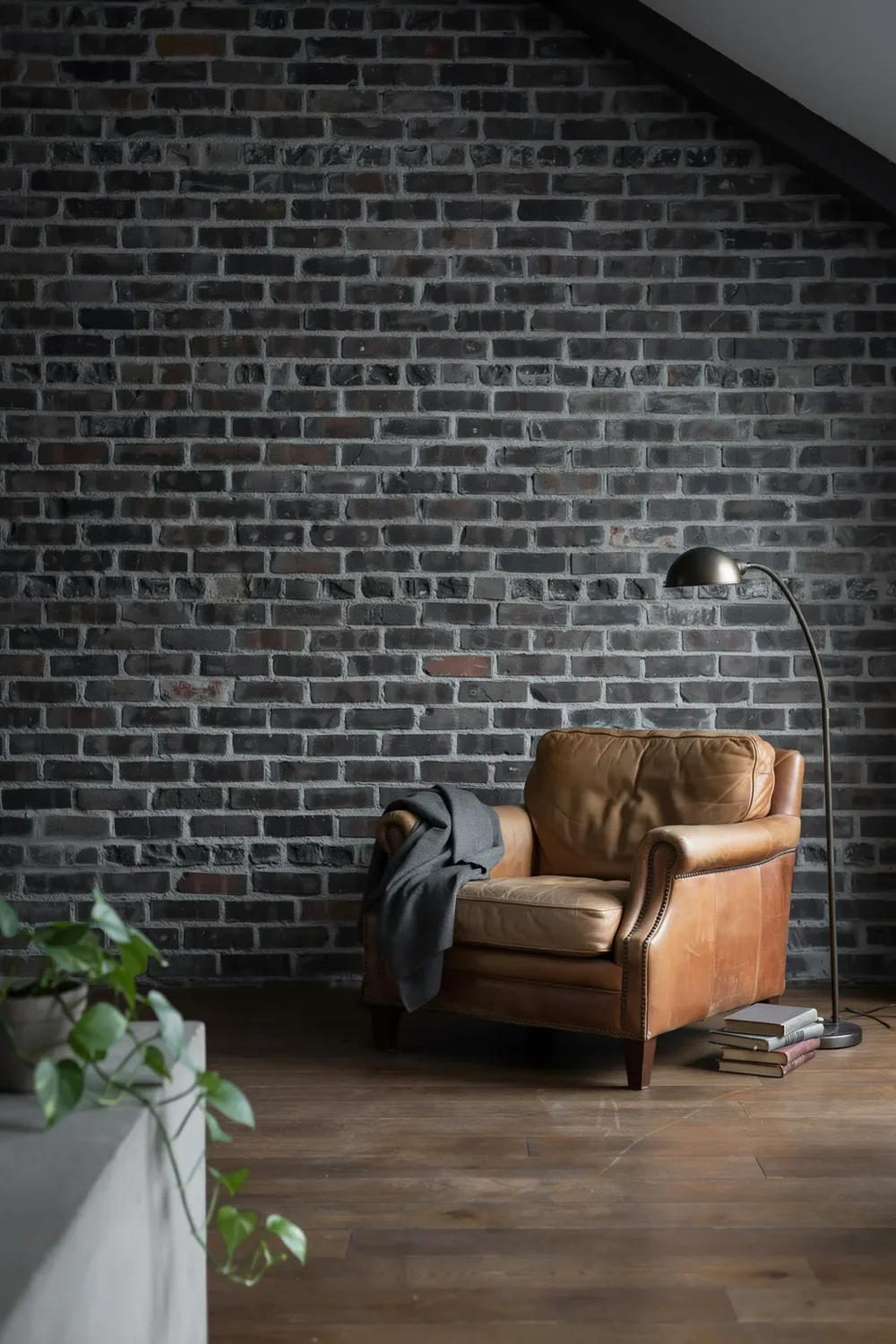
A printed black brick or raw concrete gives you the loft look without knocking anything about, and it costs a fraction of the real thing.
The good ones are convincing because the photography is good and the repeat is long, so you do not see the same chipped brick every two feet. The bad ones look like a stage set, and the giveaway is always a short, obvious repeat.
Check the repeat length before you buy, and view the sample from six feet away rather than up close.
| Convincing faux | Obvious faux |
|---|---|
| Long repeat, so bricks rarely echo | Short repeat with a recognisable marked brick |
| Matte, slightly uneven surface | Flat sheen that catches light like paper |
| Varied tone brick to brick | Uniform colour across the whole wall |
| Used on one wall with real materials nearby | Wrapped around a whole room |
13. Slats, Battens and Panelled Looks in Black
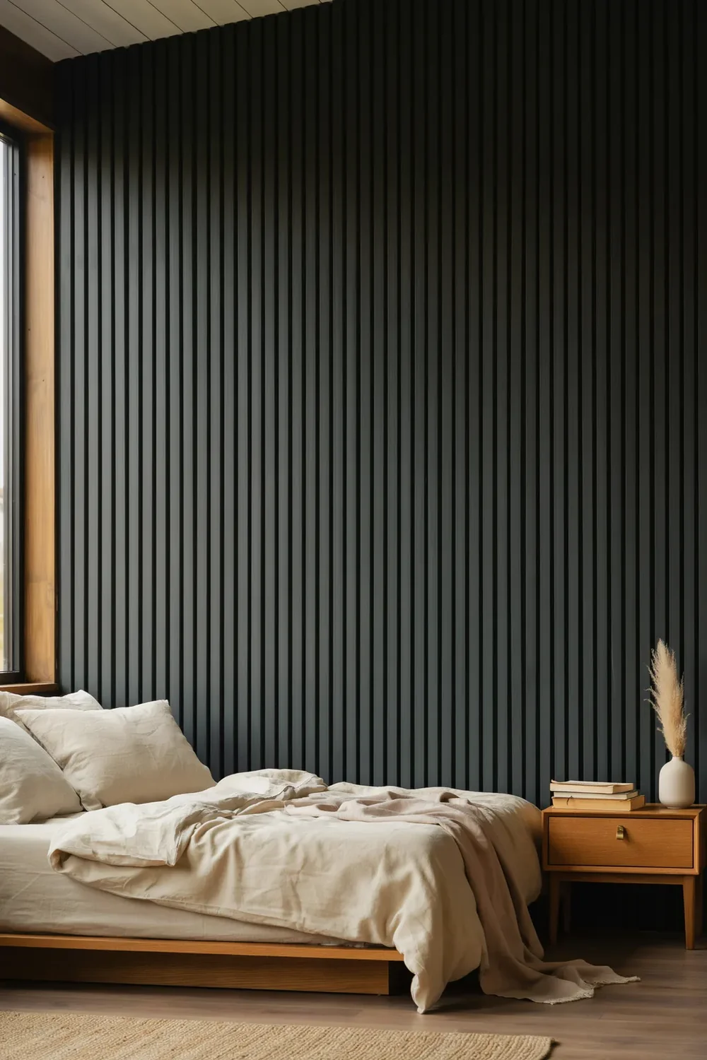
The best black wallpaper ideas add architecture, not just colour. A black panelled wall gives a flat room structure and shadow lines, and printed versions get you most of the way there for a fraction of the joinery bill.
Three panel styles worth knowing, and what each one does to a room:
14. Velvet and Flocked Black You Want to Touch
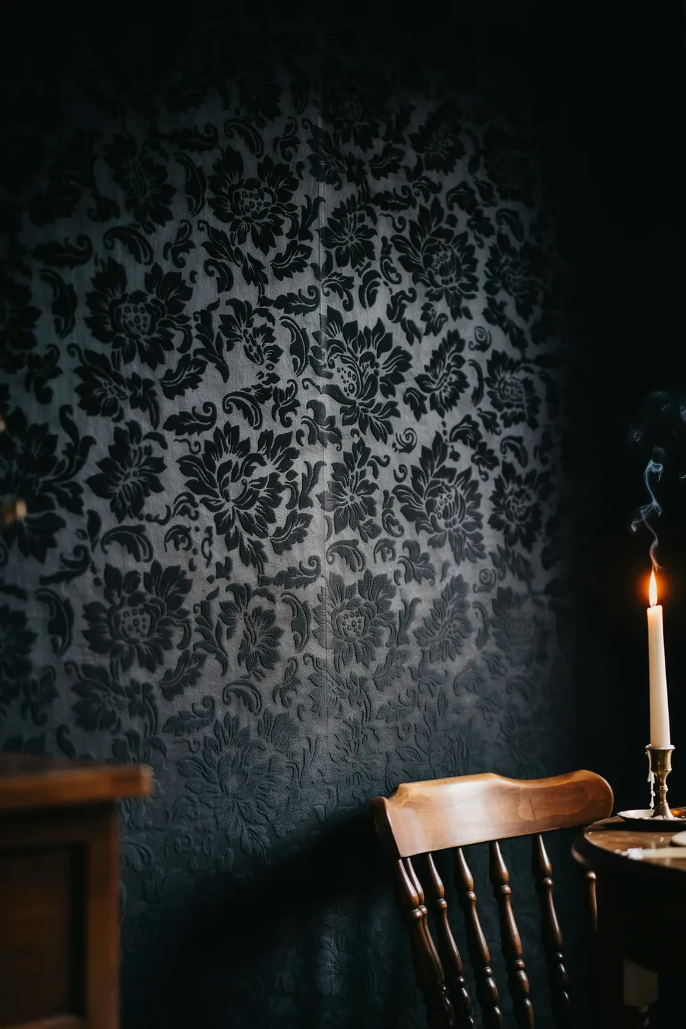
Compare a flat black wall with a flocked one and the difference is immediate. The raised pile catches shadow in its pattern, so the wall has depth you can see from the doorway and feel with a hand.
Old libraries and quiet bars have used flock forever, and the reason is that it softens both light and sound. A room goes hushed the moment you walk in.
⚠️ Watch Out
Flock is delicate and hard to clean, and black shows dust more than any other colour. Keep it well away from kitchens, bathrooms, and hallways where coats and shoulders brush the wall. A low-traffic dining room or bedroom is where it stays beautiful for years.
15. One Wall or the Whole Room: When Full Black Works
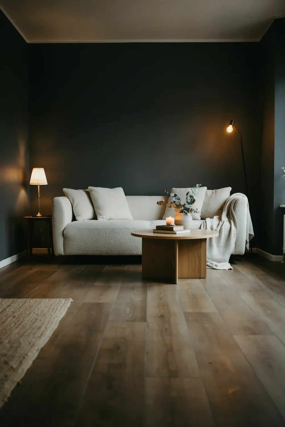
Here is the honest answer nobody gives: a single black feature wall is the safe choice, but it is often the weaker one.
One black wall in an otherwise pale room can read as an unfinished decision, with the dark wall floating oddly against three light ones. Papering all four walls, plus the trim, actually reads more deliberate, because the room becomes a single enveloping space rather than a wall with a hat on.
The catch is light and use. Full black suits a room you occupy in the evening and one where you are willing to add lamps. For a bright family room used all day, one wall behind the sofa is the sensible call.
Lower risk and cheaper, and right for bright rooms used all day. Can look half-committed if the other three walls stay stark white.
Corners disappear and the room reads as one enveloping space. Needs evening use and real lamps, but it looks like a decision, not a compromise.
16. The Lighting a Black Room Actually Needs
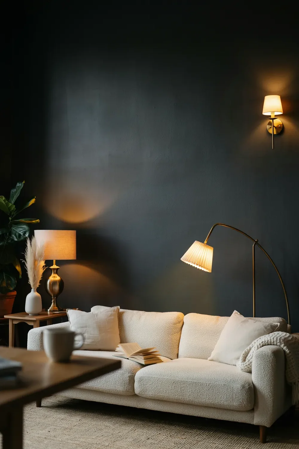
Most black room regrets are lighting failures wearing a paint-colour costume. The walls get blamed for a gloom that one weak ceiling bulb caused.
This applies to every one of the black wallpaper ideas above. Dark walls absorb light instead of bouncing it around, so the single overhead fitting that was adequate in a white room leaves a black one flat and cave-like. You are not adding lamps for atmosphere here; you are replacing the light the walls no longer reflect back.
Build it in layers:
Plan at least three light sources per room, and do not let the ceiling fitting be the main one.
Put light at low and mid heights: table lamps, a floor lamp, wall lights beside the bed.
Use warm bulbs around 2700K so the black reads soft and rich instead of grey and cold.
Bulb colour temperature makes a bigger difference on dark walls than most people expect, so it is worth checking the number on the box before you buy a whole set.
17. What Black Needs Beside It: Wood, Brass and Cream
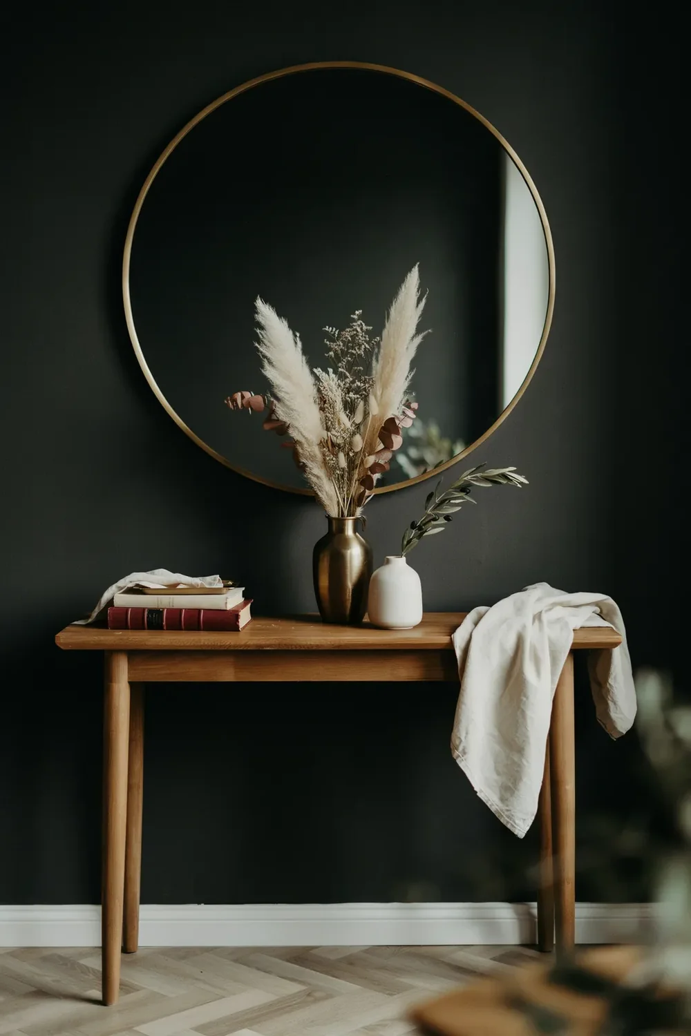
Black is not the problem in a gloomy black room. What sits next to it usually is.
Pair black only with white and chrome and you get something cold and a bit clinical. Bring in warmth and texture and the same wall turns rich and expensive. The colour needs company that reflects a little light and adds a bit of life.
Warm wood, oak or walnut, to stop the room feeling cold.
Aged brass and bronze, which glow against black far better than chrome.
Cream and oatmeal textiles rather than stark white, plus one big mirror.
Black walls with only white and chrome. It reads like an office.
Heavy dark furniture against dark walls, so everything merges.
Leaving the trim and radiator brilliant white against a black wall.
18. Renting or Hesitant? Peel-and-Stick and the Sample Test
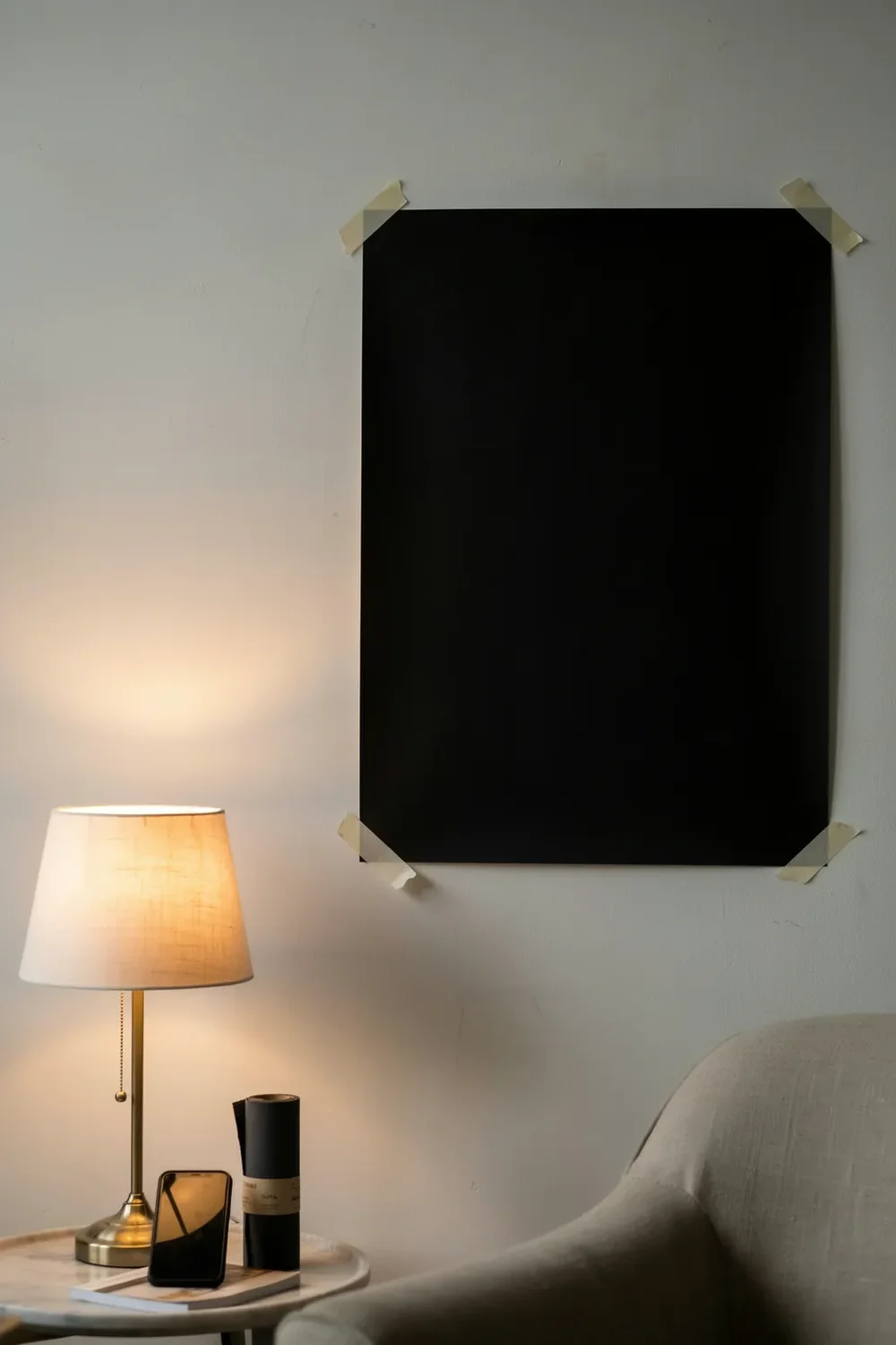
Try one of these black wallpaper ideas before you commit to it. Black is the colour people most often talk themselves into and then panic about, so a removable version is a genuinely useful halfway house.
Peel-and-stick has come a long way, and a black one hides seams better than a pale paper ever will. It suits renters, and it suits anyone who wants to live with a dark wall for a season before going permanent.
Two honest limits: it rarely sticks well to textured or freshly painted walls, and the finish options are narrower, with almost no true gloss or flock available.
Test before you commit
Wrapping Up
Black is less risky than it looks, as long as you treat it as three decisions rather than one. Pick the sheen for the effect you want, budget the lamps the room will need, and give the wall warm company: wood, brass, cream, one good mirror. Get those right and a dark wall reads rich and deliberate rather than gloomy.
Start with a taped-up sample and look at it at night, when a black wall shows what it really does.
Save these black wallpaper ideas for the next time you want a room that makes a bold statement and still feels like somewhere you want to sit.