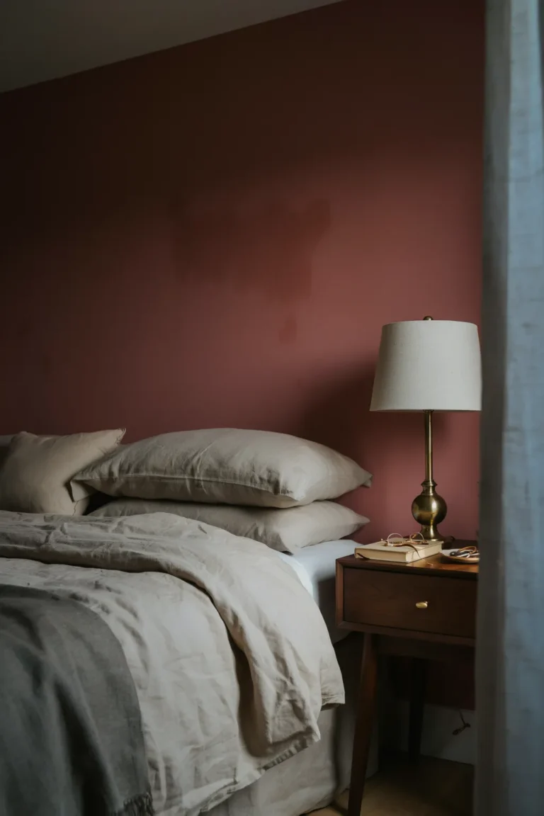
10 Wallpaper Ideas for Rooms Without Much Natural Light
A dark room does not get fixed by a lighter wall color. Most people try it anyway. They paint the north-facing bedroom the palest white on the chart, and by two in the afternoon it has gone grey, because there is no sun coming in to warm it back up.
Paper handles the problem differently. It carries color, sheen and pattern all at once, so a dim room gets something to work with even when the daylight is thin. A mica ground catches a table lamp. A small print keeps its shape after the shadows have flattened everything else. A deep, saturated paper stops apologizing for the missing window and just commits.
The wallpaper ideas below are sorted by what they actually do in low light, not by which room they belong in. Some are about sheen. Some are about pattern scale. A couple are about where you hang the thing. Each one comes with the catch as well as the payoff, because paper that looks right under showroom spotlights can look muddy in a basement hallway.
1. Pick a Ground With Quiet Sheen Instead of a Flat Matte
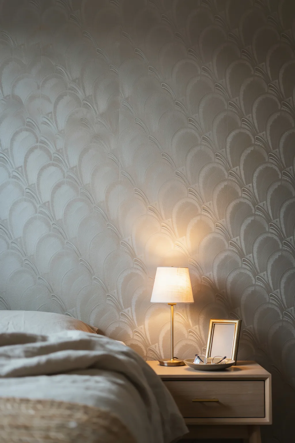
Most wallpaper ideas start with the pattern. In a dark room, start with the finish instead.
The less daylight a room gets, the more the paper has to catch light on its own.
Matte finishes absorb it. These three send it back:
- Mica grounds. Ground mineral sits in the paper itself, so the surface shifts quietly as you walk past.
- Fine metallic washes. A thin gold, bronze or pewter layer printed under the pattern rather than over it.
- Silk-look finishes. A soft satin sheen that reads as fabric, not foil.
Keep it restrained. Full mirror-shine paper shows every lump in the wall, and older plaster has plenty. If your walls are uneven, look for a matte ground with a metallic motif printed on top instead. You get the catch of light without the reveal.
Art deco patterns are the easy win here, since those fans and sunbursts were drawn for metallic grounds to begin with.
2. Swap Cool White Backgrounds for Warm Oat and Cream
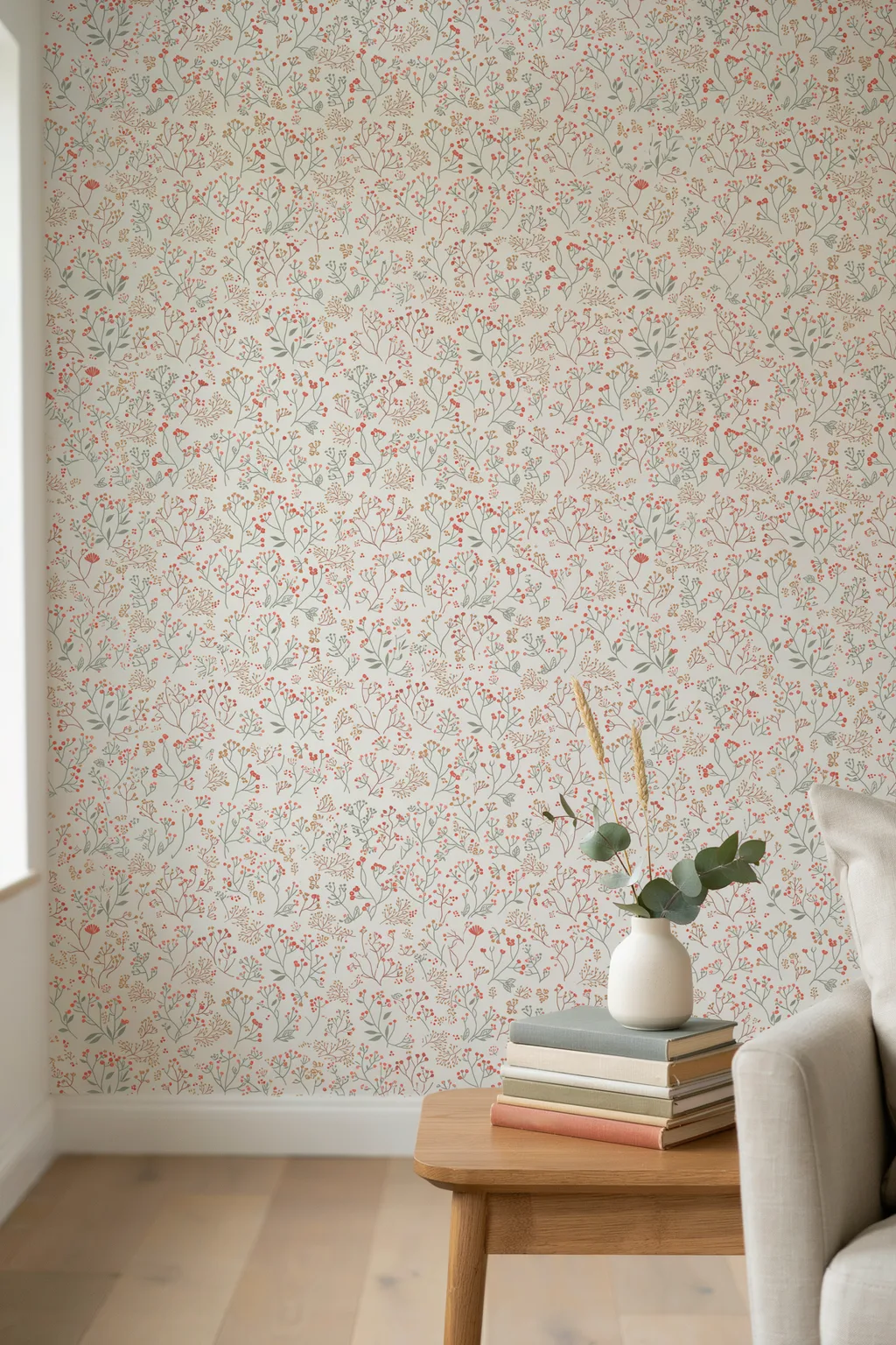
White is not neutral in a dark room. It picks up whatever light is available, and in a north-facing room that light runs blue.
So a crisp white-ground floral drifts slightly grey and slightly cold. The same pattern on an oat, buff or soft cream ground stays warm through the day, because the background is doing the correcting for you before the light ever gets involved.
This is why so much watercolor and pastel paper looks better in the sample photos than on a real dim wall. Those pastels are usually sitting on a cool white base.
Hold the sample against a sheet of printer paper. If the wallpaper ground looks faintly yellow next to it, that is the one to buy.
| Cool white ground | Warm oat or cream ground |
|---|---|
| Reads grey by mid afternoon in a north room | Holds its warmth all day |
| Turns slightly green under warm bulbs | Glows under the same bulbs |
| Fights warm oak and brass | Sits easily with wood and warm metals |
| Best where you get real afternoon sun | Best where you never do |
3. Keep the Pattern Small Enough to Still Read in Dim Light
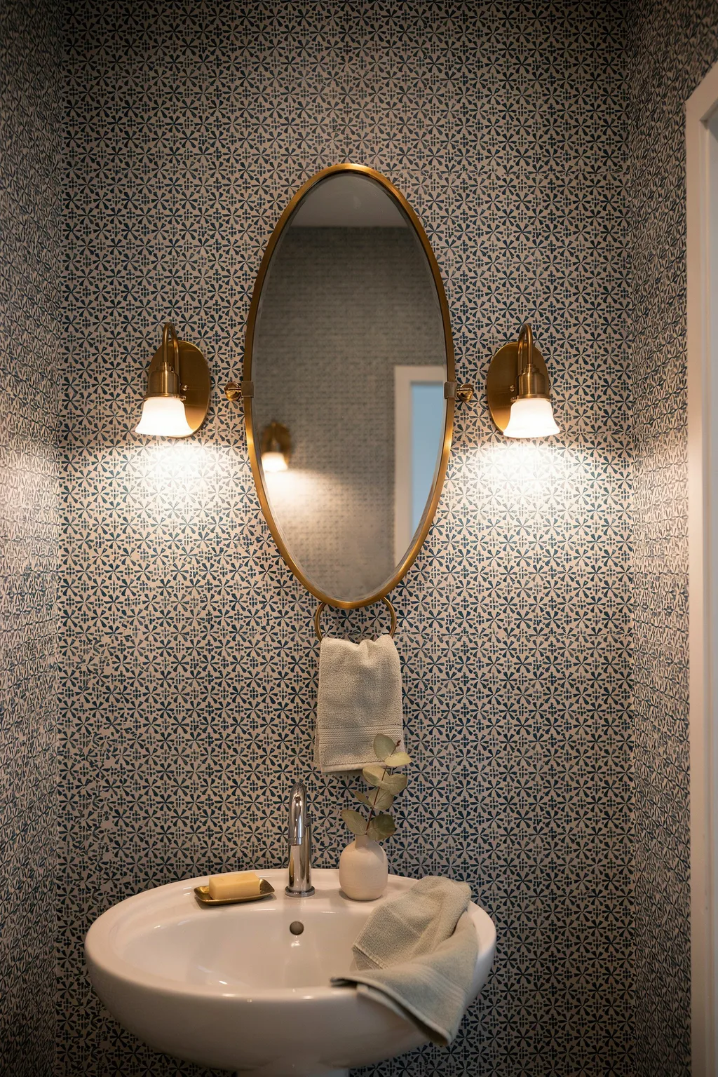
A large-scale pattern needs light to be understood. In shadow it stops being a pattern, becomes a texture, and then becomes a smudge.
Scale gets glossed over in most wallpaper ideas, and in a dim room it decides whether the design registers at all.
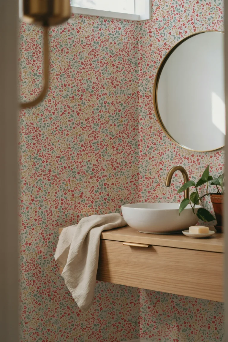
Small and mid-scale prints survive that. A ditsy floral, a fine geometric, a tight vintage motif: the repeat comes around often enough that you still read the design from across the room even when the corners have gone dark.
There is a trade-off. Very small prints on all four walls of a tiny windowless room start to buzz after a while. Keep the busiest scale to one wall, or move up to mid-scale and give the room some air.
Measure your longest sightline before you order. Past about ten feet, mid-scale usually wins.
4. Go Dark on Purpose in the Room That Will Never Be Bright
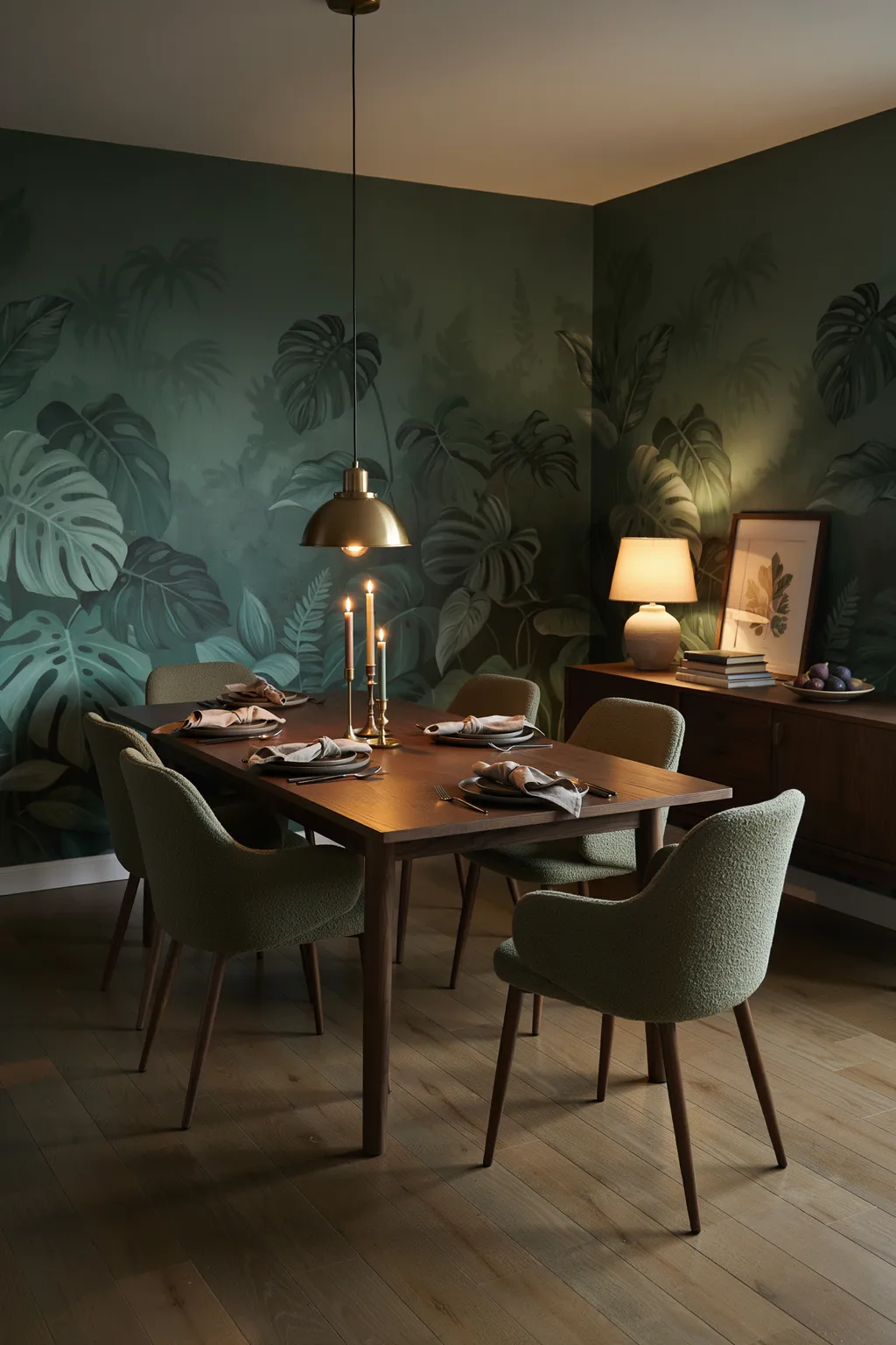
Some rooms are never going to be bright. A basement den. An interior powder room. A hallway borrowing one window at the far end. Pale paper in those spaces just looks like it is trying.
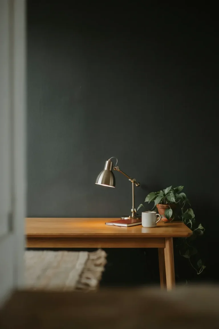
Dark paper does the opposite. Deep green, ink blue, oxblood, charcoal botanicals: the walls step back, the corners quit announcing where they are, and the room comes across as a decision rather than a compromise.
It suits rooms you use in the evening. A dark dining room at eight at night is lovely. A dark home office at nine in the morning is a slog.
Hang a mirror opposite your main lamp and bring in warm metal, and the room gains depth instead of shrinking.
⚠️ Watch Out
Dark paper needs at least three light sources in the room, and none of them should be the ceiling fixture on its own. One overhead bulb against dark walls gives you flat shadow and tired eyes. Budget for a table lamp and a wall light before you budget for the paper.
5. Paper the Ceiling to Push Lamplight Back Down
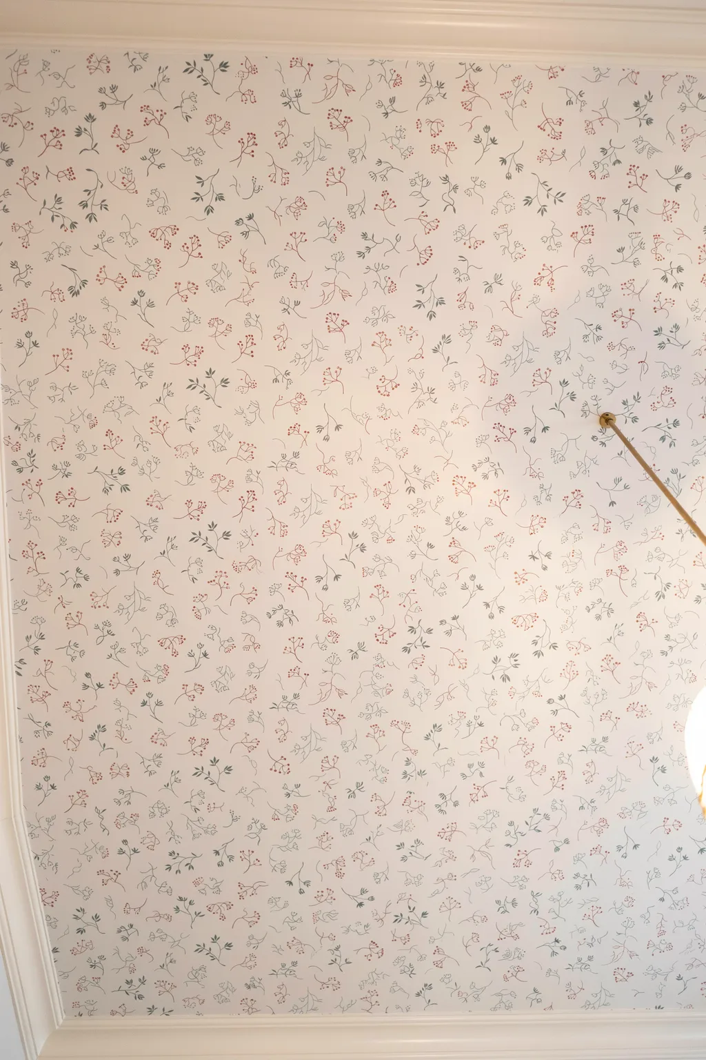
The fifth wall sits there doing nothing in most dark rooms, and it happens to be the surface your lamps actually reach. Ceilings rarely make it into lists of wallpaper ideas, which is part of why a papered one lands so well.
A pale patterned ceiling, something cream with a fine sprig or a soft cloud print, catches the upward throw from table lamps and sconces and returns it. The room reads brighter without a single new fixture going in.
A few things to get right:
- Keep the ceiling lighter than the walls. No exceptions.
- Choose a non-directional pattern so there is no wrong way to look at it from the sofa.
- Hire out anything much over 100 square feet. Ceilings are awkward solo work and pasted paper gets heavy overhead fast.
Small rooms are the best candidates by a mile. A powder room ceiling is often one roll and one afternoon.
Flat white ceiling, one central bulb. Lamplight hits the plaster and stops there. The upper half of the room stays dull and the walls look darker than they are.
Cream sprig paper overhead. The same two lamps now bounce light back down, the ceiling feels higher, and the room picks up pattern where nobody expects it.
6. Let Contrast Do the Work That Brightness Cannot
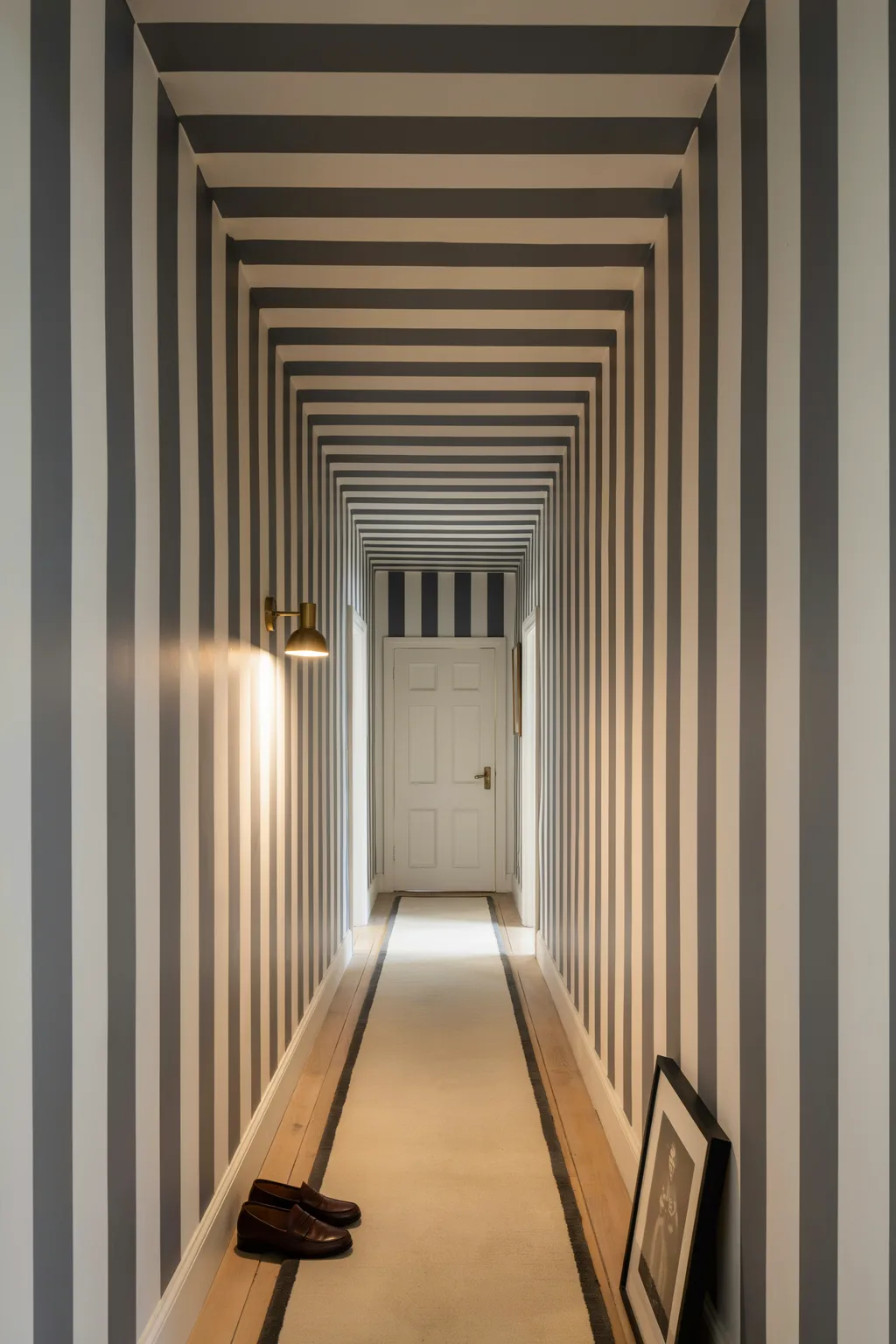
Brightness and contrast are not the same thing, and most wallpaper ideas for dark rooms confuse the two.
A pale, low-contrast paper, soft grey on off-white, looks airy under shop lighting and then vanishes in a dim hallway. There is not enough gap between the pattern and its background for your eye to catch once the light drops off.
Two-tone prints with a real difference between the light and dark parts keep working after dusk. Classic stripes are the obvious case. Strong vintage motifs and anything with a drawn outline hold up the same way.
What you want is contrast inside a mid-tone paper, not a brighter paper.
- ▸Stripes with a two-shade gap, roughly 4 in wide or more.
- ▸Botanicals where the stems and edges are drawn in a darker line.
- ▸Damask in two tones of one color, with one tone clearly deeper.
- ▸The test: photograph the sample on your wall at night with the flash off. If you can still read the pattern on your phone, it will read in the room.
7. Save Grasscloth and Heavy Texture for the Wall That Gets Some Light
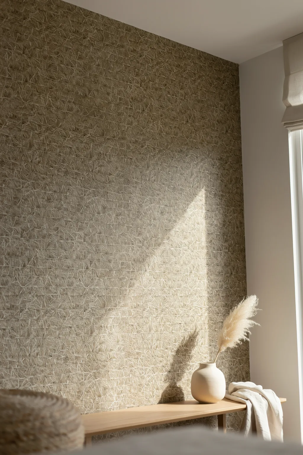
Grasscloth gets recommended for dark rooms constantly, and it is usually the wrong call. It turns up in almost every roundup of wallpaper ideas for low-light spaces, generally from someone who has only seen it in a sunny room.
Real grasscloth is a texture built out of shadow. Every fiber throws a tiny one, which is what gives the wall its depth in a sunlit room, and equally what makes it go flat and brownish where no sun ever rakes across it.
It still earns its place if the wall catches some light. A grasscloth wall set at right angles to a window, so the light crosses it rather than hitting it head on, looks superb.
Three things nobody mentions at the point of sale: the seams are meant to show, color varies noticeably from roll to roll, and it marks the moment anything wet touches it. Keep it out of bathrooms.
Hang it where light crosses the wall sideways, such as the return wall beside a window.
Order every roll in one batch and lay them out before hanging, so the color shifts fall in a sensible order.
Use it on one wall, with smoother surfaces around it for relief.
Wrapping a windowless room in it and hoping the texture reads. It will not.
Bathrooms, laundries, and the wall behind a kitchen sink.
Any hallway where bags, coats and shoulders brush the wall daily.
8. Skip the Window Wall and Paper the One Facing It
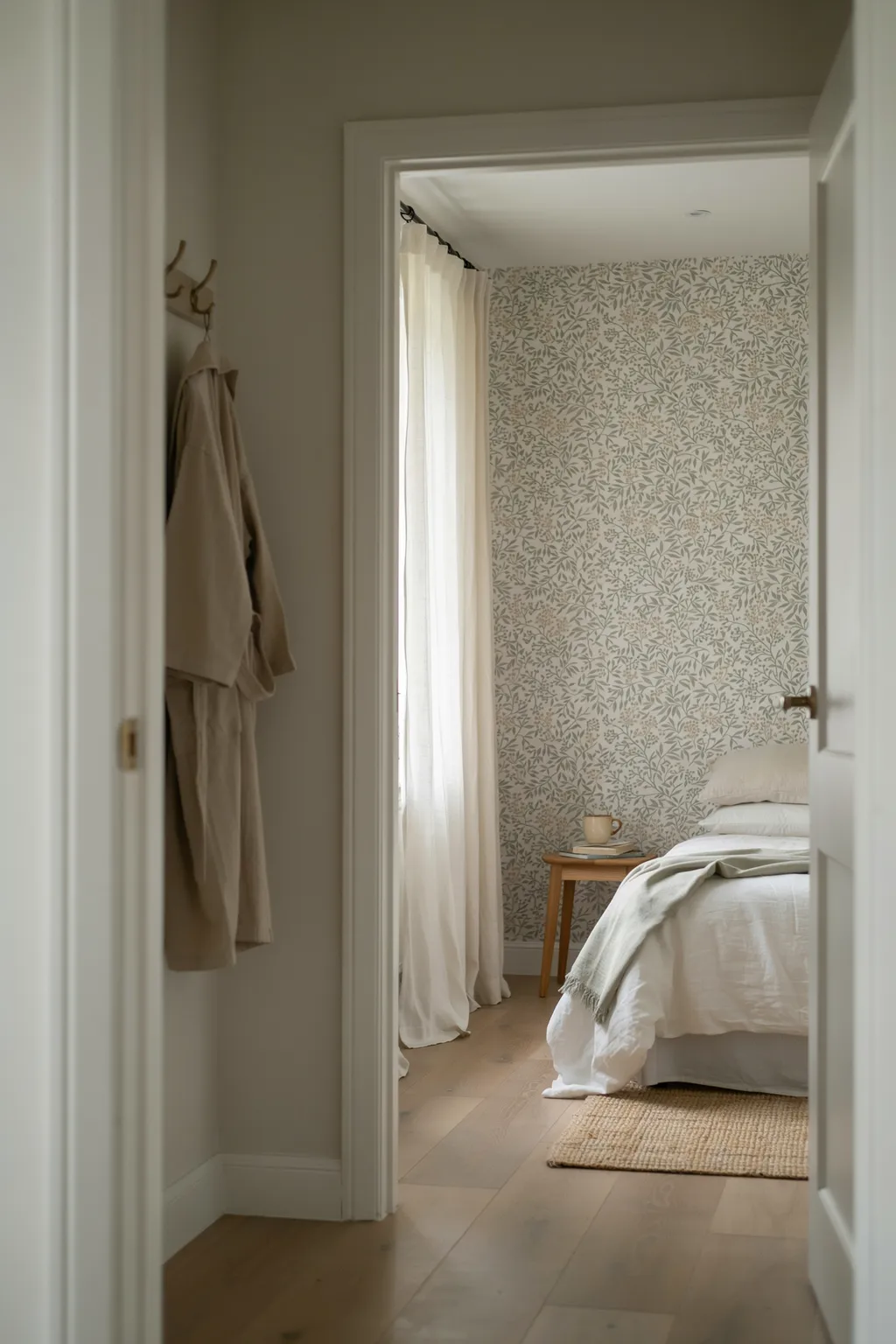
Stand in the doorway before you decide which wall gets the pattern.
The wall containing the window is nearly always the wrong pick. It sits backlit for whatever daylight hours you do get, so the pattern reads as a silhouette and the color drains out of it.
The wall facing the window is the one to paper. It catches what light does come in, and it tends to be the wall your eye lands on from the door anyway.
With no window at all, the rule changes shape. Paper the first wall you see walking in, and let the rest stay quiet.
Stand in the doorway at the hour you actually use the room. A bedroom at 10pm, an office at 10am.
Note two walls: the one your eye goes to first, and the one your main lamp throws light onto.
Same wall both times? That is your paper. Different walls? Go with the lit one and hang art on the other.
9. Use a Scenic Mural When There Is Nothing to Look At
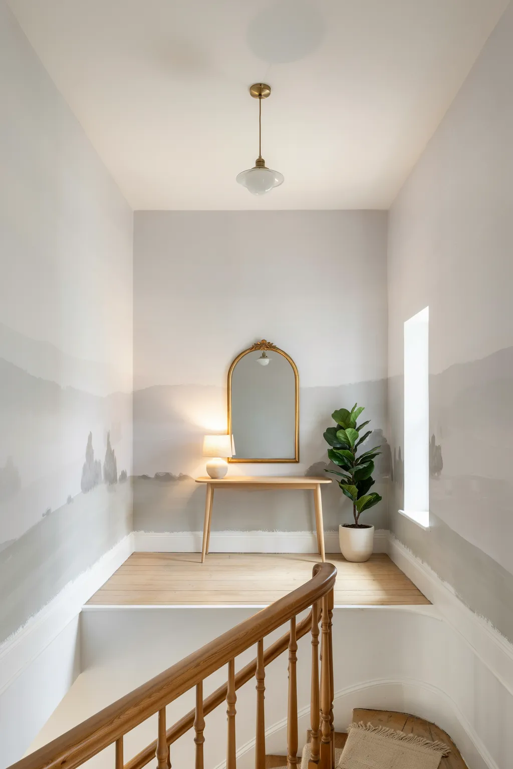
A windowless landing gives the eye nowhere to rest. No view, no depth, four surfaces all sitting at arm’s length.
That is the argument for a scenic mural. A soft landscape, a misty forest, a faded chinoiserie garden: the image invents a middle distance, and a small dark space stops reading as a box.
Of all the wallpaper ideas here this is the biggest commitment, and the dimmest, least useful corridor in the house is where it earns its keep.
Two rules keep it from going wrong.
Pick a mural that has light inside the image, ideally a pale sky or a hazy background, because a dark mural in a dark room simply closes in. Then measure twice. Murals ship as a fixed set of panels sized for one wall, and unlike rolls there is no repeat to cut into if you get the wall wrong.
Per wall, expect them to cost more than standard paper. For a hallway nobody has looked at properly in years, it is usually money well spent.
A mural has to contain light, not just color. If the brightest part of the image is darker than your ceiling, keep looking.
10. Match Your Bulbs to the Paper Before You Judge the Color
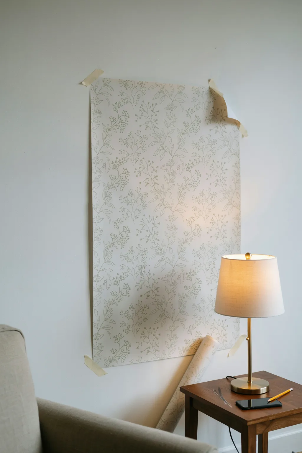
Half the wallpaper regrets I hear about are not the paper’s fault. They are the bulbs.
Paper gets chosen in a showroom running cool, bright light near 4000K, then hung in a living room lit by warm 2700K lamps. The ground shifts, the pastels turn, and the paper on the wall is not quite the paper from the sample book. Bulb color temperature changes how a pattern reads more than most people expect.
So tape a full sample to the wall and look at it at night, under your own lamps, before you order anything.
When you are choosing wallpaper ideas for a room with no daylight at all, this step outranks everything else here, because artificial light is the only light that paper will ever be seen in.
Test this before you order
Wrapping Up
Dark rooms are less a problem to fix than a condition to design around. Once you stop reaching for the palest thing on the shelf and start thinking about sheen, pattern scale, and where the light actually lands, the choices open up rather than narrow.
Start with one wall. Buy the sample before the rolls, look at it properly at night, and give yourself permission to go darker than feels sensible.
Save this list of wallpaper ideas for the next time you are standing in a dim hallway with no idea what to do with it.
More wallpaper guides