20 Bathroom Tile Ideas That Look Expensive
Tile is the one thing in a bathroom you cannot hide. It covers the walls, the floor, sometimes the ceiling, and it sets the whole mood before you notice the faucet or the mirror. Pick the wrong tile and even a pricey renovation looks flat. Pick the right one and a small budget can read like a boutique hotel. That gap is what these bathroom tile ideas are built to close.
I have stood in enough tile showrooms to know how overwhelming the wall of samples feels. Hundreds of colors, a dozen shapes, glossy or matte, big format or tiny mosaic, and no clear sense of which combination will actually look expensive once it is grouted and lit. The secret is rarely the price of the tile. A plain white tile laid in herringbone with a thin dark grout can out-class a costly stone slapped up in a boring grid.
This guide walks through 20 looks, each pulled from a real bathroom and each solving a different design problem: no color, no texture, no drama, no warmth. Some are bold, like emerald fish-scale or a green-and-black checkerboard floor. Some are quiet, like soft sage squares or a blush herringbone. You will not want all 20. Find the three that fit your room, your light, and your nerve, and skip the rest. The goal is a bathroom that looks like it cost more than it did.
Quick Answer
The bathroom tile ideas that look most expensive share three traits: a clear focal wall or floor instead of tile everywhere, a laying pattern with movement (herringbone, chevron, fish-scale, or a mosaic), and a grout color chosen on purpose to either hide or highlight the lines. Pick one hero surface, lay it in a pattern, and match the grout with intent. Do those three things and even budget ceramic reads high-end.
1. Wrap the Room in Black and White Marble
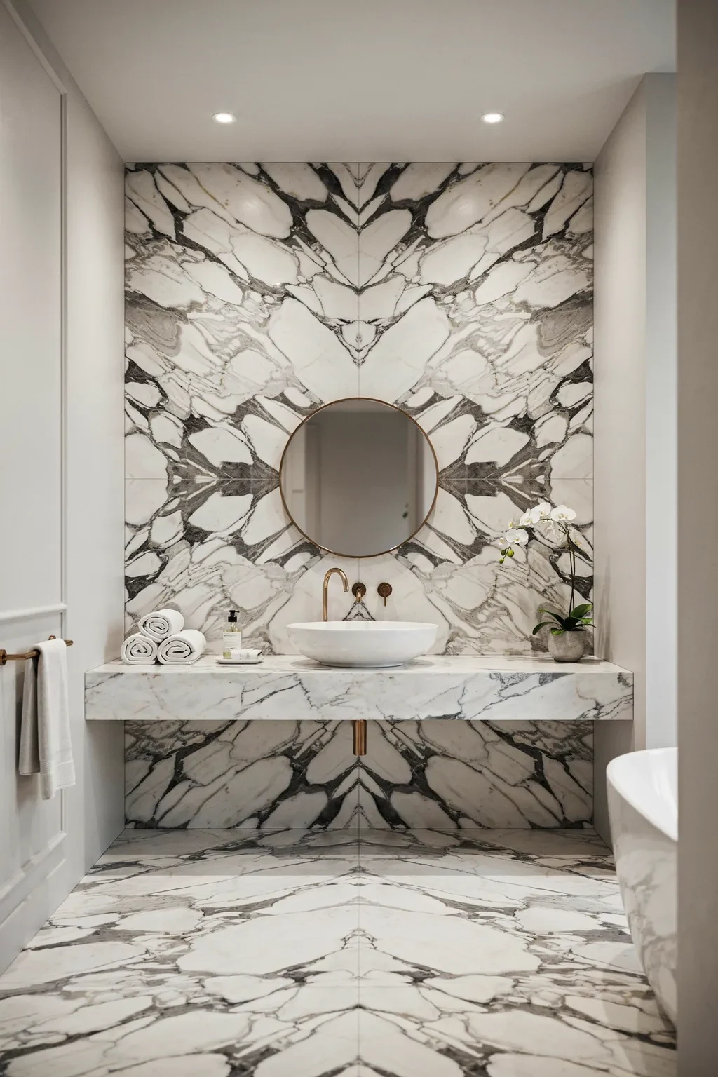
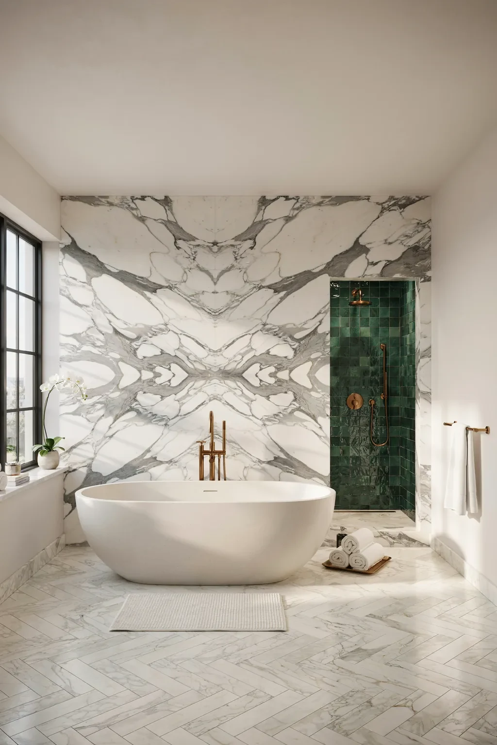
Nothing says money like marble, and pairing polished black stone with a bright white Calacatta slab is the most dramatic way to use it. Run black marble across the floor and side walls, then set one white feature panel behind the sink so the veining becomes art. A floating stone shelf and a marble vessel basin finish the look For more ways to build a room around black stone and fixtures, see our black bathroom decor ideas., and a thin LED strip in the ceiling makes every surface glow.
Contrast is what makes this expensive. The eye reads the sharp jump from deep black to luminous white as intentional and rich, not busy. Book-matched veining on the white panel doubles the drama for the cost of careful cutting. If real marble is out of reach, large-format porcelain that mimics Calacatta gives the same effect for a fraction of the price and needs no sealing.
This suits a powder room or a primary bath with good lighting. Skip it in a windowless box, where all that black can feel like a cave. One honest caveat: polished black stone shows every water spot and dust mote, so it wants a daily wipe to keep looking pristine.
2. Warm the Floor with Pink Terrazzo
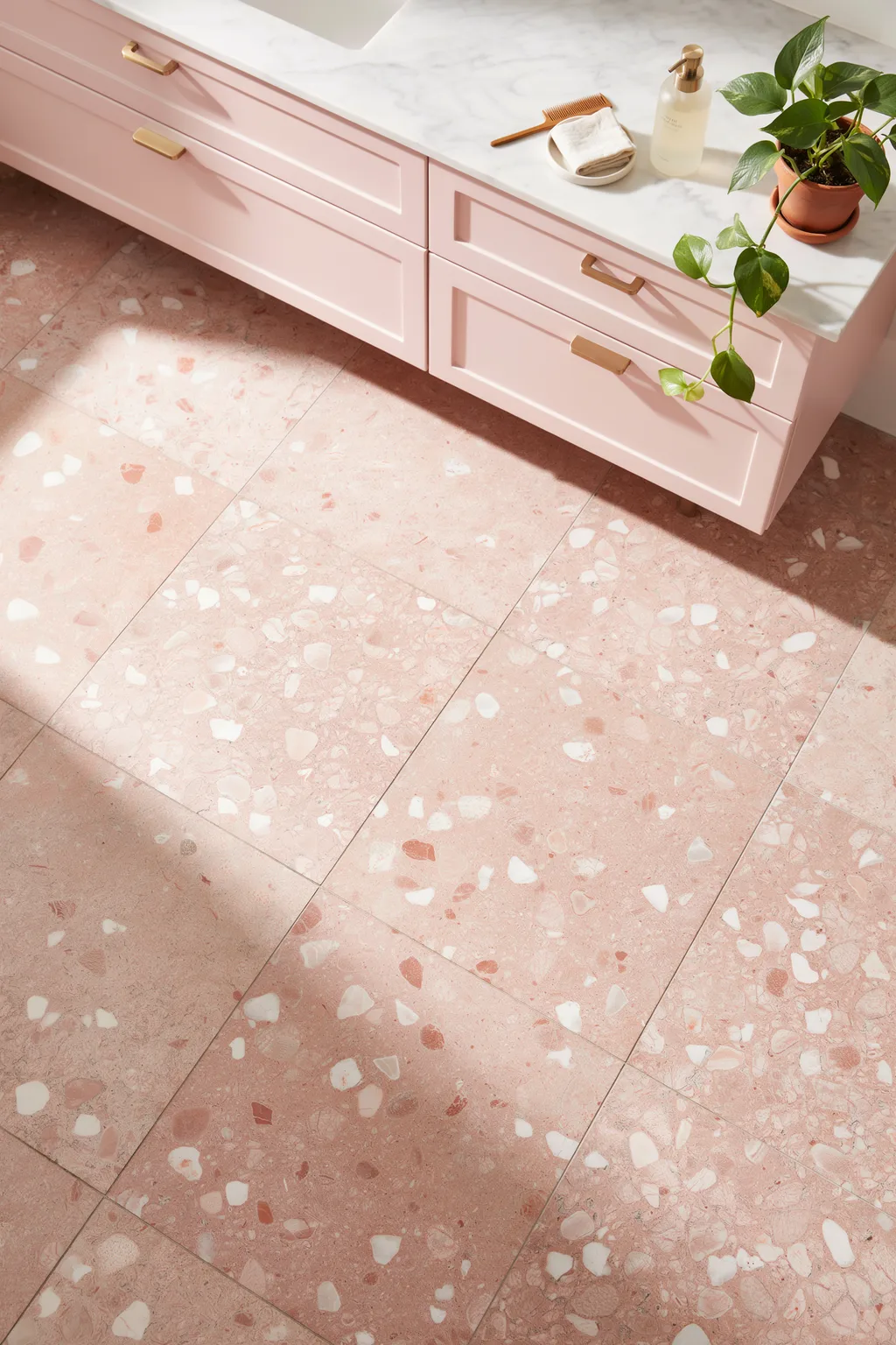
Terrazzo is having a moment, and a warm coral version turns a cold bathroom floor into something you want to stand on barefoot. The scattered chips of white, cream, and soft stone across a blush base catch the light and add texture without any loud pattern. Pair it with a matching pink vanity and brushed brass hardware, and the whole corner feels custom.
Terrazzo works because it hides everything. The busy speckle disguises water marks, hair, and small scuffs that a plain floor shows instantly, so it stays looking clean between mopping. The color also does quiet work: a warm blush reflects sunlight and makes a small windowed bathroom feel sunnier. Large terrazzo-look porcelain tiles give you the look with grout lines you can count on one hand.
This fits soft, feminine, and mid-century schemes. It is a weak match for a stark industrial bathroom, where the sweetness fights the concrete. Real terrazzo is heavy and needs sealing, so on a budget, reach for the porcelain version and save the labor.
3. Cover the Floor in Multicolor Hexagons
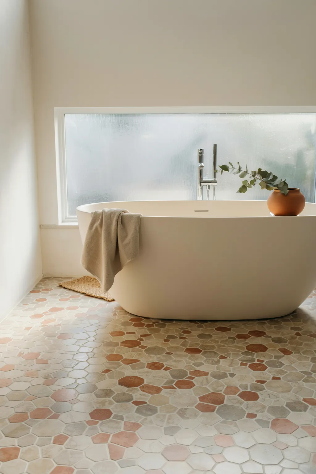
A hexagon mosaic in mixed earthy tones turns the floor into the star of the room. Blend terracotta, warm gray, cream, and blush hex tiles in a random scatter, and the pattern reads like a hand-laid rug under a freestanding tub. It gives a plain bathroom a designer floor without a single accessory.
The shape is the trick here. Hexagons interlock with more visible lines than squares, so the eye reads craft and detail even from cheap ceramic. Mixing three or four muted colors keeps it warm and organic instead of loud, and the small scale suits a compact room where a big tile would feel clumsy. Buy the tiles pre-mounted on mesh sheets and the install goes far faster than loose pieces.
This suits boho, Mediterranean, and warm modern baths. It is a poor fit if you want a calm, single-color floor, since the mix is inherently busy. Small hex means lots of grout lines, so use a stain-resistant epoxy grout or plan to reseal, or the light joints will darken over time.
4. Go Bold with Emerald Fish-Scale Tiles
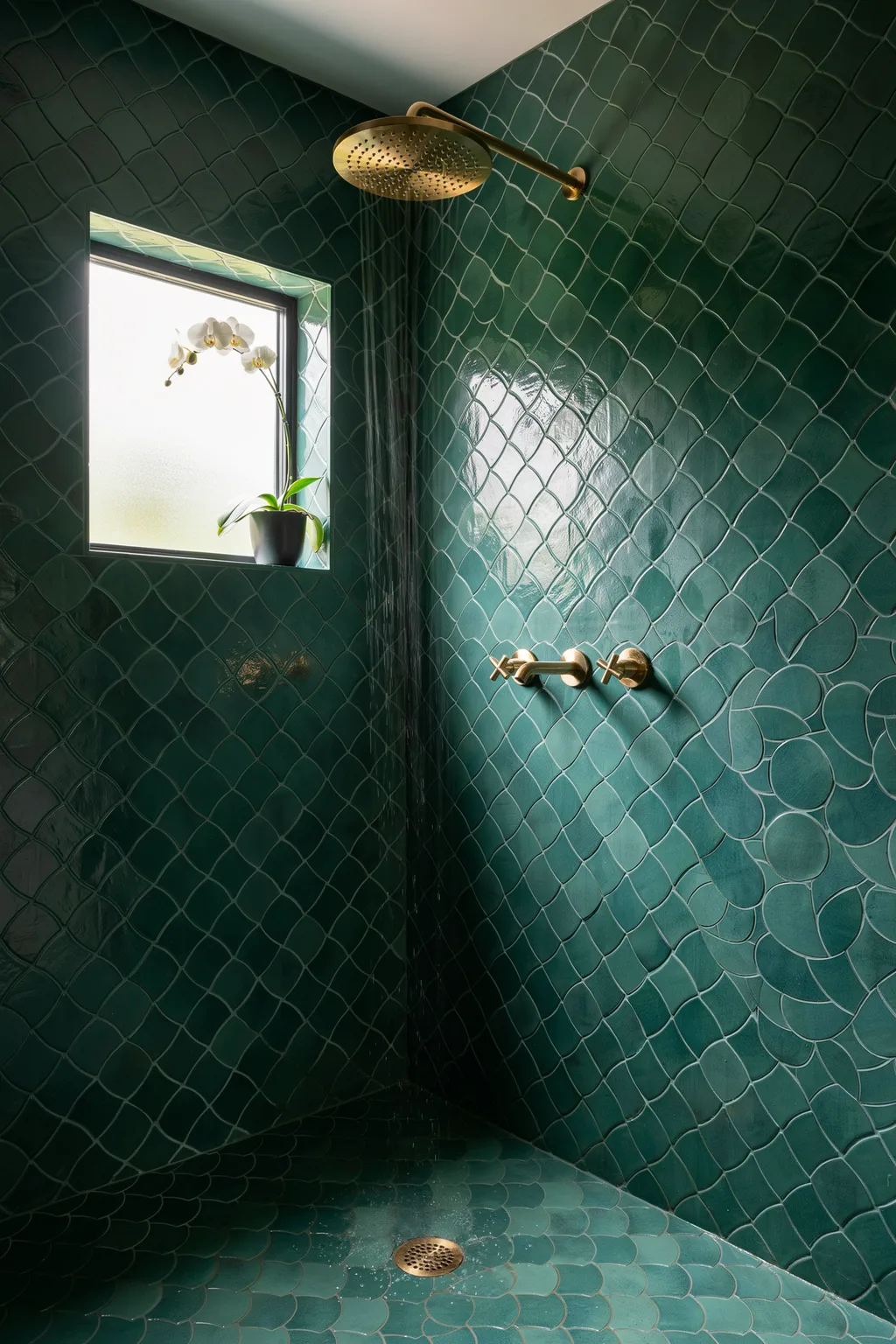
Few tiles feel as lavish as glossy emerald fish-scale, also called scallop or fan tile. Run it floor to ceiling in a shower and the curved shapes catch light like the surface of a deep green pool. Add unlacquered brass fixtures and the jewel-box effect is instant. This is drama you feel the second you step in.
The gloss and the curve are doing the heavy lifting. A shiny glaze bounces light around a small shower and makes it feel less boxy, while the overlapping scales add rhythm a flat subway tile never could. Deep emerald reads as rich and moody, and brass warms the cool green so it feels welcoming. These are the kind of bathroom tile ideas that turn a tiny shower into the best part of the house.
This suits maximalists and anyone who wants a statement shower. It is a hard sell for a bright, airy, coastal look, where the darkness fights the vibe. Colored gloss tile shows soap scum and hard-water spots, so a squeegee habit keeps the shine alive.
5. Make a Statement Wall in Bold Terrazzo
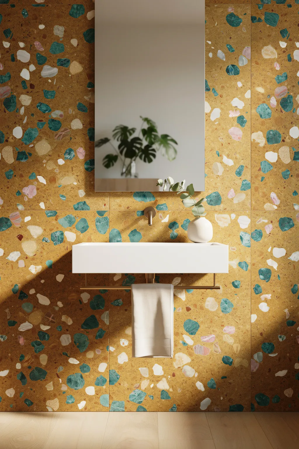
Terrazzo does not have to stay on the floor. A wall of ochre-and-mustard terrazzo studded with teal and blush chips turns the space behind a floating sink into a bold feature. The oversized chips read almost like abstract art, and a single green plant is all the styling it needs. It is loud in the best way.
Scale is what sells a terrazzo wall. Larger, more colorful chips feel modern and deliberate, where a fine speckle can look like a hospital floor. Keeping the fixtures simple, a plain white basin, a frameless mirror, lets the wall shout without competition. Because it is a feature, you only tile one wall, so a splurge tile stays affordable.
These bathroom tile ideas suit bold modern and creative spaces. It is a mismatch for a calm, neutral bathroom, where it will feel like it wandered in from another house. A busy wall needs breathing room, so pair it with plain surfaces elsewhere or the room tips into chaos.
6. Keep It Serene with Soft Green Squares
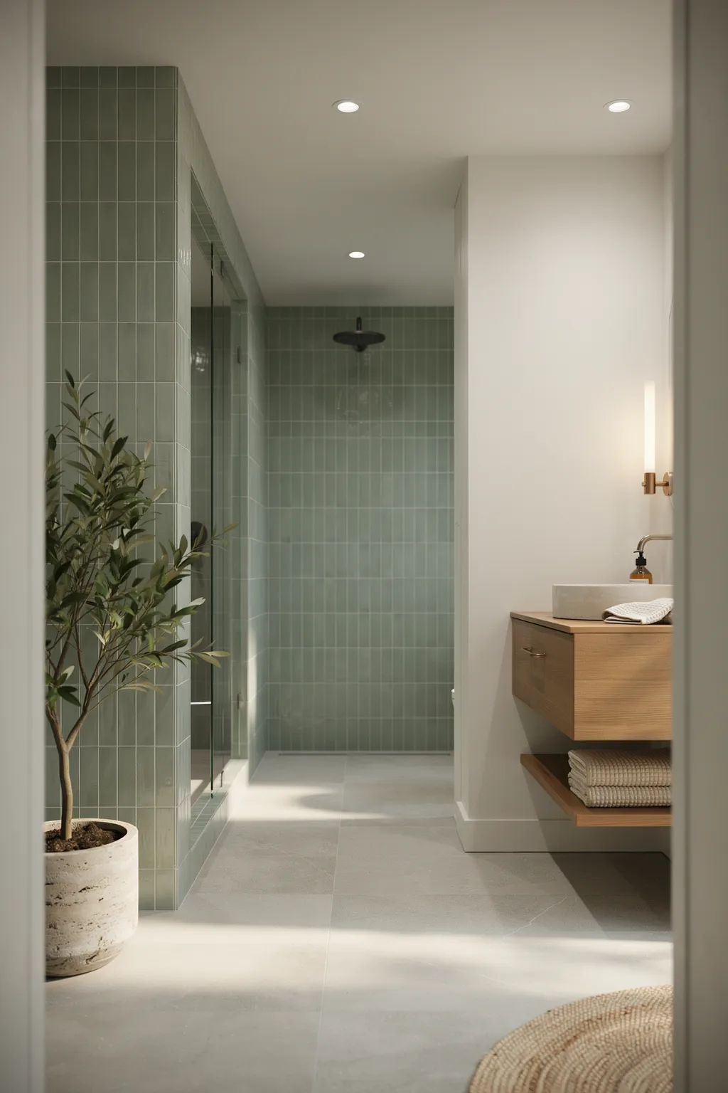
Not every bathroom wants drama. A wall of soft sage or mint square tiles creates a calm, spa-like room that feels expensive through restraint. Run the pale green squares across the shower and vanity wall, pair them with a warm wood vanity and a gray stone floor, and the whole space breathes. It is quiet luxury.
The calm comes from tone-on-tone simplicity. When the tile, grout, and walls all sit in the same gentle color family, there is no hard line to stop the eye, so a small room feels larger and more restful. A muted green also reads as timeless rather than trendy, which protects your investment. Matte square tiles hide water spots far better than gloss, so upkeep stays low.
This suits minimalists and anyone craving a spa feel. It is a weak choice if you love bold color, since the point is calm. The honest note: a subtle green can look flat under harsh cool bulbs, so use warm 2700K lighting to keep it soft.
7. Add a Green Chevron Half-Wall
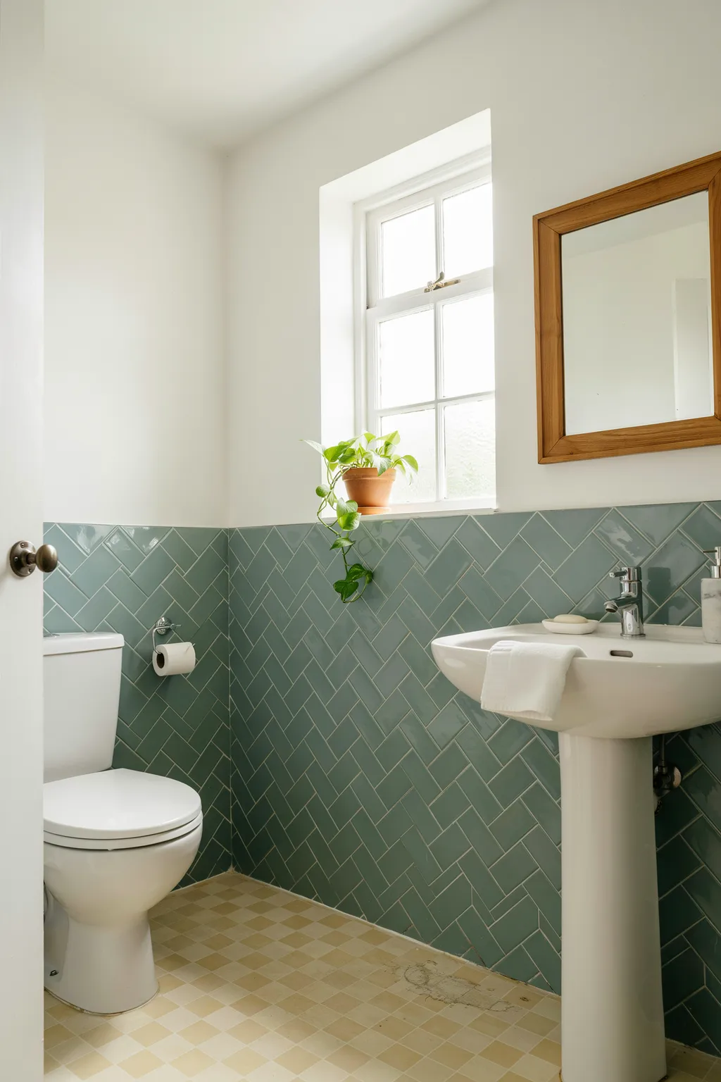
A chevron half-wall gives a plain bathroom instant polish without tiling the whole room. Run glossy green chevron tile from the floor to about chest height, then paint the wall above, and you get a crisp horizontal line that reads like wainscoting. The zigzag adds motion, and the half-height keeps the cost and the labor down.
The chevron cut is the upgrade. Where straight tile feels ordinary, the mitered V of a true chevron looks custom and deliberate, and a soft green keeps it fresh rather than formal. Stopping the tile partway up draws a tidy border that makes ceilings feel taller. Pair it with a simple white basin so the pattern stays the hero.
This suits period homes, powder rooms, and renters allowed to tile a small area. It is a poor fit for a wet shower wall, where a half-height stop lets water reach the paint. True chevron needs precise cutting, so budget for a skilled installer or the points will not line up.
8. Layer Gray Marble-Look Large-Format Tiles
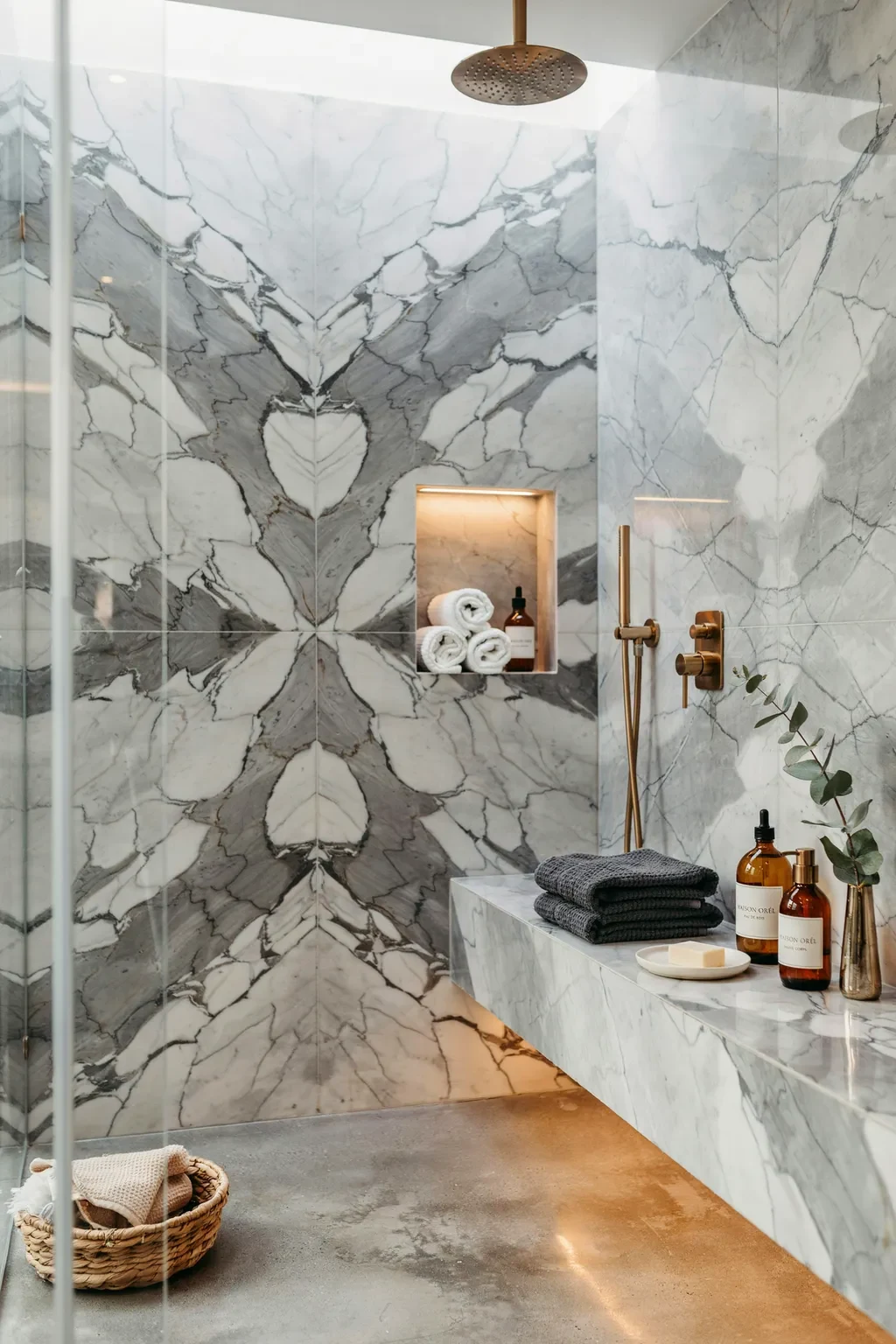
Big tiles read expensive because they mean fewer grout lines and a smoother, more seamless wall. Cover a shower in large-format gray marble-look porcelain, mix a few tones of veining, and add a small mosaic niche for contrast. Black fixtures anchor the cool palette. The result feels like a spa suite, not a bathroom.
Fewer joints is the whole point. Large tiles give you broad, calm planes of stone-look surface that a small tile chops into a grid, and the veining supplies all the interest you need. A recessed niche in a tiny checkerboard mosaic adds a hit of detail exactly where you set the shampoo. Matte black hardware pops against the soft gray and looks far pricier than chrome.
As bathroom tile ideas go, this suits modern and transitional baths and anyone who hates scrubbing grout. It is less ideal for a tiny shower, where huge tiles can require awkward cuts. Large-format tile needs a dead-flat wall and more setting material, so factor that into the budget.
9. Add a Moroccan Encaustic Feature Strip
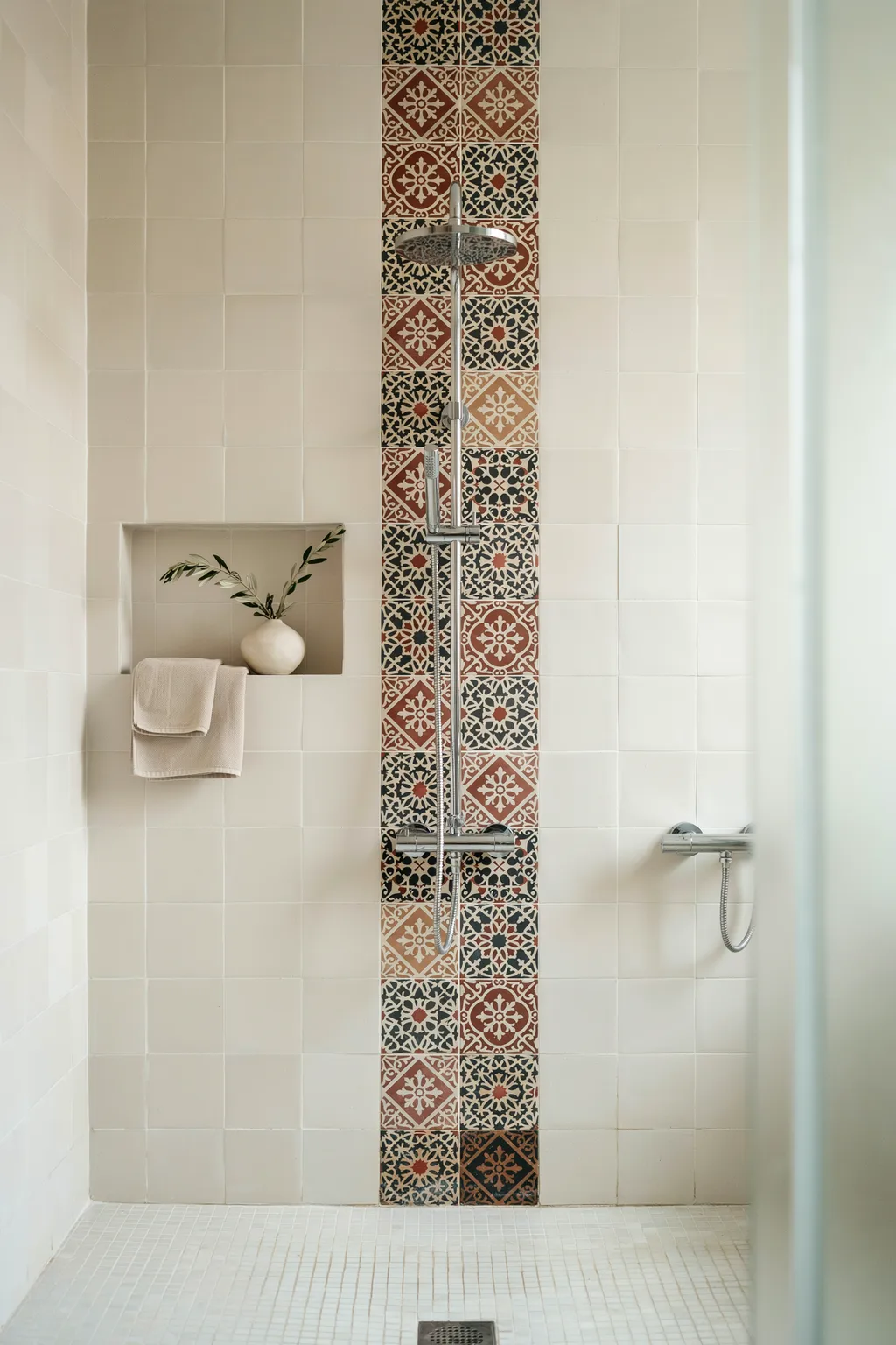
A vertical strip of patterned encaustic tile behind the shower fixtures turns a plain white bathroom into a curated one. Frame a column of mixed Moroccan cement tiles, terracotta, black, and cream florals and geometrics, with plain white square tile on either side. The pattern draws the eye up and gives the shower a clear focal point.
Framing is the secret to using bold pattern well. A narrow band of busy encaustic reads as art when plain tile surrounds it, where a whole wall of it can overwhelm a small room. Mixing several patterns in the same palette looks collected and intentional, like a hand-picked wall. Because you only need a small quantity, pricey handmade cement tile stays within reach.
This suits eclectic, Mediterranean, and vintage-loving homes. It is a mismatch for a strict minimalist bath, where the pattern feels out of place. Real cement tile is porous and must be sealed before grouting, so follow the maker’s steps or the tiles will stain.
10. Try Vertical Kit-Kat Mosaic in Blue-Gray
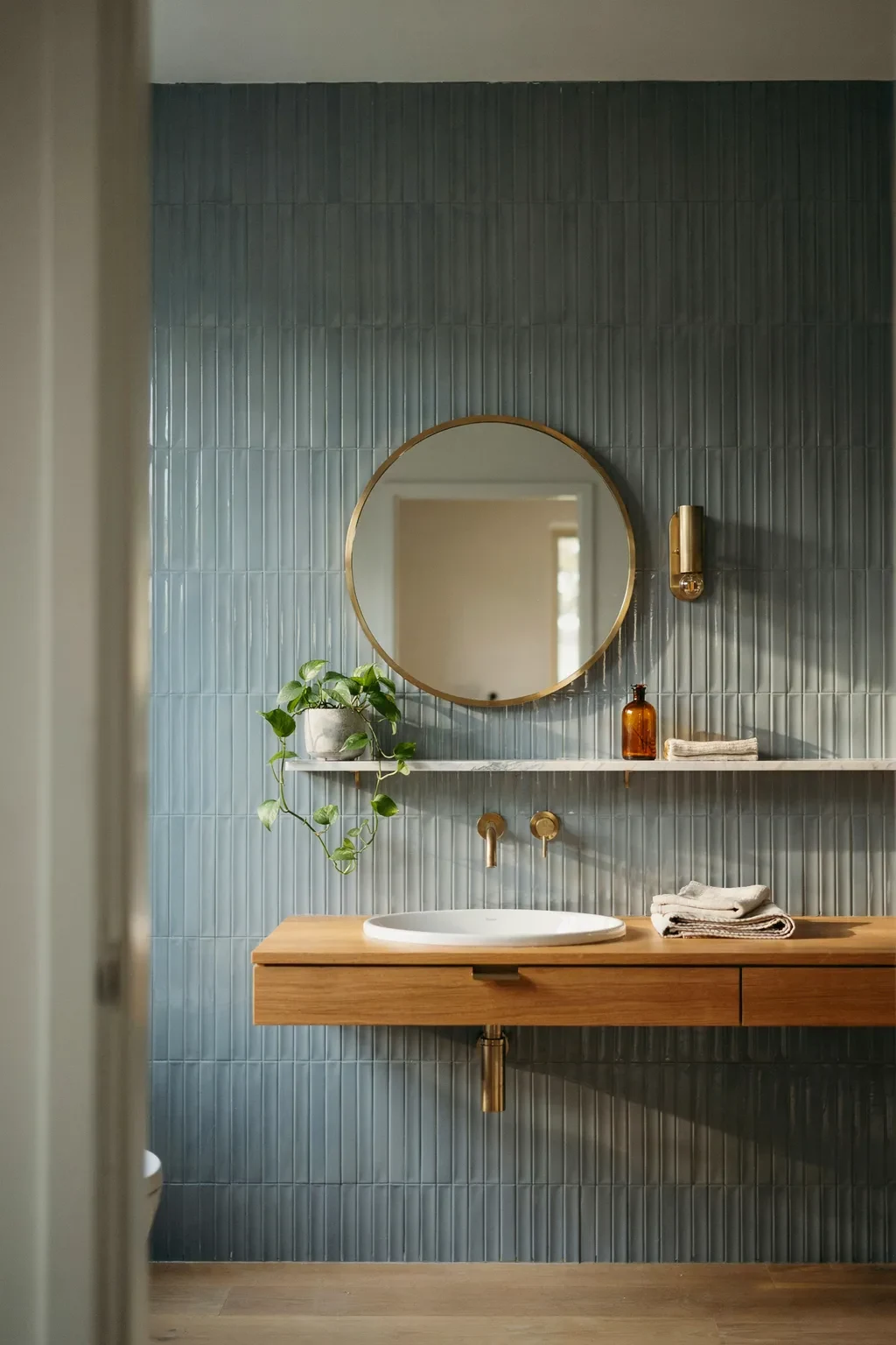
Thin, finger-shaped kit-kat tiles set vertically add subtle texture and make a wall feel taller. In a soft blue-gray, they read calm and current, and brushed brass fixtures lift them into luxury. Run them up the shower wall and the fine ribbing catches light in gentle stripes all day. It is texture without color chaos.
Verticality is the quiet win. Slim tiles stood on end draw the eye upward, so a low-ceilinged bathroom feels loftier, and the narrow format packs in texture a wide tile cannot. A muted blue-gray keeps the look serene and pairs with almost any fixture finish. Warm brass against cool tile is the combination that makes it feel designed rather than default.
This suits modern, Japandi, and calm contemporary baths. It is a weak fit for a traditional cottage look, where the crisp lines feel too sleek. Skinny tiles mean lots of grout, so a matching grout keeps the wall from looking gridded and busy.
11. Mix Speckled Terrazzo with a Navy Accent Wall
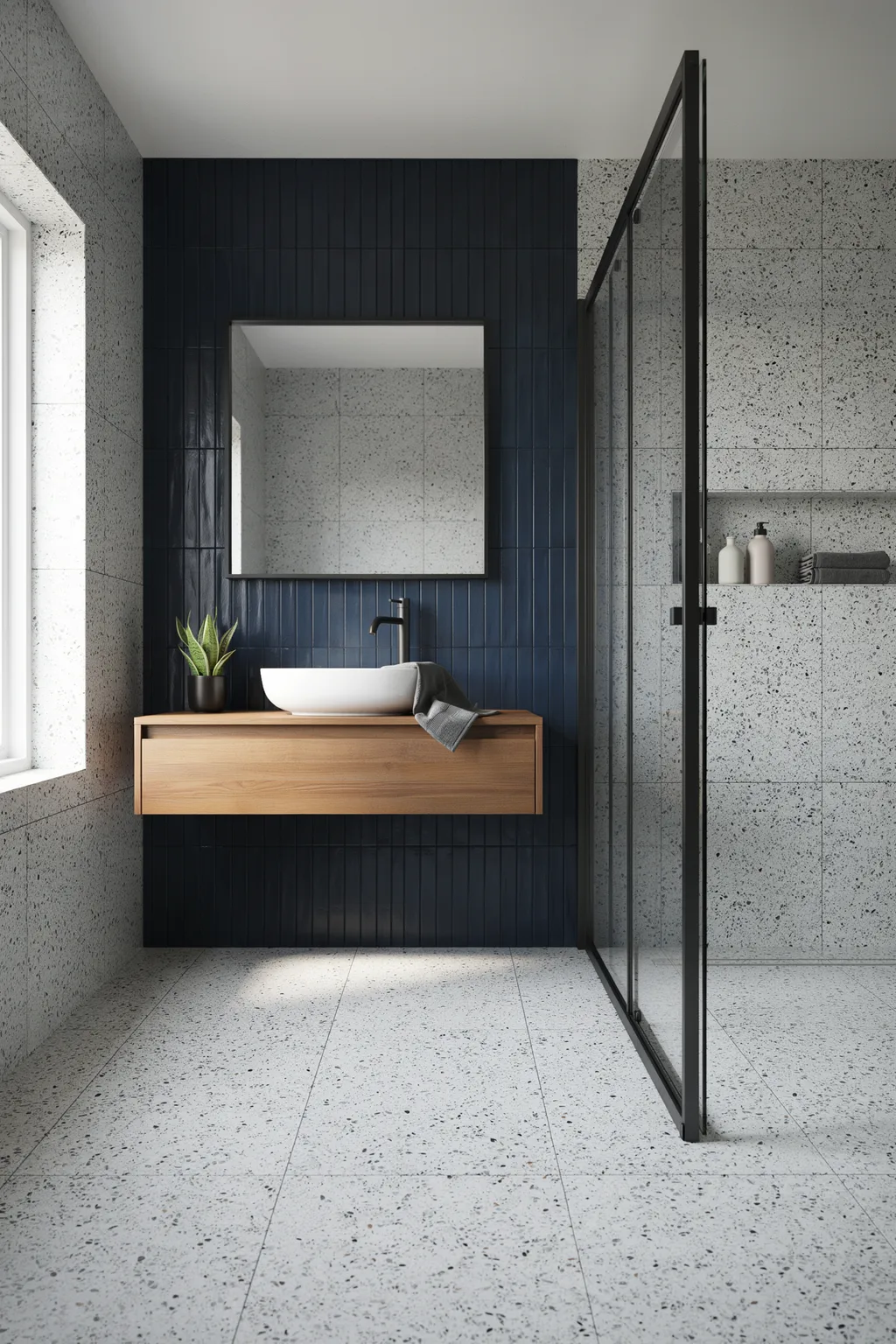
Two tile looks in one room can feel richer than one, if they share a palette. Cover the walls and floor in white-and-black speckled terrazzo, then add a single navy vertical tile accent wall behind the mirror. The busy terrazzo and the calm navy balance each other, and a black-framed shower ties the scheme together.
Pairing works when one surface is loud and one is quiet. The speckled terrazzo brings the pattern, the flat navy gives the eye a place to rest, and the shared black flecks link them so it never looks accidental. Vertical tiles on the accent wall add height, while the terrazzo floor hides everyday mess. A wood vanity warms the cool, graphic scheme.
This suits modern apartments and design-forward homes. It is a poor fit for a tiny bath, where two strong looks can crowd the space. Matching black grout on the accent wall sharpens the lines, but it takes care to keep it clean during install, so wipe as you go.
12. Lay Classic White Tile in Herringbone
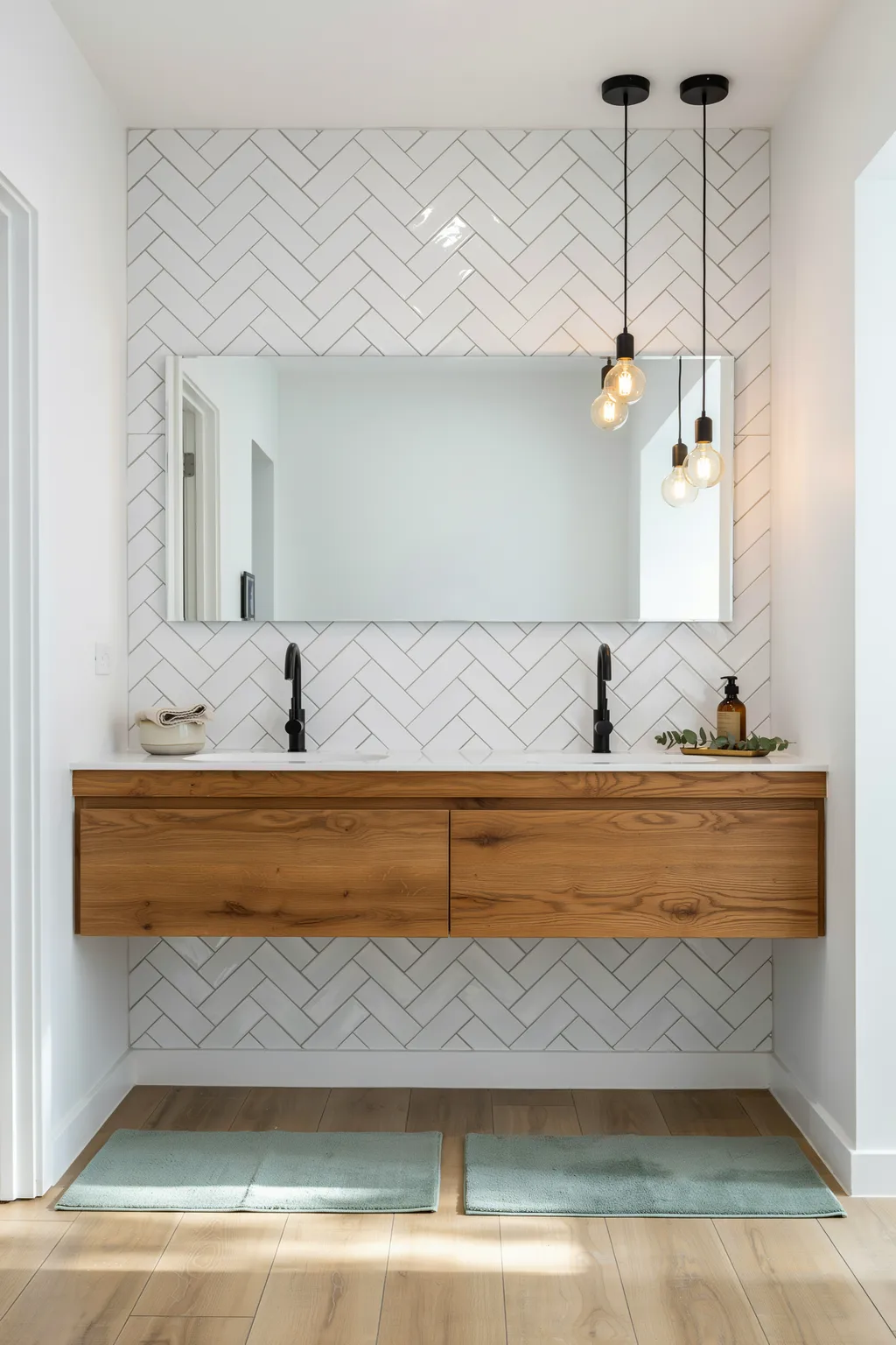
The cheapest way to make plain white tile look expensive is to lay it in herringbone. The interlocking diagonal weave turns a basic rectangle into a rich, textured wall, and it costs nothing extra but labor. Pair a white herringbone wall with a walnut double vanity, black faucets, and warm pendant lights, and the room feels crisp and current.
Pattern beats price every time. A white tile in a boring grid reads builder-grade, but the same tile in herringbone reads custom, because the eye follows the zigzag and senses craft. Warm wood and black hardware add contrast so the white does not feel cold or clinical. A slightly darker grout traces the weave and makes the pattern pop.
This is one of the most reliable bathroom tile ideas going, and it suits farmhouse, transitional, and modern baths alike, which is why it never dates. It is a weak choice if you want a seamless, pattern-free wall, since herringbone is all about the lines. The diagonal cutting creates more offcuts and labor, so buy about 15 percent extra tile.
13. Soften the Room with Blush Pink Herringbone
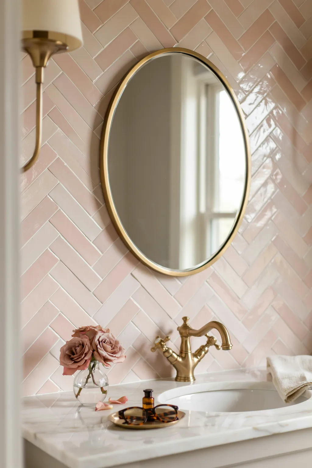
Herringbone in a glossy blush pink brings warmth and a little glamour at once. The pink glaze catches window light and glows, while the diagonal weave keeps it from feeling flat or sweet. Add a brass faucet, a round mirror, and a marble counter, and the corner looks like a chic hotel powder room. It is soft without being childish.
The gloss and the warm hue do the work together. A shiny blush surface reflects light and makes a small vanity area feel bright and expensive, and the herringbone lay adds the movement that keeps pink grown-up. Brass is the finish that flatters warm pink best, reading as gold jewelry against a rosy backdrop. A crisp white grout keeps the weave clean and defined.
This suits romantic, feminine, and glam bathrooms. It is a mismatch for a cool, moody, masculine scheme, where blush feels off-key. Glossy tile shows toothpaste splatter and water spots up close, so a quick wipe keeps the glow.
14. Bring Charm Back with Vintage Floral Mosaic
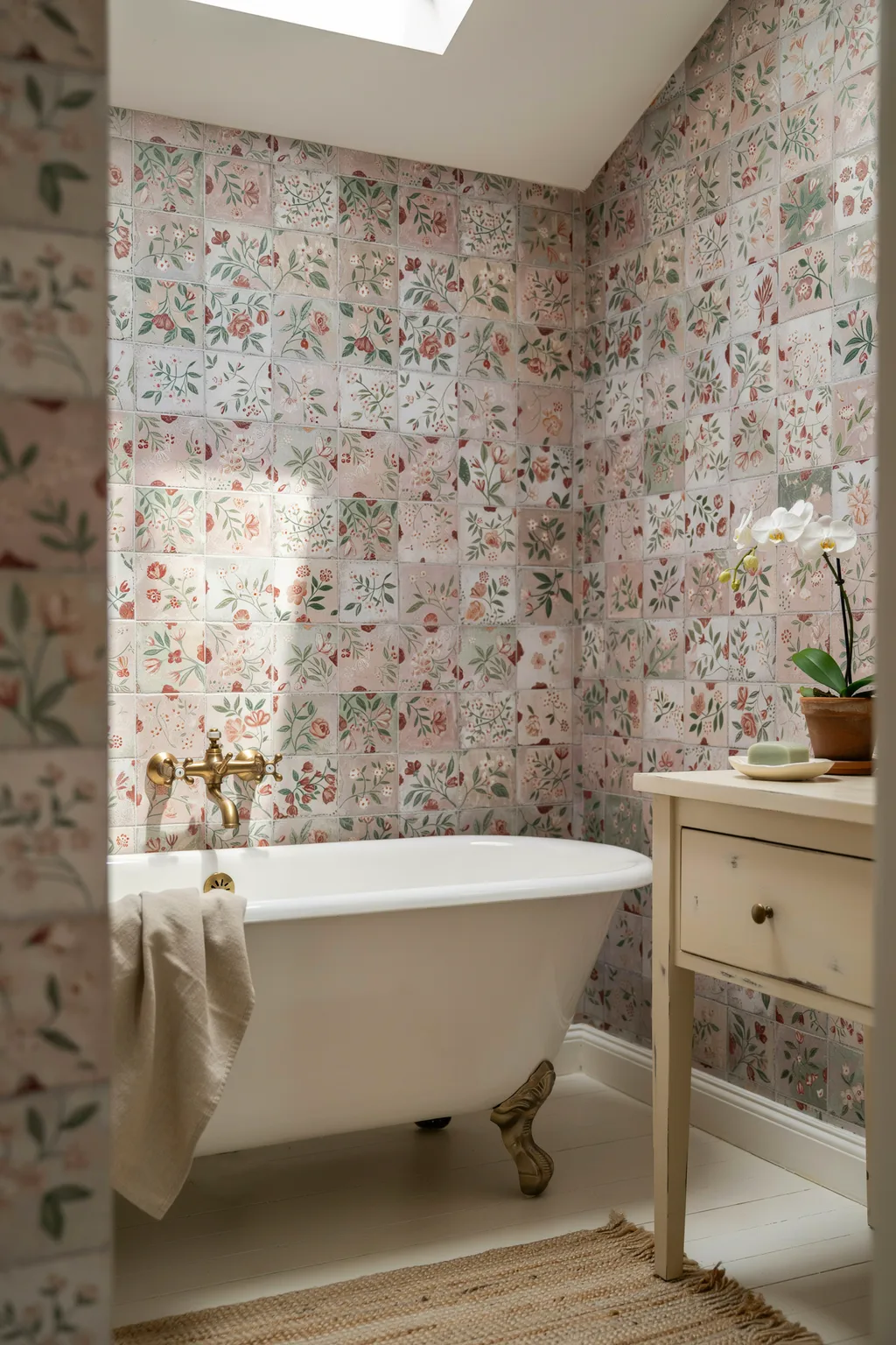
A floral mosaic wall gives a bathroom the kind of character new builds cannot buy. Tiny square tiles carry a soft scattered floral in pink and green across the walls, wrapping a clawfoot tub in cottage charm. Brass fittings and a skylight complete the nostalgic, sun-washed feel. It looks like it has always been there.
Small-scale pattern is what dates a room in the best way. A delicate floral printed across mosaic sheets reads as heritage and hand-made, softening the hard surfaces of a bathroom. Keeping the palette pale and warm stops the florals from feeling fussy or dark. Because the pattern lives in the tile, you need almost no other decoration.
This suits cottage, vintage, and traditional homes. It is a poor fit for a sleek modern loft, where the sweetness clashes with clean lines. Patterned mosaic sheets can be tricky to align at seams, so hire someone who has laid them before, or the flowers will not match across joints.
15. Grid Small Pink Square Tiles for Retro Cool
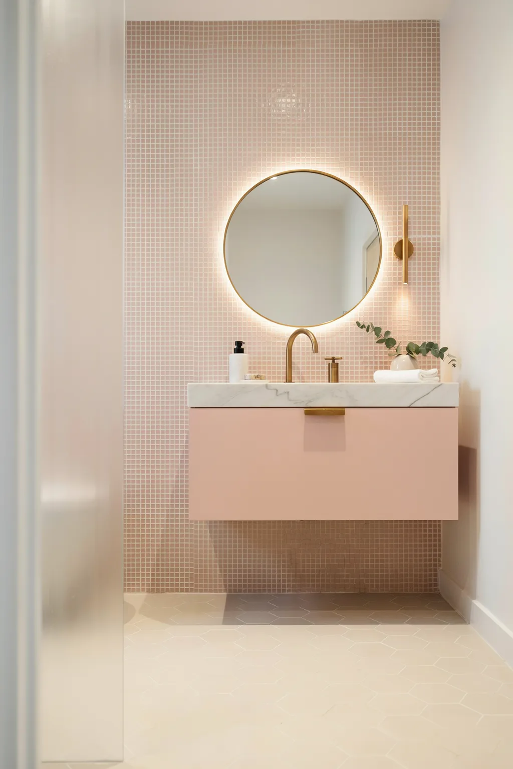
Small square tiles in a tight grid have a fresh, retro feel that looks pulled from a design magazine. In a warm blush, they wrap a room in soft color, and a round backlit mirror and a floating vanity keep it modern rather than dated. The many fine grout lines add subtle texture across the walls.
The grid is the look. Uniform small squares create a quiet, repeating rhythm that feels considered and current, and a single soft color keeps it from reading like an old kitchen. A backlit round mirror adds a warm halo that flatters the pink, while brass tapware lifts it toward luxury. Because the tiles are small and plain, they are cheap, so the cost lives in the labor, not the material.
This suits playful modern and mid-century baths. It is a weak fit for a grand traditional room, where small squares feel too casual. Lots of grout lines mean lots of cleaning, so a slightly tinted grout hides soap film better than stark white.
16. Go Vintage-Glam with Glossy Teal Zellige
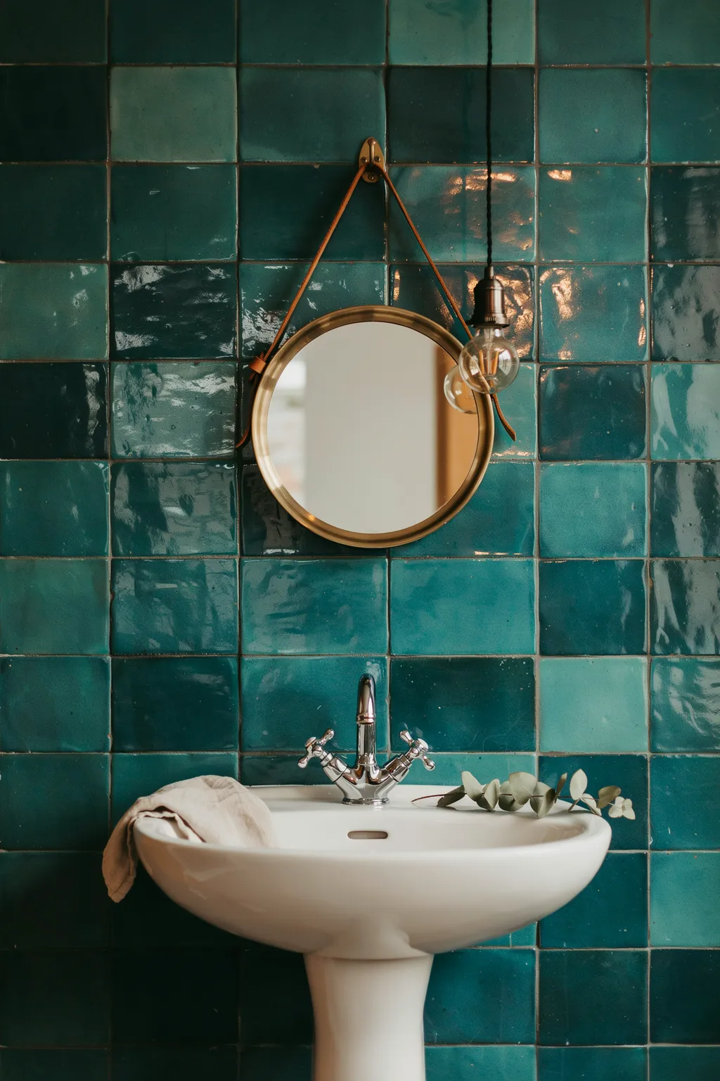
Handmade zellige tiles have gentle color variation and a wavy glaze that machine tile cannot copy, and in a deep teal they feel both vintage and rich. Cover a wall in glossy teal squares, hang a round captain’s mirror on a leather strap, and add an exposed Edison bulb, and the room reads like a design-led bar bathroom. Every tile catches light a little differently.
Irregularity is the luxury. The slight waves and tonal shifts of real zellige make a flat wall shimmer and feel hand-crafted, where perfect machine tile looks lifeless by comparison. A saturated teal is bold but timeless, and vintage brass fittings play up the old-world mood. Even a plain white sink looks intentional against a wall this alive.
These bathroom tile ideas suit eclectic, vintage, and characterful homes. It is a poor match for a bright, clean, minimalist bath, where the variation can look uneven. True zellige varies piece to piece, so embrace the imperfection or choose a consistent look-alike instead.
17. Brighten the Floor with Yellow Penny Rounds
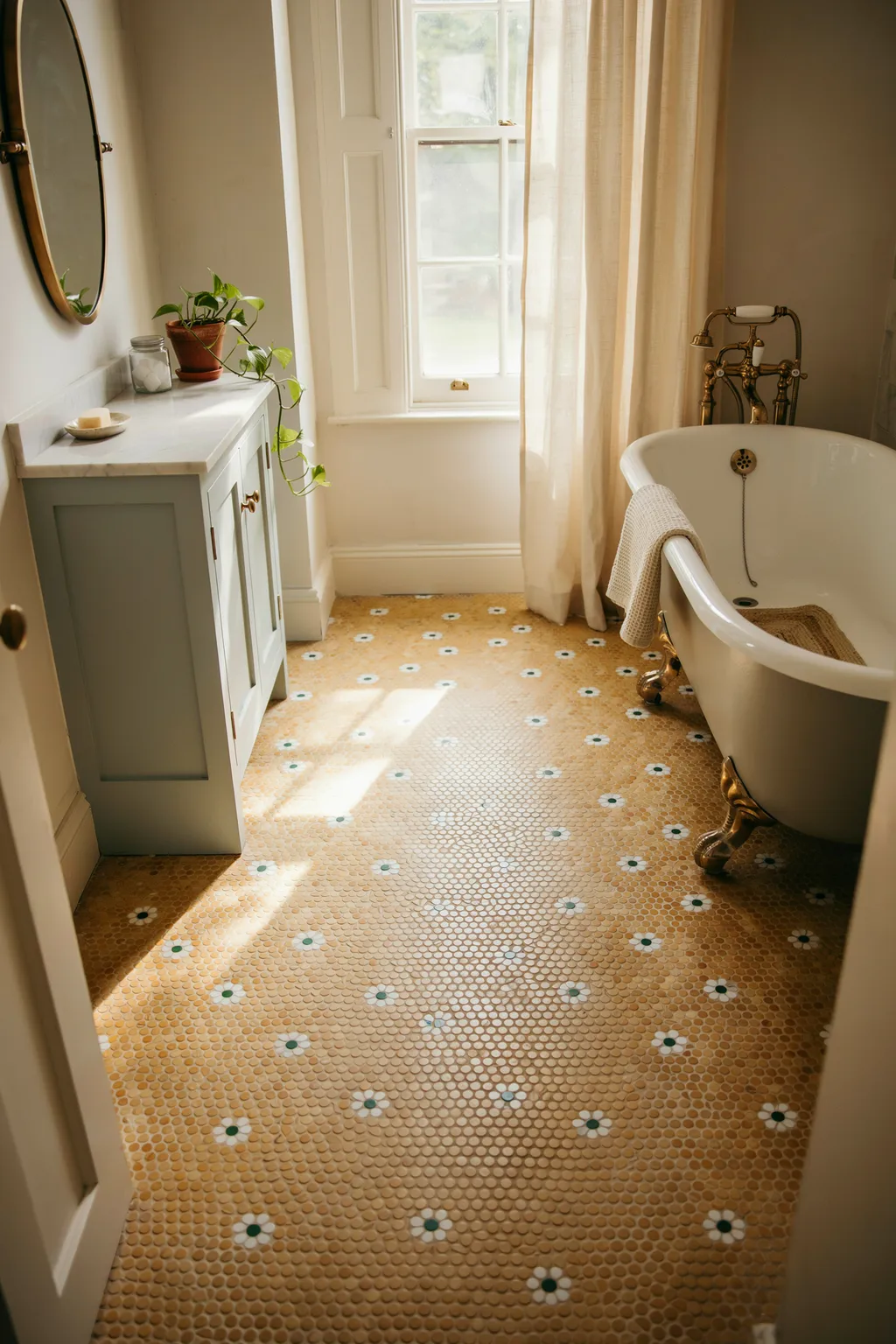
Penny-round mosaic is a heritage floor that instantly signals an old, well-kept home. In sunny yellow with small white flower motifs worked into the pattern, it turns the floor into a cheerful vintage feature under a clawfoot tub. Pair it with a sage vanity and marble top for a soft, sun-filled room. It is joyful and one of a kind.
Tiny round tiles are pure nostalgia. The dense field of little circles reads as classic craftsmanship, and dropping in occasional flower motifs gives the floor a hand-laid, custom feel. A warm yellow floods a north-facing room with cheer that paint alone cannot match. Because penny rounds come on sheets, the install is more manageable than the tiny scale suggests.
This suits vintage, cottage, and cheerful eclectic baths. It is a mismatch for a cool, moody, modern scheme, where the sunny yellow feels loud. Penny rounds have huge amounts of grout, so seal it well and expect regular cleaning to keep the joints bright.
18. Anchor the Room with Navy Geometric Floor Tile
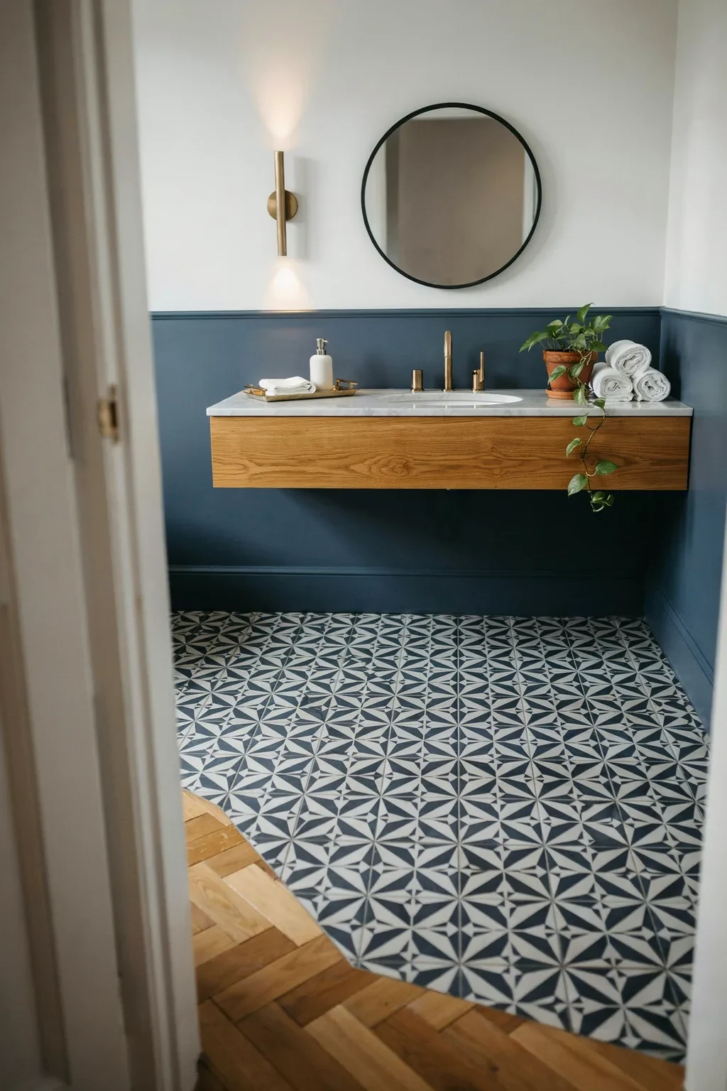
A patterned encaustic-look floor in navy and white gives a plain white bathroom a designer foundation. The repeating geometric motif, a lattice of petals and lines, reads like a hand-painted floor and pulls the whole room together. Keep the walls in simple white square tile so the floor stays the star. It is the easiest way to add pattern underfoot.
A bold floor grounds a light room. Because you look down constantly in a bathroom, a graphic navy-and-white pattern gives the eye something rich to land on while the walls stay calm and bright. Navy is dark enough to hide dirt yet classic enough to never feel trendy. Modern porcelain versions print the encaustic look onto a hard, sealed tile that needs none of the fuss of real cement.
This suits modern farmhouse, classic, and coastal baths. It is a weak fit if you already have busy walls, since two patterns will fight. On a printed pattern, lay the sheets carefully so the motif lines up across tiles, or the repeat will look broken.
19. Calm the Shower with Aqua Subway Tile
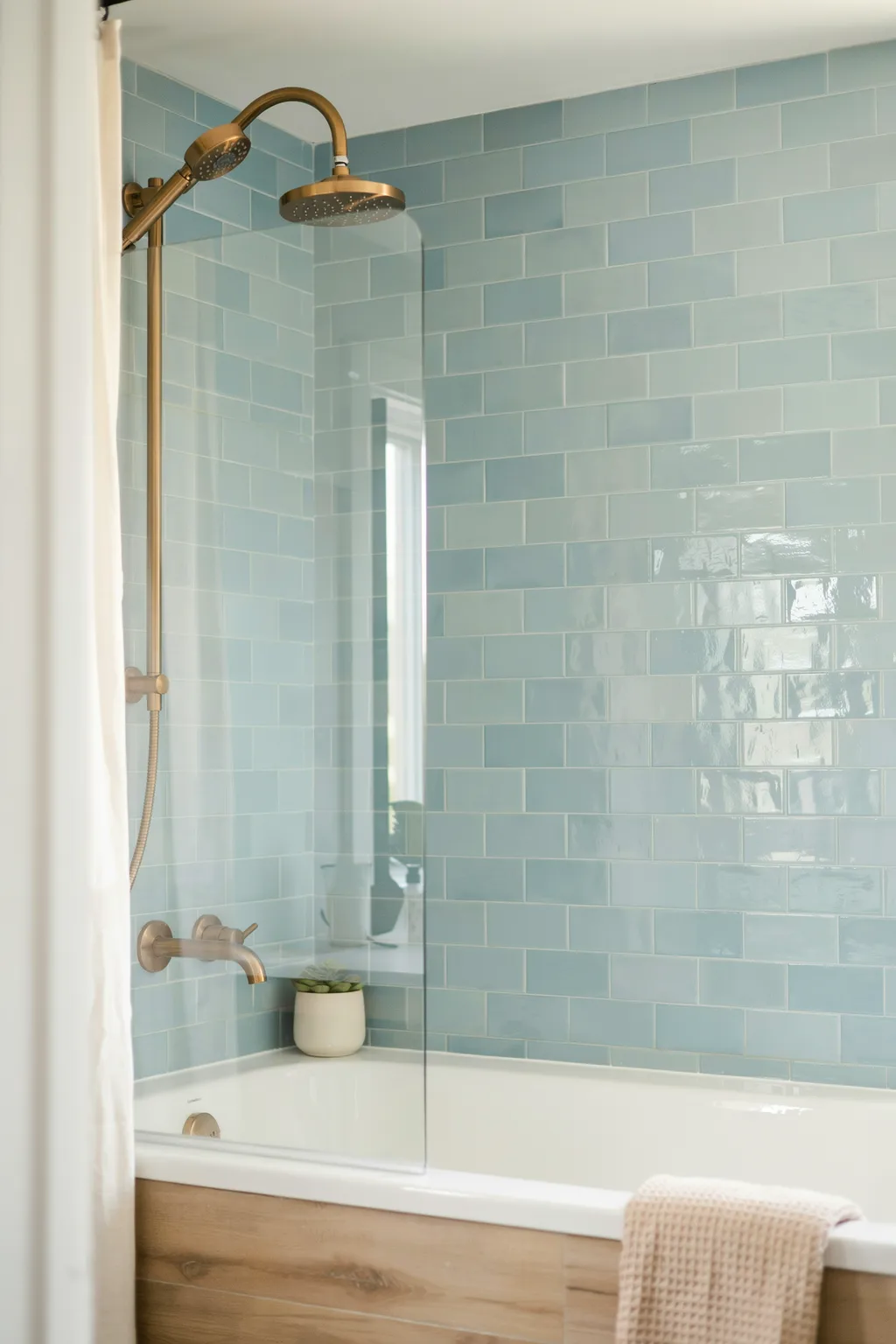
Subway tile is a classic, and a soft aqua glaze keeps it from feeling plain while staying budget-friendly. Run glossy aqua subway across a shower and tub surround, add warm brass fixtures, and the room feels like a serene coastal retreat. The gentle blue-green reads fresh and clean, and the familiar brick lay is quick and cheap to install.
Color is the low-cost upgrade. Plain white subway is safe but forgettable, while a soft aqua adds personality without shouting, and the glossy glaze bounces light to brighten a small shower. Brass warms the cool tile so the room feels inviting rather than sterile. A standard offset brick pattern keeps labor simple, so the money goes into the color, not the layout.
This suits coastal, transitional, and calm modern baths. It is a weak choice for a bold, high-drama room, where the softness underwhelms. Glossy tile and light grout show mildew in a wet shower, so use a mildew-resistant grout and ventilate well.
20. Go Dramatic with a Green and Black Checkerboard Floor
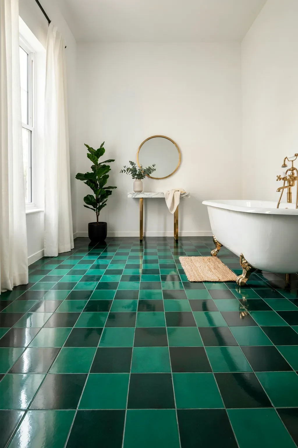
For pure drama, few floors beat a green-and-black checkerboard. Glossy emerald and black tiles laid in a classic check turn the floor into a moody, theatrical statement, and against black walls with a green clawfoot tub, the whole room feels like a speakeasy. It is bold, glamorous, and unforgettable.
The checkerboard is timeless with a twist. A black-and-white check is expected, but swapping white for rich green makes it feel fresh and custom while keeping the graphic punch. Gloss on the tile reflects the warm pendant light and adds depth to the dark scheme. Matching the tub to the green tiles ties the drama together so it reads styled, not random.
This suits maximalist, art-deco, and daring homes. It is a hard sell for anyone after a calm, bright, airy bathroom, since this room is deliberately dark. A dark, glossy floor shows every footprint and water drop, so it wants frequent wiping to keep the shine, and good lighting so it never feels gloomy.
Common Mistakes to Avoid
Mistake 1: Tiling Every Surface the Same Way
Covering all four walls and the floor in one tile with no focal point makes a bathroom feel flat and cheap, no matter the tile. Pick one hero surface, a shower wall, a floor, a vanity backsplash, and let the rest stay simple. Contrast is what reads as designed.
Mistake 2: Ignoring Grout Color
Grout is up to a third of what you see, yet people pick it as an afterthought. A stark white grout with dark tile looks gridded and busy, while a matching grout can hide the joints and let the tile shine. Choose grout as deliberately as the tile itself.
Mistake 3: Using Polished Floor Tile in a Wet Zone
Glossy floor tile looks great and gets dangerously slick when wet. In a shower or a splash zone, choose a matte or textured tile with real grip. For floors, check the tile’s slip rating; the Tile Council of North America publishes the DCOF traction standard used to compare tiles safely.
Mistake 4: Choosing Trendy Over Timeless for Big Areas
Putting a very trendy color or pattern on every wall means you will tire of it, and re-tiling is expensive. Keep the large, hard-to-change surfaces classic, and get your trend fix in a small feature strip, an accessory, or paint you can redo cheaply.
Mistake 5: Forgetting About Lighting
The same tile can look rich or dreary depending on the bulbs above it. Cool, harsh light drains warm tiles and flattens texture. Use warm 2700K to 3000K lighting and add a task light at the mirror so colors read true and surfaces look their best.
Mistake 6: Skimping on Tile Quantity
Ordering the exact square footage leaves nothing for cuts, breakage, or a future repair. Buy 10 to 15 percent extra, more for diagonal patterns like herringbone or chevron. Dye lots change between orders, so a matching spare box is cheap insurance.
Quick Start Checklist
- [ ] Measure the room and every surface you plan to tile, then add 10 to 15 percent for waste
- [ ] Pick one hero surface to carry the pattern or color; keep the rest simple
- [ ] Choose a tile shape (subway, hex, herringbone, fish-scale) that suits your room’s size
- [ ] Select a grout color on purpose, to hide or highlight the joints
- [ ] Confirm floor tiles have a matte or textured, slip-safe surface
- [ ] Order a sealed porcelain look-alike if a natural stone or cement is over budget
- [ ] Bring home large samples and view them in your own light, morning and night
- [ ] Plan warm 2700K to 3000K lighting plus a task light at the mirror
- [ ] Choose a mildew-resistant grout for any wet shower area
- [ ] Buy one spare box from the same dye lot for future repairs
- [ ] Hire a skilled installer for herringbone, chevron, or patterned mosaic seams
Frequently Asked Questions About Bathroom Tile Ideas
What bathroom tile looks the most expensive?
Marble-look surfaces and any tile laid in a pattern read as the most expensive. Large-format porcelain that mimics Calacatta marble, or plain tile set in herringbone or fish-scale, both look high-end for a modest price. The trick is fewer grout lines or a pattern with movement, plus a grout color chosen on purpose. Many budget-friendly bathroom tile ideas look costly simply because of the layout.
What is the best tile color for a small bathroom?
Light, warm colors make a small bathroom feel bigger: soft white, blush, pale sage, or gentle aqua all bounce light and open the space. Glossy glazes add extra brightness. That said, a dark tile can work beautifully on one feature wall or floor, as long as the rest of the room stays light. Tone-on-tone schemes feel the most spacious.
Should bathroom floor and wall tile match?
They do not have to match, and often should not. A common, expensive-looking approach is a bold, patterned floor with calm, plain walls, or the reverse. If you want cohesion, keep the floor and walls in the same color family but vary the shape or finish. Matching everything exactly can look flat, so add contrast somewhere.
How much extra tile should I buy?
Order 10 to 15 percent more than your measured area for standard layouts, and closer to 20 percent for diagonal patterns like herringbone or chevron, which create more offcuts. Keep at least one full spare box from the same dye lot, since colors shift between production runs and a future repair with mismatched tile stands out.
Is it cheaper to use big tiles or small tiles?
Big tiles usually cost less to install because they cover more area with fewer pieces and less grouting labor, and they read as high-end thanks to fewer joints. Small mosaics and penny rounds cost more in labor and grout upkeep, but they add detail and grip. Balance the look you want against the install time you can afford.
What grout color should I choose?
Match the grout to the tile for a seamless, calm wall, or contrast it to show off a pattern like herringbone. Mid-gray is a safe, forgiving choice that hides dirt on floors. Avoid bright white on floors and wet areas, since it stains and shows mildew fast. Whatever you pick, use a stain-resistant or epoxy grout in high-splash zones.
Conclusion
A bathroom that looks expensive almost never comes down to the price tag on the tile. It comes down to three decisions you make before the first tile goes up: choose one hero surface instead of tiling everything the same, lay the tile in a pattern that adds movement, and pick a grout color on purpose. Get those right and budget ceramic can read like a designer suite.
Across these 20 looks, the same logic keeps returning, whether the tile is emerald fish-scale, blush herringbone, speckled terrazzo, or a moody green checkerboard floor. Match the boldness to your room and your light, keep the big, costly-to-change surfaces timeless, and save the trend for a small feature you can swap later. That balance is what separates a bathroom that dates in two years from one that still looks sharp in ten.
Here is your next step: before you buy anything, bring home the three largest samples you can and tape them up in your own bathroom. Look at them in morning light and again at night under your real bulbs. That five-minute test tells you which of these bathroom tile ideas actually belongs in your space, and it saves you from an expensive mistake on the wall.
You Might Also Like